Extreme Contrast
|
For my final exam theme I chose the extreme contrast because I though that it would be a challenge to try and create an image with two. perspectives that go against each other. I was interested in this strand because it would allow me to really think about the colour contrast and the exposure contrast and all elements of the picture so that I could really bring out those two perspectives.
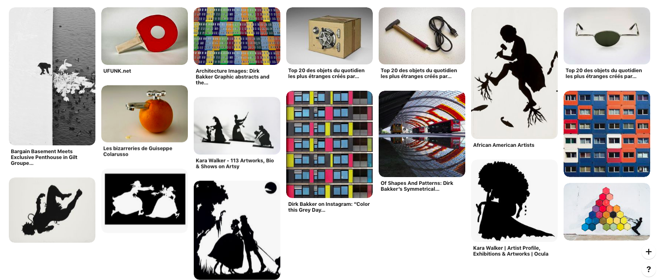
Here I made a Pinterest mood board and I took pictures from three different photographers that explored the something in their picture series. I would look at how the photographers would use contrast of colour and use that perfectly in their images. Then I looked at how the photographers used silhouettes to show a contrast of black and white, and how the showed contrast of the subject in the pictures. Then I looked at the abstract creations. I looked at three photographers in this theme that changed what you would expect when you hear 'Extreme Contrast'. |
Three Photographers
The three photographers that I looked at for the theme extreme contrast were the black and white works of Kara Walker, the colour contrast of Dirk Bakker and the minimum work of Guiseppo Colarusso.
Kara Walker
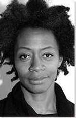
Kara Elizabeth Walker is an American Contemporary painter and was born on November 26, 1969. She lives in New York City and has taught extensively at Columbia university and was elected into the American philosophical society in 2018.
Here is one of her works of art called 'The Keys To The Coop' that she created in 1977:
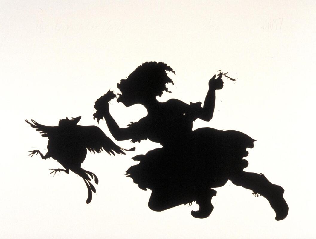
This is a drawing that she made on white wove paper of a little girl and a chicken composed in a cartoon style. The girl wearing a shirtsleeve dress and lace-up boots seems to be chasing a headless chicken with its feet and wings raised in a startled fashion. It seems like she is holding the chickens head in her hand and in the other twerking a key on her finger. It also looks like her mouth is wide open and has her tongue sticking out close to the head. This could show that she is going to eat the chickens head.
Walker creates a surreal and horror type effect when creating this image. She does this is by flipping the stereotype of a innocent girl playing with farm animals. Instead of chasing the chicken for fun she is chasing the chicken so that she can feed herself, showing that the girl is lacking in the simple necessities like food. The fact that she is eating the head of the chicken shows that she is not a sane character and has psychological problems that would cause her to eat what she is eating. This creates a horror effect because it is playing to the stereotype that a bloodthirsty insane person is hunting anything for food. It has turned what we expect form a little girl and made it savage and disgusting, much like what you would see in some horror films. This image fills the viewer with a sense of shock for what we are seeing. She wants us to consider the dark and neglected side of humanity that has reverted back to their primitive ways because they have been neglected in society by everyone else. This is also shown by the fact that she is wearing cloths that you would get in the old times, showing that she has reverted back to her old and primitive state.
When Walker created tis type of work she was considering the racial stereotypes that were present amongst African-Americans in America. This shown by the fact that the picture is painted in black and white... showing that the two sided perspectives that people have. Walker wants us to consider looking beyond what is out there.
In her painting she talks about how most opinions in life are seen in black and white with no further development. Thats why she puts her pictures in black and white instead of making them in colour, she wants you to really look at every aspect of it to gather an idea of the real scenario. Here are two more examples of her work...
Really good analysis of the image, Aaran. In the section where you discuss her work, look a bit deeper into the types of work she produces and explain them and the themes she addresses, so you can aptly discuss her intentions. Plus, show two more examples of her work.
Proof-read your work here and below for superfluous punctuation, missing letters, and misspellings.
Proof-read your work here and below for superfluous punctuation, missing letters, and misspellings.
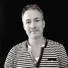
Dirk Bakker
|
Dirk Bakker is a full-time photographer with a particular style for taking photos. Dirk has considered to have defined his own style of photography as most of the photos he took are of an artistic nature. Dirk Bakker is a Dutch photographer that researches abstract patterns in architectures. Once he has taken the picture he will immediately change the graphic appearance and the appearance of the materials. He does this to intensify the urban landscape. One of his photos he took of stacks up crates is below.
Add two more examples of his work. |
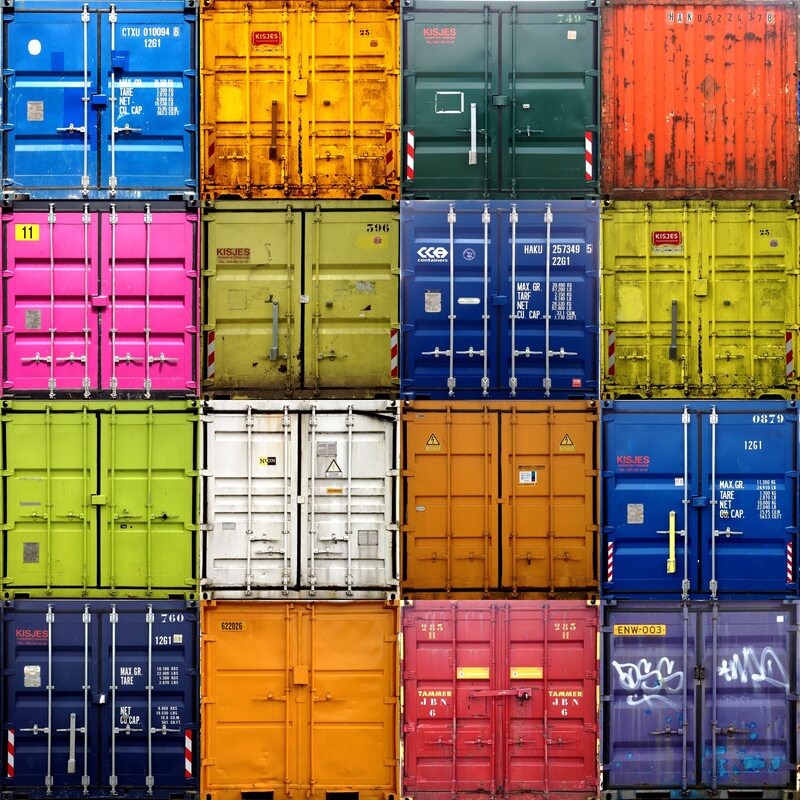
In this photo Bakker creates a sense of abstract reality when he takes these pictures as he has changed the colours of the original picture so that it fits his vision. Bakker has done this by simply changing the colour of the architecture style of the image by making the colour contrast their original state and each other. He uses bright and dark colours next to each other to try and bring out the details in the architecture of the creates. He wants us to consider the abstract and creative interesting.
Bakker is considering how the landscape and the architecture co-exist by the use of graphic development. This is shown by the fact that the real colours of the boxes are being withheld from us because Bakker wants to create a new colour pallet for the picture, that is why some of the boxes are so bright and clean, almost to show that they are fake. Bakker was interested in this because it talks about the ability to change the normal world so that it is more cleaner and brighter for everyone that looks at it.
The way Bakker took this photo was by first finding the creates in their natural state and then he would take the picture using a digital camera - then he would put the picture on an editing software and he would change the look and style and brightness and colour of the picture so that it would fit his image. This creates quite a dreamlike effect on the image as the bright colours give off a hypnotic feel. This helps support Bakker's point about landscape and architecture co-existing as when he creates these images he wants it to feel like something that you have created in your dreams.
Here are more examples of his work below...
Guissepo Colarusso
|
Colarusso was born in Switzerland photographer with a keen interest for flipping everyday objects and making them seem unusual. He was influenced by how things work and was extremely fascinated about how to flip its intentions so it doesn't work in the traditional sense.
This inspired my work because I would change the way that regular things are done. Anything else to say about him and his work? His influences? How can his work inspire yours? Add two more examples of his work. |
Here is one of the pictures that he took of one of his abstract arts:
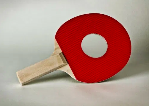
Colarusso creates a futile and intriguing feeling when he created this piece of art. He does this by placing a hole in the centre of an object that needs to be flat and complete in order to work. In this he wanted us to consider how useless this item is when something like this can happen to it, really bringing out the flaws in the object.
Colarusso is considering how wonderfully annoying and useless most materialistic items are as all they do is promote show and a false sense of personality if fully pursued. This is shown by the large hole placed in the middle of the table-tennis racket, showing that it is a useless item that we are now glorifying and calling art. Colarusso was interested in this issue because it tests peoples frustration over the handle of everyday objects, and the test of usefulness on the materialistic lifestyle.
Colarusso has used a digital camera when he took the picture of the object - as this is less of a photograph than an interesting way to gaze upon his rendition of modern art. When creating this work he has decided to take the picture at an angle so that it doesn't look like he has just coloured it in the same colour against the background, you can see the inside of the paddle. This creates quite an impractical and hopeless sense in the photograph as the object has been modified to be an ornament, in the sense that it has no use other than to just stand there. This helps to support his point about the frustration over the handle of everyday objects as it shows people cannot handle this item as they cannot use it for what it was made for. And it help further his point about materialism as it is shown as something unless and without meaning. This links into the theme of extreme contrast as it shows a something that has been purposely been given no point.
Here are more examples of his work down below...
Colour Focus - (Dirk Bakker)
For this shoot my main idea was to try and recreate Dirk Bakker's photos of landscape and architecture, then edit them to look better. Except, I felt like if I took a wide picture of the scene and have my focus subject somewhere in the middle of it, I could then convert the pictures to black and white and then colour in the subject to show it as the main point of focus.
This was the original image that I took...
...and this was my edited version.
More examples of my shoot are below, and below them are the original images.
The intentions of this shoot were to try and exhilarate how these specific items stand out in their setting and the contrast that they have to their surroundings. There reason that I had put everything except for that subject in black and shite was because I needed the background to be irrelevant and to seem like one subject that was compiled up of many different subjects - the black and white would blend them together. I would change the different effect of the cloured subject because I thought that it would make it seem more out of place in their natural habitat, that is why I made it seem more cartoon like. In order to take these pictures I used and ISO that varied from 100-800 depending on the lighting that was outside, I used a shutter speed of 1/100 so I could get a clearer image and also let in some light for a little exposure to brighten the colours, and I used an (F) of 6.8. This links in with the Dirk Bakker work because, just like him, I managed to incorperate his idea of blending architecture and digital design to create a abstract image. This fits in with the theme of 'Extreme Contrast' because the black and white contrast each other, and that black and white contrast with the coloured in object.
WWW: I managed to find a lot of coloured items in public and with photoshop they looked more abstract.
EBI: I could have been more careful when I was colouring in the image.
WWW: I managed to find a lot of coloured items in public and with photoshop they looked more abstract.
EBI: I could have been more careful when I was colouring in the image.
|
The first think I would do is upload the pictures to photoshop and then unlock the layer and duplicate it.
Next I would edit the top layer by changing the brightness contrast, and the hue and saturation, but then I would move the unedited layer to the top and then change the top layer to black and white. In the black and white options I would change the colour concentration to make them fit together. Next I would either select the object on the top layer that I wanted to keep by using the pen tool, or I would use the quick select to get the image. Either way, once the selection was made I would go on the eraser tool and then rub out the selected area so that the colour would show on the black and white image. Once I was happy with the picture I would then go the to the 'layer' section at the top bar and then go to flatten image so that both layers would be condensed into one. Then I would save the image and upload it. This is a good project but I must admit, it has very little in common with the work of Dirk Bakker and his architectural images. Find another photographer whose work is more similar to yours, add that in the above research section and then, do a different shoot in the style of Dirk Bakker. |
|
This fits in with the work of Dirk Bakker because I took inspiration form the fact that he would find architecture in nature and then flip it for his own desire. Like him I would go outside and I would take pictures of objects and buildings in their natural state as in a way the created their own type of architecture they way that they lay, and I wanted to exploit. The way I would exploit it was by making it everything black and white (taking the colour out of it) just so that I could get the main focus on the one bright and colourful item in the picture, and much like Bakker I would use my knowlage of graphics and change the style of the picture so that it looked fascinating. So we would both go out in and find things fixed in nature, then flip them for our own gain.
Abstract Life - (Guissepo Collaruso)
I took the idea from Collaruso about altering objects to make them useless and incorporated the extreme contrast idea into it. Instead of making object seem useless I instead tried too use the idea of opposites and peculiarity. As you can see the image below.
This image was edited so that it would look more appealing. As you can see with this photo I was showing the extreme contrast of old and new by combining them together. That is also why I changed the saturation to make the image seem more grainy, to give it the film look.
The intentions of the shoot were to try and shows an extreme opposite in an unusual sense.
Here are more examples of the work that I did down below...
In order to take these pictures I had to change the settings on my camera to an ISO of 800, shutter speed of 1/80 and an (F) of 6.8 so that I could get a clean light on the pictures and then fix it in photoshop. The reason that I made this pictures look grainy was because I wanted to make it seem like they were taken on a film camera and developed in a strange way so that the bright colours would stand out and the dark colours would be bold. The way that this fits into the Guiseppo Collaruso pictures is that it shows almost abstract opposites of what you would normally expect. One example of this is the darts that are stabbed into the dartboard. This is like him because it is much like the piece of art he made with he cooked egg not he table tennis racket, it is something that you wouldn't usually expect but at the same time it is an opposite of what you get. So the way that I incorporated this into the dart board was that I wanted to bring that same element into this work as by having the darts there it is something that you wouldn't expect and and at the same time it is presented as a opposite. Though with some pictures like the food beside the plate of spoons, I wanted to go with a literal take on the idea of opposites. I though that the pepper and the broccoli could represent the traditional knife and fork and make the spoons be the food. These fit the intentions to try and show unusual opposites because they turn viewers expectations. which is also the reason that this fits into the theme of extreme contrast because they are two objects that you would not think to together, being forced together to show how different they are from each other.
WWW: I felt like I put my ideas in motion and they were set out well so that people can understand what they are.
EBI: I struggled to find ideas and it was hard coming up with contrast for things that i was happy with.
WWW: I felt like I put my ideas in motion and they were set out well so that people can understand what they are.
EBI: I struggled to find ideas and it was hard coming up with contrast for things that i was happy with.
|
The way that I created these pictures was first by uploading the picture onto photoshop and cropping it so that I could remove all of the negative space that is in the picture.
Once that was done I then would play around with the brightness and contrast of the picture so that the subject was clearly shown and it had a strange look to it. Then I would play around with the levels of the picture just so it would look like it was taken with better light and so I could brighten all of the dark spaces. Once that was done I then changed the vibrance of the picture, colour balance of the picture and the hue and saturation of the picture just so that it could look like it was studio developed. After that the picture would be done and I would then save it and upload it to the website. You've created an interesting set of images here, Aaran. Please shoot at a much lower ISO next time - these are too pixelated and do not create the impression of film grain. With all your work, in addition to explaining how you produced it, you need to evaluate it. What worked well and what could improve? If you were to shoot/execute the project again, what would you do differently? This then informs all future work. In order to raise your points for AO3, it's essential that you evaluate your work as you go along. Please go back and add a short evaluation of each of your projects and/or individual images. |
|
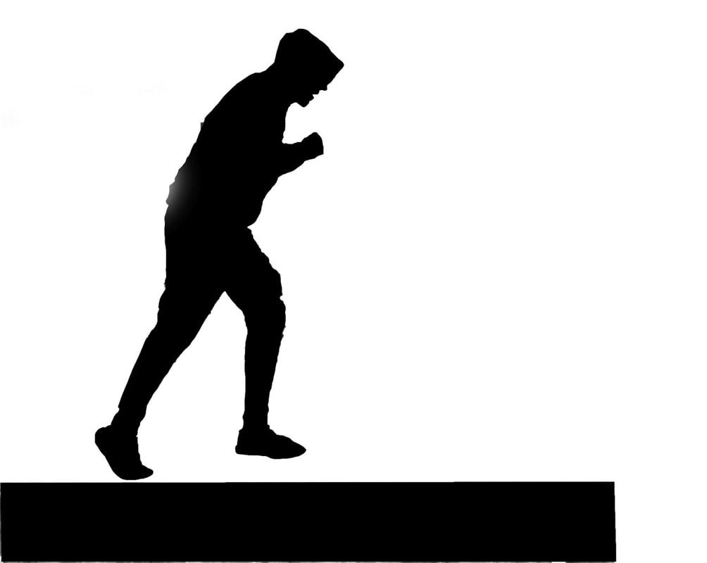
Silhouette - Cara Walker
For this talk waned to try and recreate the work done by Cara Walker, the way that she made abstract paintings using silhouette. The only difference between my work and Walker's work is that I used photoshop to make my work. Below are some of the pictures that I took and fixed to be silhouettes.
This is the original picture...
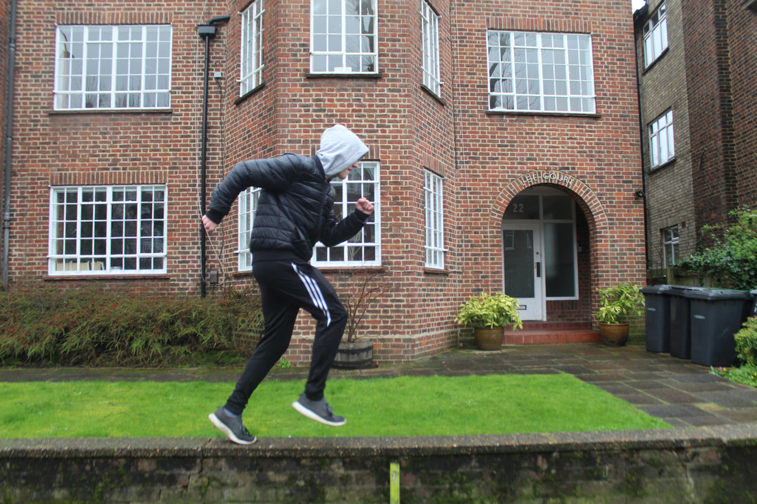
...and this was he edited picture.
In order to get the subject in he picture clear I had to use an ISO of 200, because of the daylight.
More examples of the shoot are down below, aside their original image.
More examples of the shoot are down below, aside their original image.
With these pictures I used an ISO of 100-200 as the photos were taken outside, I used an (F) of 5.8 as it didn't matter if the picture was blurry or to over exposed and I used a shutter speed of 1/80. My intentions of this picture were to try and do what Cara Walker did by creating silhouettes of people except instead of painting them I decided to take the actual picture with a camera and then colour over the figures with photoshop. Much like her work I had the subject in the picture doing something strange so that the person viewing the picture would be interested because it isn't just a boring subject. In some of the pictures the people are doing abstract things because I wanted them to seem like a mystery. I wanted the people that saw the picture to come up with their own idea of what they think is happening in the situation to try and bring out peoples abstract and creative side. This task fits in with the work of Cara Walker because i have done the same thing that she has done except I have changed the situation of the picture. This fits in with 'Extreme Contrast' because the black and the white in the picture contrast each other, and the contents of the image contrast the normal, so two types of contrast are present in the image.
WWW: I felt like I got my message across through these pictures and managed to capture my themes in a graphical way.
EBI: Editing the pictures was hard so I wish I would have found a different way to edit them.
WWW: I felt like I got my message across through these pictures and managed to capture my themes in a graphical way.
EBI: Editing the pictures was hard so I wish I would have found a different way to edit them.
|
In order to make this image first I would upload it to the photoshop application.
Once that is done I would use the pen tool and select around the subject/subjects. Once the subjects have been traced I then select them and colour in the selected area in black to make the silhouette. Then depending on if there are more than one subject I would colour the other one in and then have a stream of black connecting them together so that I could select them both at the same time. Once that is done I then right click on the mouse and go to select inverse so that the rest of the picture is selected. The I will colour the background in white so that I get the final picture. Sometimes once I have highlighted the subject i will change the background to black and white to see where I could colour in. When I use props in the picture I will go on the internet and screenshot the item. Then I will upload that screenshot to photoshop and remove the background. Then I will select the prop and add it on the picture in the right place. Then use the pen tool to select over that and colour it in black. This is an excellent project, with some great effects. You've explained really well how you've produced the images, as well. Now, look at my previous comments on evaluating your work. Have you checked out Kara Walker's films? Maybe an idea for a final exam piece? |
|
Minimalist - Chung Kong
Minimalist posters are when people make an abstract poster for the film of their choice. This poster was made by ChungKong, a graphic designer and artist from the Netherlands that has made over 800 posters.
He creates a nostalgic sense when he makes these posters of the films. He does this by taking something that most people all know and love and he brings out the feeling that people felt when watching the film. He will take a memorable scene or feature of the film and then create a poster about that so people will understand that. When he makes this photo he wants us to consider the happy feelings that people felt when they watched the film.
The photographer is considering how good cinema was and how big and fantastical it is. This is shown by the fact that in his pictures he will pick memorable bits to make a poster out of and he will have a line from the film as the tagline to show his commitment to his work and his love for film. He was interested in this because film has had a big impact on his life so he is almost paying respect to film.
In order to make this picture he would use the same front layer of the poster and then he would colour over it so that he could blur out the faces and make it in his own vision, whilst still making it known what the original film is. This creates quite a unique sense to the poster whilst keeping the original idea and intent of what the person that designed the poster had. This helps support his point about how big and fantastical film is because it shows that commitment that this graphic designer has towards something because it has made such a big impact on his life.
Check out the work of Edward McKnight Kauffer, who did some of the Art Deco London Underground posters, for more inspiration.
https://www.vam.ac.uk/shop/e-mcknight-kauffer-a-designer-and-his-public-80154.html
https://www.vam.ac.uk/shop/e-mcknight-kauffer-a-designer-and-his-public-80154.html
Extreme Contrast Minimalist (Chung Kong)
For this this development I decided to try do an extreme contrast of perception by blurring their faces and taking away some of their identity so that you would try and get guess who they were from their personality. At the same time I tried to do and extreme contrast of colour with their cloths and the background that I put.
Here is an example of one of the pictures...
Here is an example of one of the pictures...
Here are the rest of the pictures that I took, with the original one next to it...
For taking the base pictures used an ISO of 800 because I was inside and because I wanted the background to be lighter so that it was easily distinguished from the person on photoshop, and because I wanted to bring out the brightness in their cloths so that I could get a perfect colour match. When creating this piece of work I needed the background to contrast with the cloths that the people were wearing so that it would fit in with the scheme of work. I also need them to have their mouths closed because when I was to fade over their faces it wouldn't looked warped or strange. Also, in these pictures I found that while I was editing the photos that there was a sense of contrast with perception of reality because when my friends would look at the photos they would recognise them just by the cloths they wear and the outline of the body. This showed that without the identity of their face, they were easily recognised. This fits in with the work of Chung Kong because I am doing the same thing that he is doing, but I am doing if of real life pictures. This fits in with the work of 'Extreme Contrast' because each picture has an extreme contrast of colour and an extreme contrast of perspective.
WWW: I felt like I animated over them easily and it looked good as well. It also managed to pass the message through well.
EBI: I feel like some of the pictures look a bit warped and I could have not put in most details as they made the pictures look strange.
WWW: I felt like I animated over them easily and it looked good as well. It also managed to pass the message through well.
EBI: I feel like some of the pictures look a bit warped and I could have not put in most details as they made the pictures look strange.
Final Piece Extreme Contrast Minimalist (Chung Kong)
My main intention for this final piece project was to try and develop my previous development, but make parts of the extreme contrast clear. I would go through and watch sections of films to try and recall the events of the movie, then I would take a memorable part from the film and take a still of it. Once that was done I would edit the main people in the frame (people that were a lot closer than others to the camera or the only one in frame) so that they looked like what I did for my last development. The reason that I chose films to do was because I couldn't exactly leave my house during quarantine to go to big places like Central London.
In this shoot I took into account many different types of extreme contrast when choosing the film and scene: Of course there was a contrast between the background being normal and human and the people being animated in the frame. I also wanted and extreme contrast of emotion as I chose parts of the films where the people would be in thought or expressing some key emotion to the film, but once I have edited them I take out the emotion in their face to make it strange for the scenario that they are in. Also, in this shoot I incorporated and extreme contrast with perspective like my last shoot as you by blocking the face of the actor you start to look around and start to figure out what the film is, and who the actor is, just by looking at other things and matching them with culture... It is almost like a guessing game of what film is just by looking at things like their cloths.
Below are all the pictures that I have done with a description of what they are...
This still was taken from the ending of the movie 'The Graduate'. This is one of my favourite films mainly because it has one of the most amazing endings to a film. The reason that I chose this ending to the film and chose this scene to edit the characters is because in this scene you can see that the the male character in the photo is in deep contemplation and is in deep thought as he is realising what he is doing and what is to come. So by editing their faces and taking the emotion out it is almost a contrast of emotion. Another reason I chose this scene was because it is a famous one and most people would recognise it as it is a bride sitting next to a man in the back of a bus. This scene also shows an contrast of colour as she is wearing all white in a wedding dress and he is wearing a dark T-Shirt, hence why i gave his skin a darker tone and gave her skin a lighter tone. Also by animating over the people it created an extreme contrast of reality as it shows two people in a different world than the one that they are in.
The reason that I chose this scene from Forest Gump was because it was one of the most pivotal scenes in the films as it starts off his retrospective narration of his life. In this moment he is showing his innocents by opening up to a stranger and telling his life. So the reason I edited this scene was because in a way it is memorable and people will understand what this film is, and also because if you take the emotion out of the characters in this scene by covering their faces, there is still some emotion here as the people will recognise it and start to remember. I also felt like this was perfect because since they are in a park, which has a lot of trees and greenery, it is a contrast that they are animated and fake compared to their background. In this picture I also did a contrast of colour she is wearing bright clothes with white and purple whilst he is wearing dark grey cloths in his suit.
The reason that I chose this scene of the film was because it was quite a memorable shot that people will know. This shows a contrast as in this scene both of them are in shock and amazement as the machine has worked, but even when you take the emotion off of their face you can still feel their shock by things like they way they are positioned. Another reason why I chose this was because you don't need to see their faces to know who they are, the wardrobe design is so famous that everyone will know who they are. In this picture there is also a contrast of colour as one is wearing a complete white jumpsuit and the other is wearing a range of two colours, with his I toned down the brightness on his jumper to show the contrast between the two characters. There is also an extreme contrast with the animation and the reality of the background. The nights sky was really good because it gave you a nice idea of where they are and what is going on in the scene.
The reason why I chose this film was because it was a marvel in colour and framing, so it would be easy to animate over the characters and it would be easy to choose a part of this film to animate over. This was a good scene to use for extreme contrast as in this picture there is a contrast of distance as one is right up close to the camera and the other is far in the background. Also there there was an extreme contrast of colour as the manager in the front was in bright purple and pink colours to show his class and the lobby boy in the background was in dark colours to show his status. I also liked how the entire set and characters are in bright colours, so even though they are animated they still fit in well with the background. You could barely tell the extreme contrast. Everything in this shot was already set up for extreme contrasts, so all i had to do was just animate over the characters, I didn't even have to change the colours in the photo.
The reason that I chose this scene was because it was also a pivotal moment in the film. This was where you found out the twist of the film and each character in this scene is expressing more amazement and shock, So for me to animate over them it just looks like they are staring at something. This is an extreme contrast of emotions just like the one I did for 'The Graduate' but this takes the tension out of the scene. There is also a contrast of colour in this like the others as the main character is wearing bright blue cloths and the others are wearing dark guard uniforms. I paid more attention to detail in this photo by doing things like colouring in the numbers on his shirt and colouring in the badges on their hats, this was so the image could be more captivating than just plain cloths and hats. I like this because it forces you to try and look at things like the bars in the background to try and figure out what it is if you don't get it straight away.
This was an easy one I wanted to do as each though it is simple it still has quite a lot in it. Each of their cloths are contrasting with each other and no person has the same colour scheme, each one is sort of unique. I also liked it because it did what the 'Back To The Future' one did by showing their emotion and feeling by body language instead of relying on reading their face. I also like the forest at night setting that the had as it gave the picture a strange effect like the belonged there but at the same time they didn't. Though this was simple it still gave a lot of contrasts of little things.
The reason I chose this was because it was another one of my favourite films. I chose this scene because it thought the person doesn't show much emotion in the scene it was still a memorable moment and a memorable scene in the film that people will recognise. There is an extreme contrast of colours with the gown as there are bright reds and semi-dark greys that work together to create a nice pattern that makes it more appealing to the eye. I also liked how, yet he is animated over, he still fits in well with the background. It works well because though you can tell that he is animated he still feels natural. This was interesting because though there was not much detail you still had to pay attention to the little things like the way the red lines flow on the gown. Though it was simple it required a lot of time.
Again, this is another one of my favourite films as it was such an abstract piece of cinema that had so many things you wouldn't normally do, but they worked fantastically. I chose this scene in the film because this was when his character was starting to doubt all of the intentions of this location, and was starting to doubt the innocents of the people around him as well. Here he is starting to get confused and is showing slight frustration and concern on his face. Though even when you animate over his face the only thing that makes you think he is thinking that is the combination of his glasses an his stature. This shows an extreme contrast of emotion. There is also a huge extreme contrast of reality and animation as he is the only person that is animated, whilst the people in the background are still normal. This was to show the importance of this character and to really make him seem more intimidating to convey emotion as he is the only different one.
This was an important scene from the film that I felt like it was perfect to animate over. In this scene the characters are terrified as a more intelligent life form is out to kill them and they don't know what to do. You can see the fear in this scene as they are all have terrified expressions on their face. So when you animate over them it almost relaxes the viewers and the situation to be more calm. as they don't have emotion to try and convince the audience. So in a way there is a contrast of emotion, but more specifically contrast of fear and tranquility. The animated characters fit in with the background well because of the intense sci-fi decoration, which shows a contrast of reality as this is a projection of the future. Showing a contrast of present and future.
I chose this film because I felt like this character had an extreme contrast of society as he was trying to stop all the darkness in society, whilst being part of it. Also, it was quite easy to animate over as he had a simple costume that consisted of dark colours with white face paint, so in a way his character contrasted reality by being so surreal, and my animating over it only enchanted that trait. There was a lot of contrasting of colour with this colour as he wears dark cloths but also wears a pale face to almost show a dark and brooding exterior in contrast with a innocent and bright interior.
There were many reasons why I chose this scene and this film: One of the reasons was because this is where you first are introduced to the character's new side and the outfit he is wearing is packed full of colours that contrast with each other like the blues and the yellows and the reds and the yellows and the dark greens and the bright reds. So it was easy for me to animate over. Another reason was because of the clear contrast of emotion. In the picture you can see him looking angry and evil, but once you animate over him he seems less alarming and more welcoming, he seems more like a real clown. So this picture has a contrast of happy and sad.
The reason I chose this film was because it was full of strange events that confuse the characters as well as the audience. The reason I chose this scene was because though his character seems emotion he is deep in thought and is slightly board because he doesn't want to be there. The character has already done a contrast in emotion, so by animating over it all I was doing was strengthening this. Also, the grain of the film means that he sort of doesn't fit in with the background. I liked this as it showed a contrast of old with the grain of the film and the new of the moder graphics. Though I did have to saturate the colour when animating him so that he would fit in perfectly.
The reason that I chose this film was because there were famous characters that you could recognise just by the look of their cloths and their outfit. Also, there was a contrast of colours with their cloths to show that these two characters are completely different from each other, yet they work so well together.
This was a key moment in the film that I had to do as the acting of the main character was so good that in this scene you can see the performance of him fills the screen with fear. So when I cover his face after animating the audience is almost more relaxed as the only thing that showed fear was his facial expressions. I also chose it because the blue of his outfit was a contrast with the boring and dull colours of the background to show that he is a character of interest.
Though this was not the most famous scene from the film it was still the one where both of these characters had been broken down and were now weak and scared. So when I animated over it there was a big extreme contrast of emotions as they are terrified but once animated they seem normal.
In all of these pictures I tried to take into account the contrast of colour as you can see by the fact that I would make some characters brighter than the others or make them darker than the others; though my main intention for this project was to show the contrast of emotions, thats why I chose scenes from the film where emotion was strong so that I could almost dismiss it.
WWW: I felt like I animated over the people perfectly and have no complaints with it. I even got some of the memorable features of the characters.
EBI: There were some things I had to deal with like the crazy hair that fluffed up, and I couldn't animate over them as it would distort the picture and make the person look strange and not human.
The Making
|
|
The first thing I would do after uploading the picture would be to increase the size of the picture so that I could zoom in closer and be more detailed.
|
|
Then I make a new layer so that I don't ruin the actual picture.
|
|
|
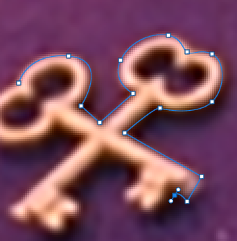
Then once that is done i begin to select the area that I want to colour in by using the Pen tool. Once I selected the areas I left click and press make selection (make sure it is on 0cm).
|
|
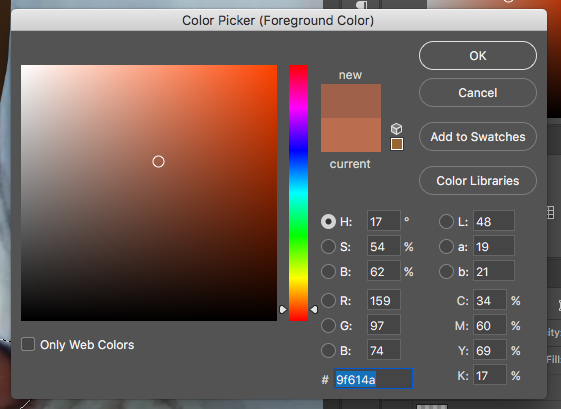
After I have done that I try to get the colour of the image selected area and then colour it in with the brush tool.
Once that is done just repeat the steps until here till the image is fully coloured to your satisfaction. |
|
|
|
Once done just go to layer at the top bar and then press flatten image so that it looks like this. Then change the size so that the largest side is 45cm. Then save the images for web devices and upload to the Weebly.
|
What do you think the photographer’s intentions are? There may be more than one. ‘PEC’ each intention.
P (Photographer’s name) creates (what type of images? Fantastical, surreal, objective)
E He / she does this by… (describe something in the image)
C He/she wanted us to consider ….
What wider issues is the photographer addressing?
P (Photographer’s name) is considering (is the photographer talking about a bigger issue in photography, society, politics?)
E This is shown by … (describe something in the image)
C The (Photographer’s name) was interested in this issue because (they felt it was relevant to us now…)
How do the materials and techniques used support your photographer’s intentions?
P (Photographer’s name) has used (the darkroom / multiple exposure / film / digital manipulation techniques) in creating this work.
E This creates a ______ effect. (describe something in the image)
C This helps to support (Photographer’s name) point about (showing an identity / hiding a person’s identity / the media / anonymity)
