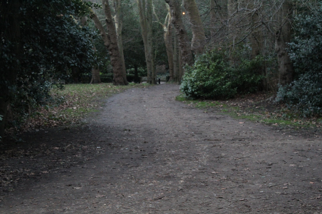
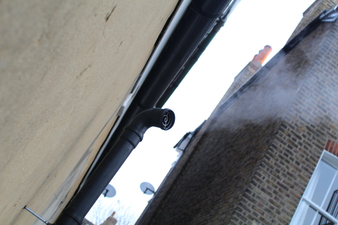
Movement
Yowa Yowa
This work on levitation is inspired by the magnificent work of photographer Yowa Yowa. She was an artist who, much like Halsman, worked on the idea of jumping. Though her ideas were different to Halsman's, she worked on the same idea of jump. She uses the idea of levitation and incorporates it into every day life. In an interview she said that she was inspired by the self portraits by Natsumi Hayshi. Her friend sent her images of her and she said it 'made her heart ache for Tokyo. She called her site Yowa Yowa because it was Natsumi's own words and it meant weak or feeble. She called herself this as she found it hard carrying a heavy SLR camera around with her. I like her photos because they bring a sense of magic to the photo and make the ordinary seem supernatural
Move this whole section on Yowa Yowa above your own photos.
Move this whole section on Yowa Yowa above your own photos.
|
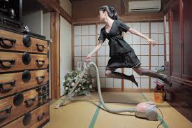
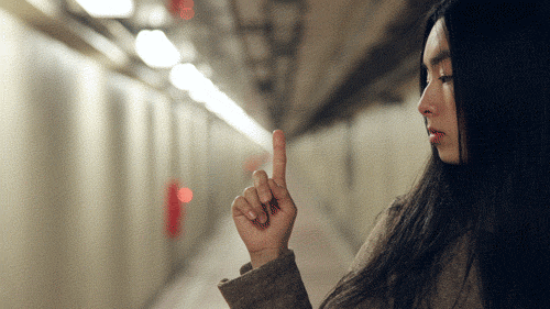
This is one of my favourite photos of hers because it makes me think about a modern witch, the way that witches use brooms to fly and she is using a hover while flying. In this photo she must have used a high shutter speed in order to capture the effect of levitation, but not to low as to darken the picture. The (F) for this photo must be a high one as well as she has got the drawers in focus and her self and the back ground. Lack of exposure of light and the fact that she is inside would tell me that she has the ISO on 400 as to not let in to much light as there is already a light above her head.
|
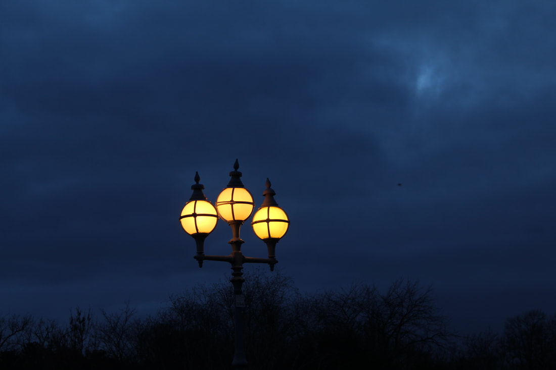
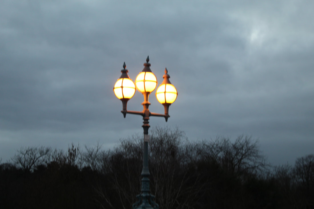
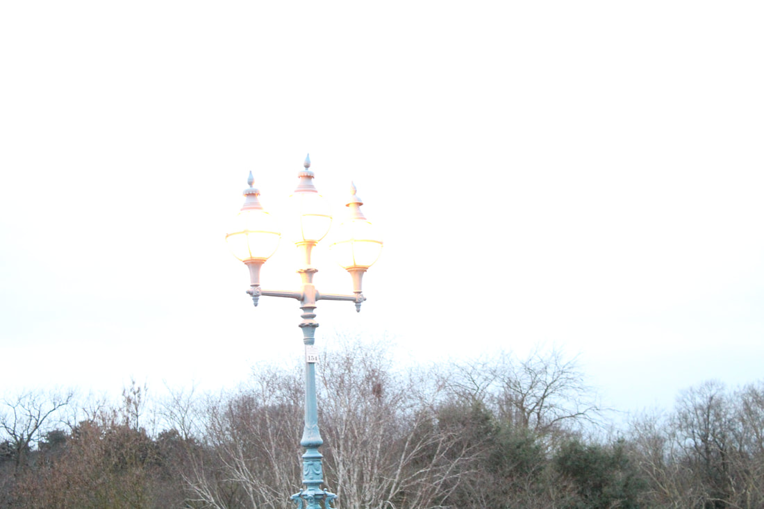
Movement Pictures
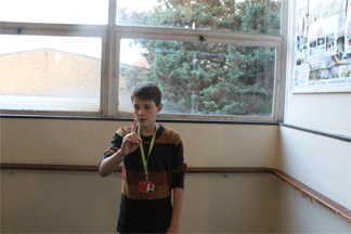
With these pictures I used an ISO of 100 and a shutter speed of 1/100 so that I could get a clean and sharp image with no blurs of them falling. These were inspired by Yowa Yowa because I like the way that she can bring life into everyday boring things. With these pictures I wanted the subject to do some every day things but also bring other effects as well so that it would be exciting.
WWW: I took good pictures that made it look like he was levitating.
EBI: I should have done more photos on everyday things so that it would be more like Yowa Yowa.
WWW: I took good pictures that made it look like he was levitating.
EBI: I should have done more photos on everyday things so that it would be more like Yowa Yowa.
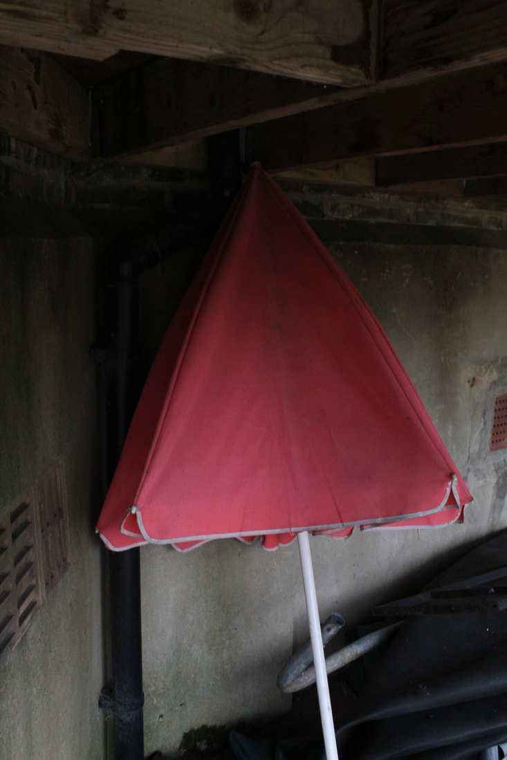
Levitation
Good efforts. Whilst the composition isn't as strong, the photos of Lottie definitely look more like they are levitating. Which attempts did you notice worked better than others?
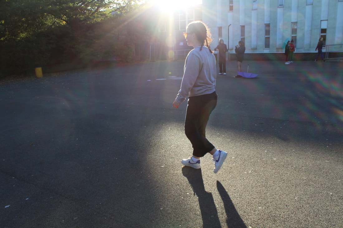
I noticed that the worked better than the others was when she was walking on air, the reason i say this was because there was not a lot of exposure, except on her body, and i managed to take the picture just in time.
I noticed that the worked better than the others was when she was walking on air, the reason i say this was because there was not a lot of exposure, except on her body, and i managed to take the picture just in time.
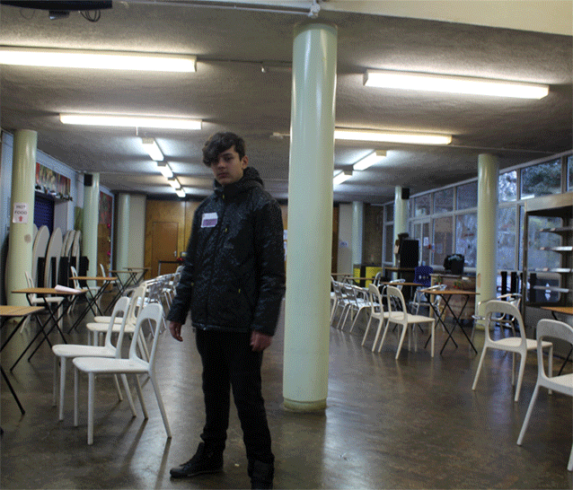
In these photos we were trying to achieve a sense of effortless levitation by having someone either jump off of a platform and take the picture with a shutter speed greater than 1/60, as to get a crisp image. The way this links to movement is because the outcome of this picture is to make it look like some one is moving whilst in the middle of air. And in order to make the subjects in these pictures look like he is levitating, the subject himself has to move forward or jump to get space between the ground and the subjects feet. The trouble of trying to get these pictures is that you have to factor in things like the lighting and the shutter speed.
oThe problem with this picture to the right is that the sagging of the cloths ruins the affect. When some jumps their cloths tend to move in the direction they are moving and fly all over the place. In a levitation photo we want the person seeing the photo to feel like the person is floating, but with the cloths moving up and down it can ruin the affect and make the person looking at the photo feel like their is some thing wrong with their levitation.
The Shutter speed was also wrong in this photo. I put it on 1/70th of a second and that wasn't fast enough to catch the picture. Next time I would have to get the shutter speed on something over 100. Another thing wrong is that the person is to far away from the camera and it makes it look strange as the person would have to focus on heavily on the subject with all the other things in the way. People use photo shop to fix these things. The ISO 4 was a good choice on this setting as there was no glaring sun and nothing to reflect the sunlight into the camera. Also the aperture (F) of the picture was good as I kept it medium so that not a lot of light would be let into the camera and have a high exposure. I can't remember the (F) but i would advise you to not put it to high. I'm so glad that you're getting the hang of analysing your photos! Whilst you should always show all of the photos you've shot, in future, select only one that hasn't worked out to write a lot about - otherwise it may look like you've not achieved what you set out to do. Definitely analyse one that hasn't worked out so well and use this same level of analysis that you've used here on your good images. |
The problem with this picture was that i didn't consider the aperture of the picture (F). I must have had it on a low setting as more light got let in to the camera and the light exposure was all wrong. Though the sunlight in the picture is beautiful, it is also a big glaring distraction from the subject of the picture. Also another thing that went wrong was that I put the shutter speed on a low setting. This means that I could only got her standing on the floor and not taking off of the ground. The problem with low shutter speed (low being everything under 1/60 of a second) is that you can't get a good idea of when the camera will take a picture of, with a high shutter speed you will get a clearer picture and you will get a better shot in air. Also the ISO used was a 4, and with the sun glaring directly in the camera i would have to put a higher ISO 
|
I think that the thing that worked well in these photos was that even though we didn't get the right shutter speed, ISO, or (F), we still managed to get the right angle angle of the camera. instead of having a landscape photo where there would be a lot of useless things to the side that might stray from the subject, we used our initiative and moved the camera in a portrait style as to get some room for the air and keep everything in frame.
If you go through these pictures then you will see the different ways that these photos have messed up because of flying objects, the wrong (F), the wrong shutters speed, or the ISO is wrong.
Don't include the same photos twice. Again, look at my feedback above. You can batch your analysis to what didn't work in one section but then move on to what did work well.
Don't include the same photos twice. Again, look at my feedback above. You can batch your analysis to what didn't work in one section but then move on to what did work well.
In inspiration I took these pictures with a shutter speed of 1/80 as to get a crystal image and also not make it to dark. I also put the ISO on 6400 because it was night and i needed all the light i could get. And finally i put the aperture on 8.0 to get some focus on me and the background interactions. inspired by her i did some everyday house things and jumped while doing them in order to make it seem i was levItating. I do admit that in some pictures it does look forced and the last one you can't really see my legs as much. Though it was very interesting to put my knowledge of photography and cameras to use in these pictures.
I'm impressed that you've tried this out at home...however - unless you're using a timer with your camera on a tripod or you have a shutter release cable, do not include images of yourself that someone else took. Nowhere in your portfolio should you have images of you unless you specify how you shot them, yourself. Otherwise, it looks like someone is doing the work for you and you could be disqualified.
I was using a tripod and a 10 second timer
Zoom Blur
|
|
The picture on the left is the best picture I took that I liked, the pictures on the left are the best ones of the pictures I took. When I took these pictures I used a shutter speed of "0'8" (an eighth of a second), my ISO was 6500 because it was very bright I the area and any added light made the exposure to high. I used an aperture of 5.8 (F) which let in the right amount of light and also got the ball in focus even when it was zoomed in.
I really like the first photo as an interesting composition and effect. However, I'm not sure if you properly got the best results using this technique. Try shooting this again with more light available and holding your camera as still as possible.
I have changed my pictures of zoom blur
|
|
In These Zoom Blur pictures I used the same ISO, (F), and shutter speed. The reason that chose the one on the left as my faverouite picture was because it had a slight blur and looked like in an 80's music video when the text would fly
|
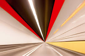
This is one a zoom blur picture done by photographer Dominic Harris. he must have just gone at high speeds one a motor way and took the picture. In comparison he as not zoomed in but has kept the road in focus, he probably used a low aperture in order to get the road in focus. Phs picture is a good example of how to take a good zoom blur photo because he took every aspect into account and worked on it.
|
Francesca Woodman Inspired pictures
In inspiration of Francesca Woodman we took ghostly and ghoulish pictures like her to capture the same effect. We took some pictures like that and the best ones are the ones in black and white.
|
|
In this picture I used an ISO of 400 to get the some light come in the picture. In order to get the blurring effect of the camera I just had to change mode to shutter speed priority and change the shutter speed to an eighth of a second on order to get the blur.
After taking the photo I had to put them into Photoshop. First I went to the top to the hot bar and then I clicked on adjustments and turned the picture to black and white. They allowed me to change the colour ratio in the pictures in order to get the picture dark in irrelevant places and brighter in the main focus. I took these pictures on a 10 second timer and I used a tripod to make the background look sharp. WWW: the blur ca out well and the door way was to create an unreachable affect EBI: I should have cropped the image a big as the black and white one is a bit small. |
|
In this image I kept the same ISO and Shutter speed, and cropped the image to draw attention to what I wanted them to see.
I thought there was to much of the background in the picture and so I changed it. I wanted to create a haunted ghost affect in the picture, thats why I had bent over as if I was in agonising pain. WWW: I felt that I conveyed my message of fear in all things very well. EBI: The contrast of tone against this specific picture choice wasn't as good as the other pictures because the colour against the wall tends to match the figure and the lack of lights blasting against the subject makes the figure blending to the picture |
|
|
|
For this picture put the ISO on 200 and put the shutter speed on a quarter of a second, which was to quick as the subject wasn't moving fast enough.
In this picture I wanted to create a spooky effect of an altered world by tilting the camera and having the ghost change. I used Francesca Woodman's technique of putting yourself in places that are very uncomfortable and create a sense of claustrophobia. WWW: I felt that I used her technique well for this photo and by tilting the camera I created an unbalanced effect EBI: I thought that there wasn't enough colour contrast between the figure and the background because they, when transformed into black and white, blended in with each other and I felt my point didn't go across as much. The idea behind these photos is that your background is meant to be sharply in focus and the only thing that moves or is blurred is part of the subject. Any chance you can try shooting this again? Really think about your composition, the background of your subject, and shoot in areas where you have enough light. |
Francesca Woodman
|
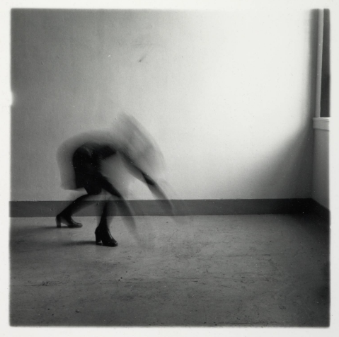
This is a photo taken in 1976 by the photographer Francesca Woodman entitled 'Providence, Rhode Island'. In the image you can see a Francesca Woodman wearing a dark dress and knee high boots while she has her back arched and her arms stretched out, almost as if she is crawling towards the window and its light like an animal. Her torso, hands, arms, head, and some of the leg seem to be blurred. I think that Woodman's intentions in this image were to create a ghostly effect on the picture by using a low shutter speed and a high aperture as everything is in focus in the picture. I also think that she was trying to make it look like the ghost was going to heaven as the window is shining a lot of light to make it seem like the light of above. The way that she must have taken the photograph is by using a low shutter speed as said earlier but as the photo was being taken she would move around to get the blur affect on the picture. She must have taken this picture during the day as the light from the window is very bright and something that you wouldn't get from the moon light. By the looks of this picture she must have either had her and someone else taking the picture, or she has put it on a short timer and has ran into the established frame and made the pose as seen. I think that when looking at this picture she wanted us to consider the absence of presence as there is not one single object or person in the image except for her and the light. I think that the reason that she wants us to focus on her and the light shining in form the window as these were the intended subjects for the image.
|
I think that in this image Woodman was addressing the disturbing of psychological states in this piece of work as shown by the blurriness of the subject, which could suggest that she is showing how she feels inside or that the body represent the psychological states and as we go up the body the image gets blurry showing insanity. I think that in this image she wanted to explore her own metal state by making her the subject of the image and that her head is blurry and that is affecting the body, though her feet are planted to the ground, which could mean that she walks across earth not knowing who she is which makes her feel scared like someone would of a ghost and she sees herself as a blur. She also said that the reason she took those pictures was that she wanted to show the body's inner force, so what we are seeing is her bodies inner force, crouched on the floor of an empty room. Good!
Francesca Woodman has used colour photography (have a think about this) in a black and white image in crating this work as shown by the light reflecting on the floor and making a shade of grey, her wearing dark cloths to show the black in the image, and the light on the walls reflecting the walls and bringing out the white in them and stopping towards the middle, slowly darkening the back of left side of the picture. This helps support the artist point about states of mind and ghostly as it could show that the left side of the image is the under world as it is dark and the right side of the image is heaven as it is the brightest area in the image, which could join in to the point about the phycological states as it shows that she is in a dark phycological state as she is closer to the dark side but is trying to change as she is moving towards the light side of the image.
I think my images like this are very similar to hers as they are both shot in black and white, we both had the subject in the image blurry, and we have chosen the location and the lighting and what to make darker and lighter. The only difference between the picture is that she as chosen the cloths very well and has more meaning to her pictures than I did. The way that I captured the image was that I used a light setting and cropped out the main sources of light. I also used a semi-high shutter speed in order to make the person more blurry and made sure that the subject was out of focus to make more of a blur. everything was set up so that when the person moved it would look ghoulish and then I would have to fix it on photoshop.
Romain Laurent
Romain Laurent was born in New York City 1983 and he has been working as a freelance photographer in the French capitol. He was a director of commercials and photographer of abstract photos and GIFS, he is based in New York City. He does some of the 'Tilt' Photos. He came up with the idea when he went dizzy for a second in his life and felt the world go tilted, so he decided to make a series showing how he felt. I think that his work is sophisticated and disconcerting of how he manages to tilt the camera and the person looks straight and like this is normal life. The way that i might incorporate this into my photos is by making using some of the light reflections he has in the pictures and by making it seem like every day life.
Good section. Anything about his GIF's? These were the photos you were supposed to shoot, right?
Good section. Anything about his GIF's? These were the photos you were supposed to shoot, right?
|
Above are some of the Gifs that he has made by using the factor of light exposure with a light background.
|
In this section we are trying to create a GIF, or moving image. The way this links in with movement is that it is a series of pictures put together like animation to create a short video that makes it look like a looped movement.
|
This was a GIF that I took myself with the ISO of 600 as because there was already light because of the window. We used an (F) of 6.8 because the subject was far form the camera and we needed to get him in focus. and we used a shutter speed of 1/60 as to not shut to quickly and let in less light, and to get a non blurred face or motion.
|
Light Pictures
For these pictures i used an ISO of 100 in order to get the best light exposure. I used a 30 second shutter speed for the first two then used a 20 second one because the time was to long and left in time for other light exposure, or i had finished early and had to waste time which would ruin the picture. I used a 5.8 (F) as that managed to get everything in focus. In taking these pictures I saw that if i went at another angle then it would make a green light on the camera which i used in my pictures towards the end.
we used a ISO of 100-200, but I used 100 to get the light perfectly. The shutter speed of bulb so that we could get the perfect time to get the picture. We also used an (F) of 5.6 so that we could let in as much light as we can. I like the one of the tree because before it put it in photo shop it was full of big exposure, but when I darkened the picture I saw nothing but the picture.
Michael Bosanko
Michal Bosanko is a photographer who is based in Scotland in the back streets of Glasgow. He does a vary of light paintings. He came up with these light paintings in Greece when he was trying to take a picture of the nights sky, but kicked his tripod. The picture was ruined, but he was fascinated by the light streak across the screen made by the moon. He then decided to manoeuvre the camera around the light source and became to create light paintings. Now though he uses the traditional torch. He said that when he first started making his pictures there was trial and error but after a while he started to plan his projects and make them better.
Michael Bosanko creates a series of light pictures to create a mystical and fantasy effect. He does this by using something so mysterious and beautiful as light and uses it to create images of outer worldly things. An example would be the picture of the fairy he made with little flashes of coloured light at the bottom. He wants us to consider the reality of mystical and abstract situations occurring in our modern world.
Michael Bosanko creates a series of light pictures to create a mystical and fantasy effect. He does this by using something so mysterious and beautiful as light and uses it to create images of outer worldly things. An example would be the picture of the fairy he made with little flashes of coloured light at the bottom. He wants us to consider the reality of mystical and abstract situations occurring in our modern world.
|
|
Michael Bosanko is considering his opinions on the key aspects of life, creation and loss in this piece of work. This is shown by the use of the tree roots sinking into the ground to show a life being created like a tree, and the use of the creation of human life shown as light shows the magic in it. The way he demonstrates loss is by the use of her letting go of the heart shaped balloon, which shows the loss that you will encounter in your life that you have to let go.
Michael Bosanko has used a vary of different colours on his torch as shown by the bright and glamorous colours in these pieces of work. This creates a wondrous effect as shown by the bright diversity of colours as they catch our attention and trigger our creative side and our side of wonder. This helps support Michael Bosanko's point about creation as it makes us feel magical inside about how these things are created and how the pictures are made. It also shows us the wonders of life in a way that we will never forget. |
Traveling Gifs
|
The photo on the left was one I took in school. I used an ISO of 600 because there was a lot of lighting in the school was really bright. I used a shutter speed of 1/60 because I didn't want less light getting in the picture than normal and I had an (F) of 5.8 because he wasn't going to be that far from the camera.
WWW: with the picture I thought that I did the motion very well EBI: The camera was shaky in some places and he kept moving from the centre of the phrase |
|
This was the Gif I took at home with a tripod and a ten second timer so that I could get the scene set up properly and get the chair a good measure back. I used and ISO of 800 because the light above was too close to the camera. I used the same shutter speed because it was easy to use the same and there was no blur because I was straight.
WWW: I felt that I measured the distance from the camera really well and kept the lighting constant. EBI: there are moments were I move to different places on the camera and I think that putting the leg on the knee should be developed more. |
Light Gifs
|
When I took these pictures I used an ISO of 100 for the dark bits, I used a shutter speed of 30 second because I couldn't put it on bulb for long enough without breaking the picture while trying to draw the picture, a 30second one allowed me more time to do draw the pictures and have time after to wait and look for improvements. I used an (F) of 5.8 just like I learned in class because the fish was a quite close to the camera.
WWW: Even though it was hard I like drawing the fish because it was a challenge to draw and didn't have any problems with the light shining on the background as the red light was dim. EBI: I felt that I could have worked on fish more and had more frames with the fish to make the Gif longer. I also had another section with the light turning on and it wouldn't go in because the numbers on the pictures, I should probably make the pictures in chronological order. |
Movement Development
|
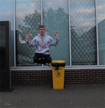
With this I used an ISO of 200 because the could were blocking most of the sun. I also used a shutter speed of 1/320 and kept the (F) 5.6 as it was still useful for the lighting and the focusing. I wanted to keep the aspect of levitation but I felt that when I saw them as as still picture it didn't create the aspect of floating. So I combined the idea of moving gifs to make it seem like he is actually levitating and moving to create a type of wizard effect. i had to delete a log of pictures because the subject was either to low or the subject was either to hight and out of frame. it was quite easy to get him in the centre of frame but when I cropped it the subject would move all over the place. The topic I have selected is Moving GIF and the artist that inspired my work is Yowa Yowa. The reason she did was because I thought her pictures of her moving were magical and they showed and everyday life as better. It was my own idea to have the person move because I thought it would make a glorious final image.
|
The concept behind this shoot was that I wanted to create a magical affect when people look at this but I felt that just standing still would seem to mundane, and if I had him flying in a superman pose then I would think that it was to movie like. So I decided to have him cross-legged and he put his arms up but I thought it looked better. The subject of this picture was my friend as he was the only one available and was tall enough to make his legs look really crossed. In looking at this photo I felt that the final piece was really good but when the picture was zoomed in it was a slight blurry because it was slightly out of focus and was a too large of a depth field. Even thought I saw some bad things I must say that I am happy with the final image of the picture because I have achieved my aims of making the man look like he is levitating, not flying or hovering. I am also glad that I made the GIF because my light paining would not look good and the floating GIF looks better because it achieves the affect I wanted to create.
WWW: I kept him in the centre of the frame for most of the pictures and I tried to get his legs the same distance from the body and his pose the same.
EBI: i could have made the picture less blurry and changed the (F) so I could get more light in and get him more in focus.
WWW: I kept him in the centre of the frame for most of the pictures and I tried to get his legs the same distance from the body and his pose the same.
EBI: i could have made the picture less blurry and changed the (F) so I could get more light in and get him more in focus.
Good, Bad, Ugly
Good |
Bad |
Ugly |
|
|
|
|
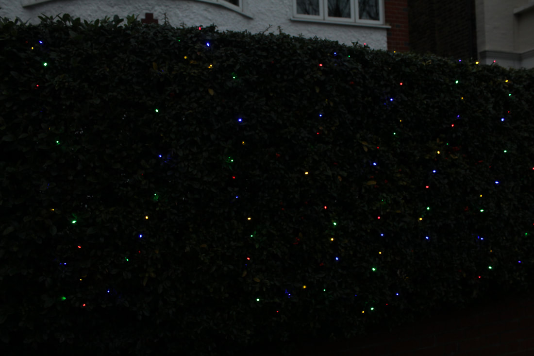
For this picture I used an ISO of 200 to get the dark effects on the camera. I used a shutter speed of 1/80 because I wasn't trying to take a still clear phrase of a moving object or creature. I also used the same (F) for each picture i took because it didn't need to change. The reason I took this picture was because it was a Christmas decoration which brings people with joy and because i thought it resembled the night's sky and puts people at peace. Also the colours in the pictures contrast the darkness.
|
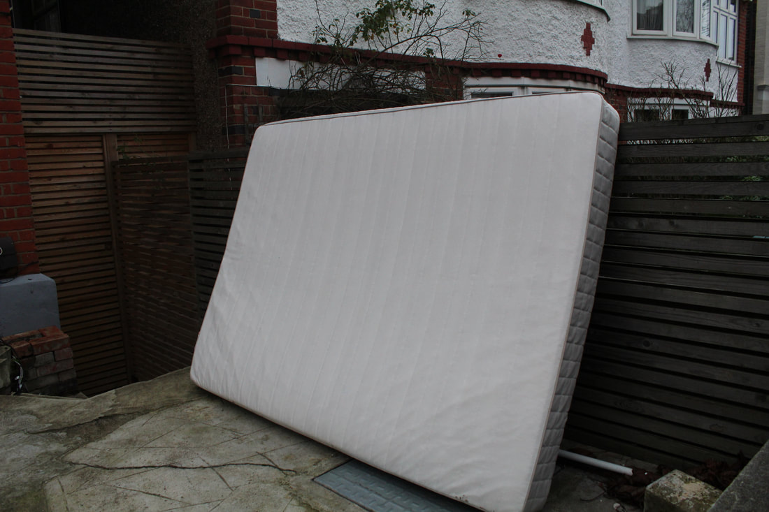
.For this picture used the same shutter speed and used the same (F) as there was no need to change the picture. I changed the ISO to 400 so that I could get the white colours bright and standing out. I chose these pictures as bad because there were a lot of dark colours make the picture seem very dark and dreary. The reason I decided to have the mattress as the subject of the picture was because I wanted a contrast of the idea of comfort and the dark and dull colours of make you feel uncomfortable.
|
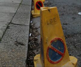
This picture was where I set the ISO to 5.8 as to get the cones in the background. The reason I used the cone as a subject was because I saw a row of these and spotted the on battered cone amongst the other cone. I saw it as the odd one out and thought that the colours in the cone weren't as bright as the others. it looked dull and ugly compared to the others.
|
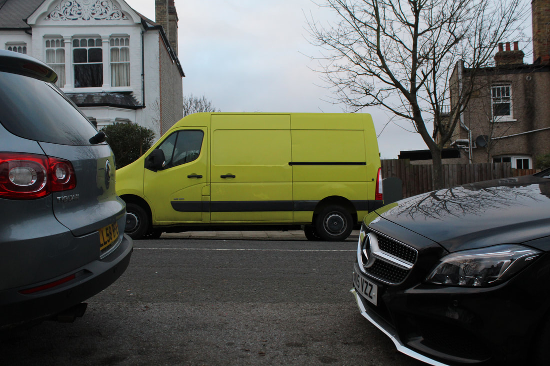
The ISO was 600 for this picture and the (F) and shutter speed were the same as before. the reason i used the car was because it caught my eye, the bright yellow car among the grey coloured cars. The colour contrast of the bright and the dark. I was going to take the picture of just the van but i thought by placing it between the two cars shows a glimmer of hope in a dreary picture.
|
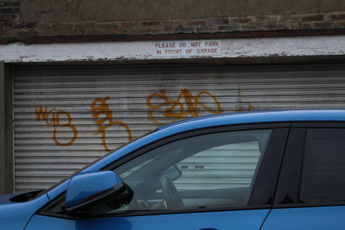
when I took this picture I found a comedic sense to it, as the sign says not to park in front of the garage and a car is parked right in front. It was surprisingly quite easy to get the sign in focus from such a far distance. I also was very lucky because the sun light was shining on the car.
|
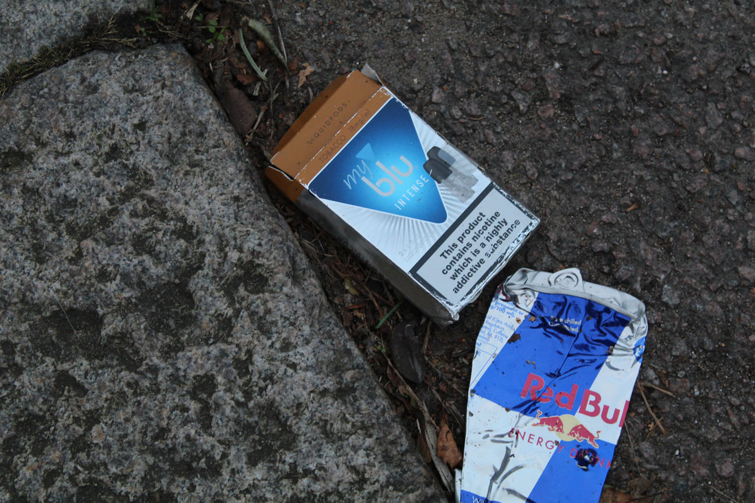
For this picture I used the same ISO, (F), and shutter speed as the others. I saw the crushed can on the side f the road and it reminded me of road kill, left on the side of the road. The reason I chose this picture as ugly because these objects were harmful things as they cause pollution by being left on the side of the road, and they cause an unhealthy person.
|
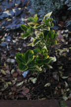
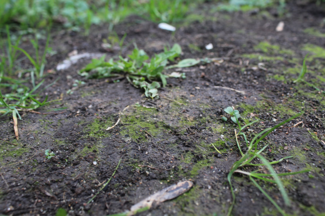
With this picture I used an ISO of 400 to bring out the green in the leaf. The reason I put this picture in the good section was because the subject of the picture is a plant that is growing. The plant shows the innocents of a small growing child and the green represents the colour and culture in life.
|
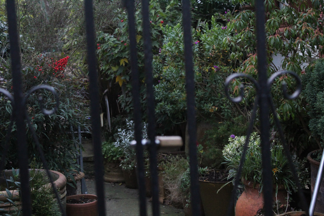
Since the garden was dark I had to use an ISO of 800 in order to get some light in the plants. with this picture I used the bars to try and make you empathise with the plants by making you feel trapped and claustrophobic.
|
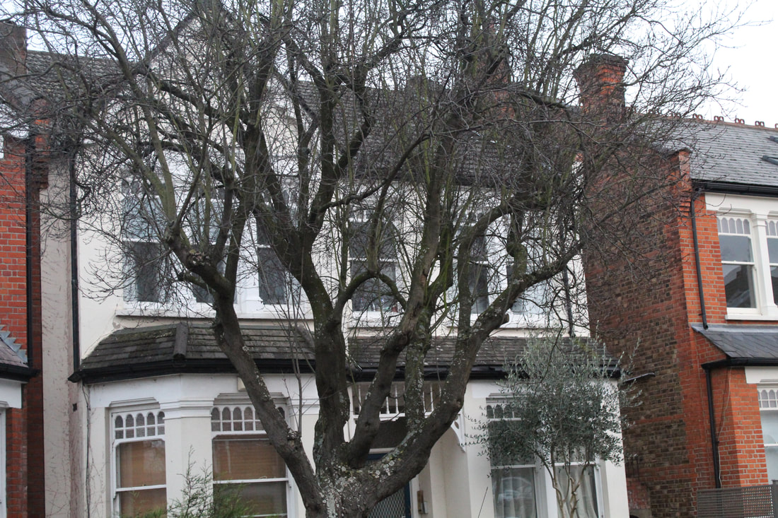
I had to change the ISO of this picture to 400 because it it was to bright and I wanted to create a dull and board effect. This picture was ugly because it is of an old tree that has lost all of its leaves. With this picture I wanted to represent people in nursing homes who are alone and have lost all their colour because everything is bleak and dull in the home. I wanted to convey the message that life doesn't have to be this way and show an ugly side of life.
|
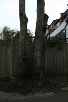
I used an ISO of 600 for this picture. The reason I took this picture was because it is of two trees that start off at one plant. For me it shows two living things being created by one, two living things that have no feud with each other, they just go their separate ways and grow magnificently.
|
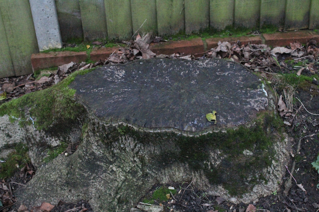
With this picture I had to re-take because the lack of light was very hight, I had to change the ISO to 800 so that it was clear of what was in the picture. I chose this as my subject because I wanted to show development in a cruel way. Also I liked that the centre of the tree was big and darker to the rest of the stump, so the contrast of dark and light was there and presented as a present and future.
|
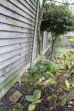
With this picture I wanted to people to look closer and see what is really in the picture. I made people do this by turning the ISO to 100 so little light was introduced. I wanted to make you empathise with the plants by showing the darkness to create affect of claustrophobia and fear. The plants are surrounded by a brick wall and a wooden fence to show neglect of nature and life.
|
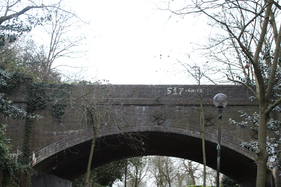
Even though though this picture looks dull and dreary, I put it in the good section because after looking at this bridge for some time a saw that it was a way for the plants and nature to connect with each other.
|
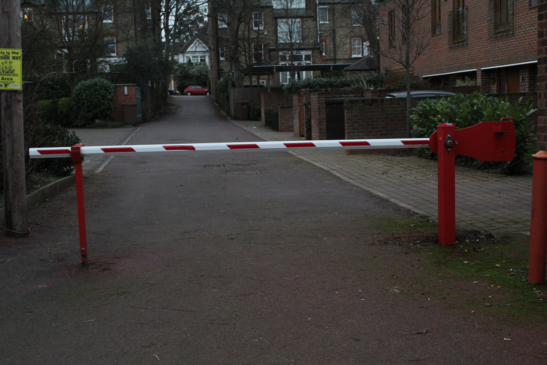
I chose this photo because i saw that even in the dark I could still get a heavy red colour which I wanted to show anger. The reason I chose the stop bar was because it represented a negative idea. In order to bring out the negativity I changed the ISO to 200 so I could get a sense of darkness.
|
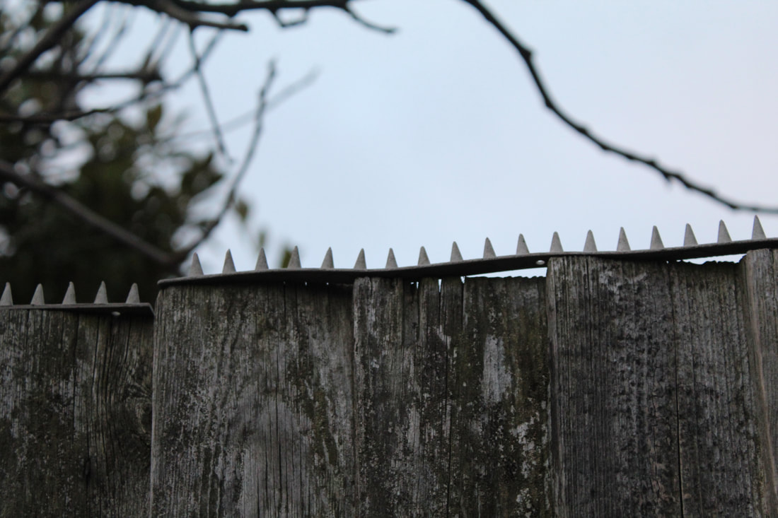
In this picture I used an ISO of 400 and changed the (F) to 4 so I could only get the spikes in focus. I chose this for ugly because I thought that the propose of this machine was a very ugly one and it sought out at changing a problem in a horrid way.
|
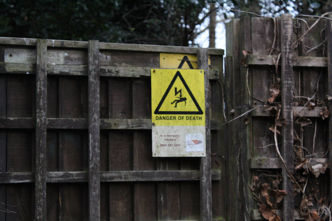
This picture caught my eye because of the colour. I chose this as good because, normally, the colour yellow is used to represent very happy things and the contrast of happy and death way very interesting.
|
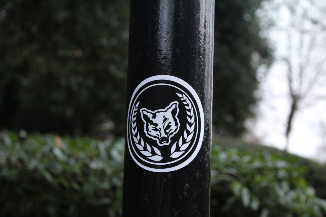
I chose this as bad because firstly, it has a picture of an angry wolf on the sticker which is suggesting violence. And secondly, the use of black brings quite an unsafe feeling to something violent. It almost compliments the threat.
|
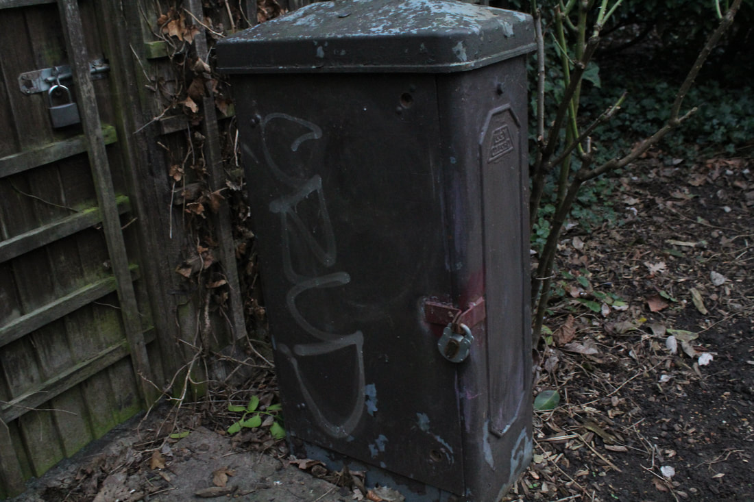
I chose this as ugly because it has no significant value towards anything and it sits on the side of the street rusting. It was very missable but when you look at it you can imagine the things it has been through and see the colourless object.
|
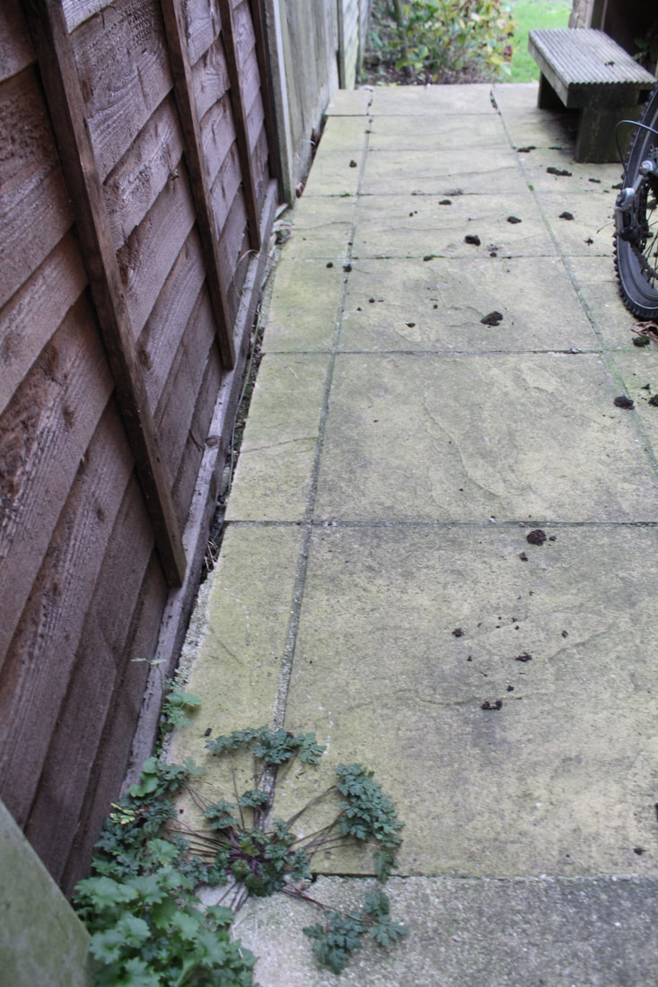
I chose this picture as good because it shows the path created by man and the wearing down of a community of people who are together. I used an ISO of 600 and changed the (F) to 4.
|
I used an ISO of 400 because the light was shining brightly and the (F) was changed back to 5.8 because I wanted the castle bury in the background. I wanted to show the path that people have created and wanted to show the neglect of nature
|
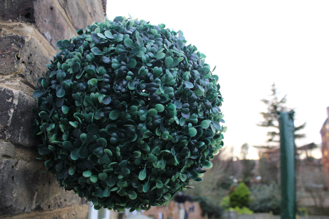
I put this under ugly because it shows the containment of living things. like a plant zoo.
I used an ISO of 600 because the over cast was really bright. |
In order to get the light to be singled out I put the ISO on 100. With this picture I was very intrigued because the lights look like a pathway and leading to the sky and the use of blue brings a heavenly effect to the picture. I also like the bushes in the sides which overflow and look like they are holding up the walls.
|
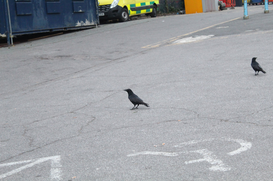
For this picture it was already getting dark so i decided to change the ISO to 800. The reason i took this picture was because I saw that crow look around for a really long time and it reminded me of lonely travellers who is lost. the reason I put this under bad was because the scene looked very sad with the grey everywhere with occasional bursts of colour.
|
I used an ISO of 200. I thought this picture was ugly because around this time it was getting dark and this was the only light that was not lighting up. I was going to get a picture of both lights but they were very far from each other and it I got both in shot then they wouldn't be the subject of the picture.
|
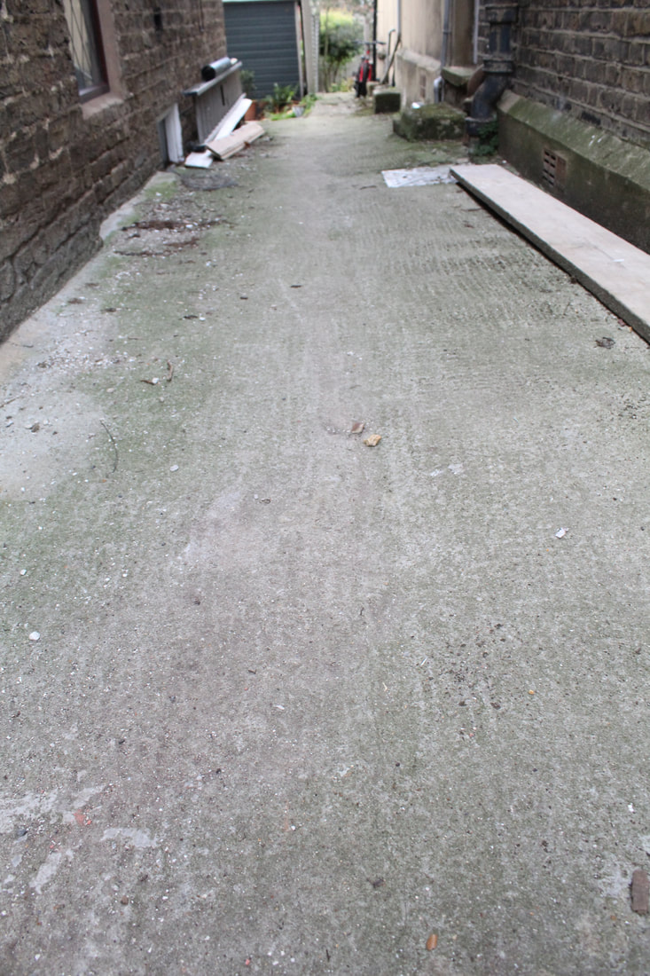
For the rest of these pictures I used an ISO of 600. The reason I did this picture as good was not because of its colour, but because it is a smooth road that connects people, which are natures living organisms.
|
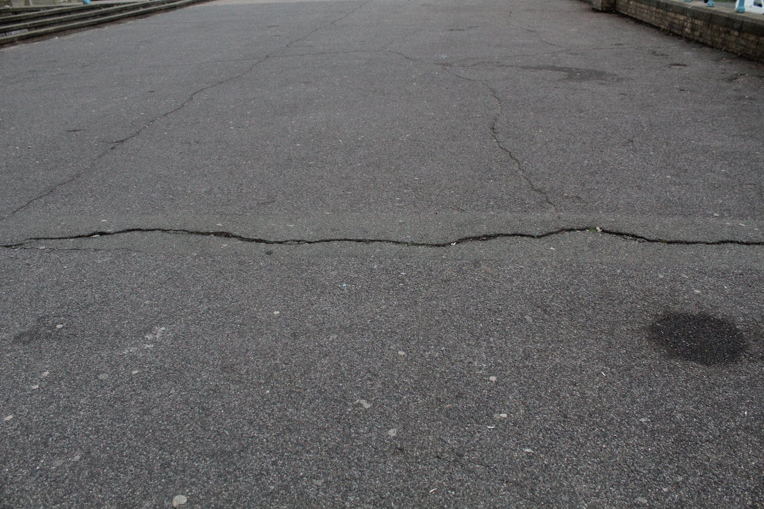
The reason i chose this picture for bad was because the subject of this picture is the crack in the path which is a metaphor for the separation life between things.
|
The reason I put this picture as ugly was because I thought that it represented the hole in society
|
This picture was 'good' for me because it was clean enough to eat on and it was about helping people in many ways.
|
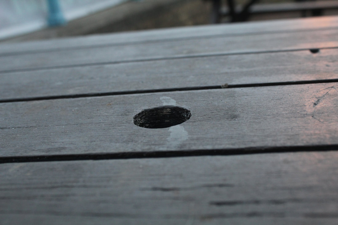
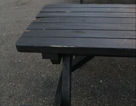
This picture was under bad for me because it is restricting the use of something and is very inconvenient if anything falls though it.
|
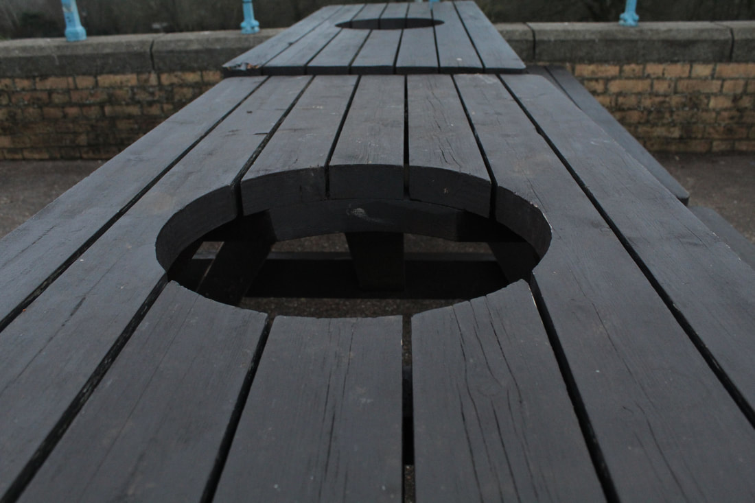
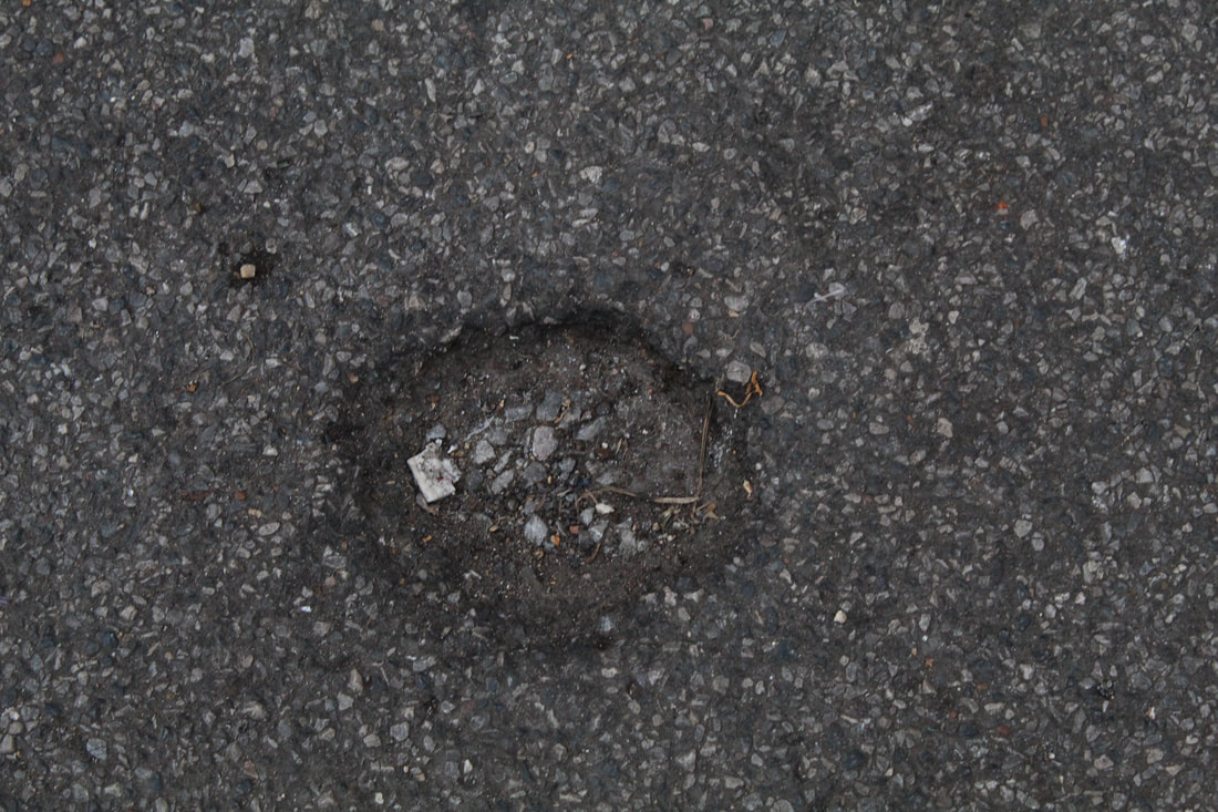
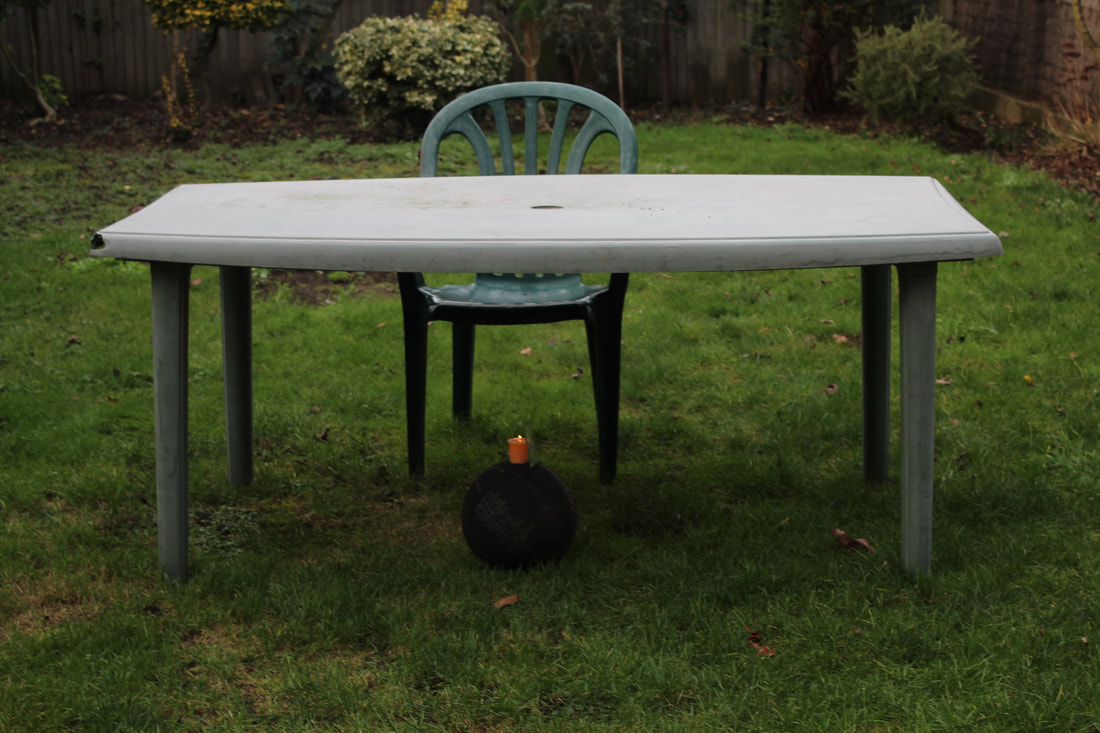
This was ugly to me because it had no propose except for making it hard to sit and utilise the table.
|
For this picture I changed the ISO to 100 so that the light could shine bright and change the background to be dark. With this picture I wanted to create a sense of the plants giving life to the light.
|
For this picture I decided to change the ISO to 600 so that I could get the light exposure really big and to show more of the plants in the bottom. This was showing the plants giving life to the light for all.
|
For this I used an ISO of 6400 so that I could get a really bad light exposure that would ruin the lamp in the picture, that was why i put it as ugly.
|
I put this as good because I wanted a vary of colours and light shown in nature to show the culture an life that is embedded within each follicle of grass. For this photo I used an ISO of 800.
|
For this photo I used the same ISO. With this picture I wanted to show the development of the world and have only one plain colour to show the light being contained by the boring world around it.
|
For this picture I had to change the ISO to 1200 because the shadow of the table was really dark. With this picture I wanted to have the dark and grey colours bring out the faded and dull side of the other colours and have the right light in the middle underneath show the neglected light of life.
|
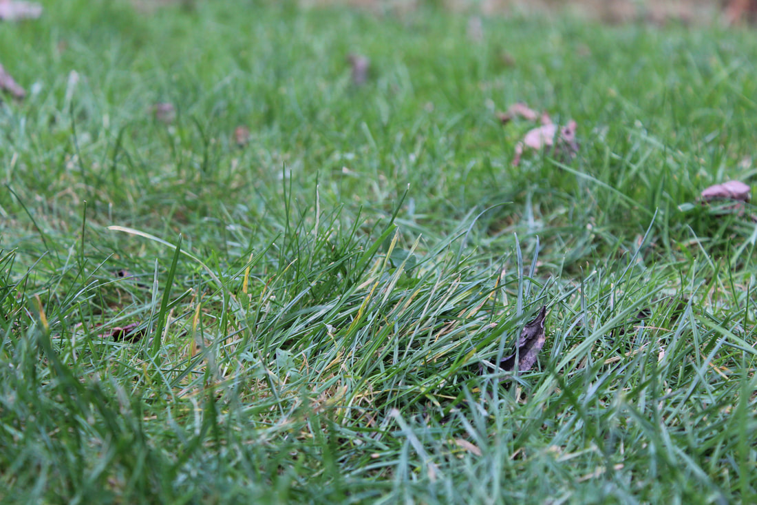
With these three pictures used an ISO of 600 to try and get it a bit dark. The reason I took a picture of plain grass was because I wanted to show the life that growl beneath out feet.
|
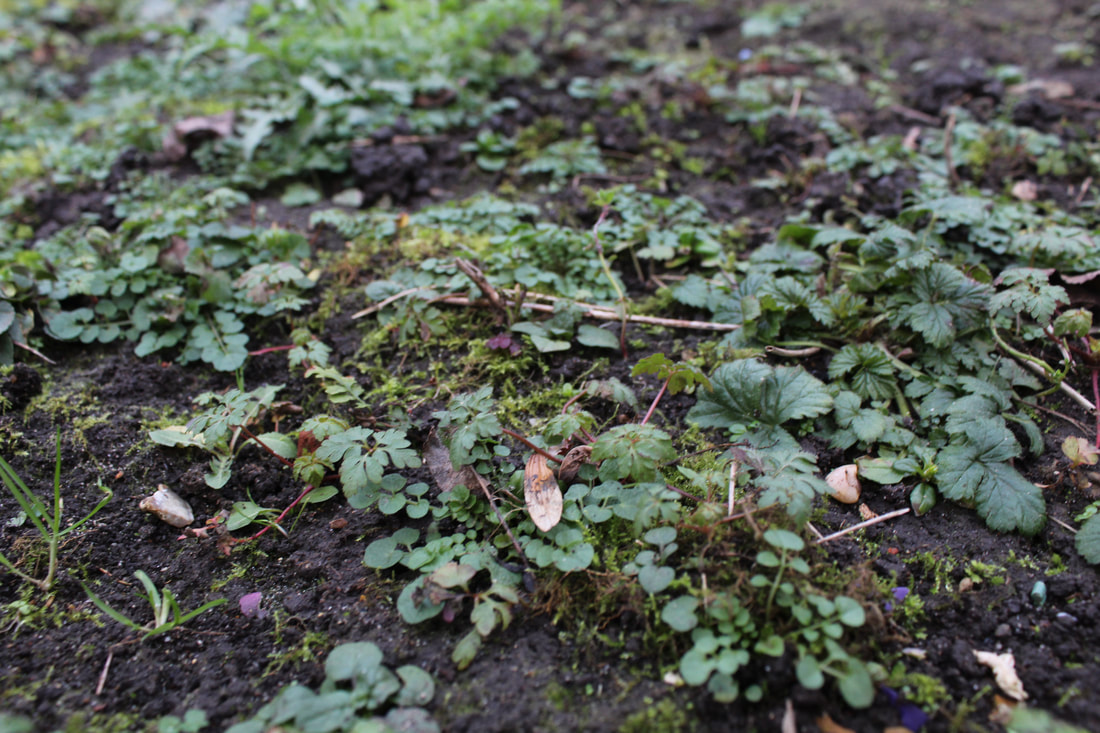
I wanted this picture to link to the rest on this row. I wanted this picture to be a metaphor for the start of the neglect of nature. i chose this as bad because it is about plants being killed by neglect.
|
This picture for me was ugly because it showed the loss of life in a tragic way, lack of care and lack water or sunlight. This picture was taken in my garden and this was where my ramp used to be to get into the trampoline. the grass underneath was practically dead.
|
For these pictures I used an ISO of 600. I wanted to take a picture of the colour in life and I wanted to show how there was no contrast but there was a blend of the green and yellow colours.
|
My reasons for placing this particular picture as 'bad' was because I thought that it represented the useless things we buy as humans simply because we think it looks cool, and the next day it is chucked on the floor and waisted.
|
I decided that this picture would go in the ugly section because I thought that it looked very deformed and quite ugly. For me this was due to the bad effects of nature.
|
For this picture I had to change the ISO to 1200 because the shadows were extremely dark. With this picture I wanted to show that there was a bright side in everything, thats why I picked a grim area with an object with bright shining colours that still shine even though the colour is almost faded and worn.
|
The sun was already shining very brightly so I had to change the ISO to 600. The reason I chose this as my subject for my picture was because I saw the dull and bleak colours and saw that the umbrella looked trapped in a dull world and had done nothing to change it.
|
For this picture I kept the same ISO because I wanted the darkness to show what I really saw in this picture. If you look closely in this picture then you will see that the small twigs trailing off the side of the branch look very spider like and look very alien like. i thought that this looked very ugly because of how thin each twig is.
|
For the rest of the pictures below I used an ISO of 600. For this picture I wanted to show the path of nature and the beauty it contains.
|
I wanted the dull colours and the colourless floor to distract people from the plant that has spurted out. My reasons for that were because I wanted to show the smothered plants and the neglect of life.
|
In this picture I wanted the path to be very dull and grey because the plants at the end look very colourful and green. I wanted it to show the path to a better future.
|
This picture caught my eye because the white complimented the green of the plants and red of the bricks. For me this was very interesting because there were a lot of bright colours that brought a happy feeling to me.
|
The grey colours in this picture really can make you feel very down or upset. I did this so I could make you empathise with the subject of the picture, show that the brick feels very sad and alone.
|
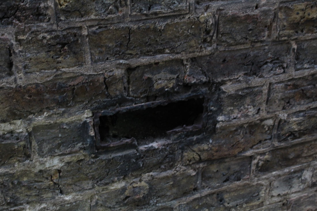
I thought that this was very ugly because it was almost like an odd one out, the missing link. The rot had forced the brick out and left an almost cancerous hole.
|
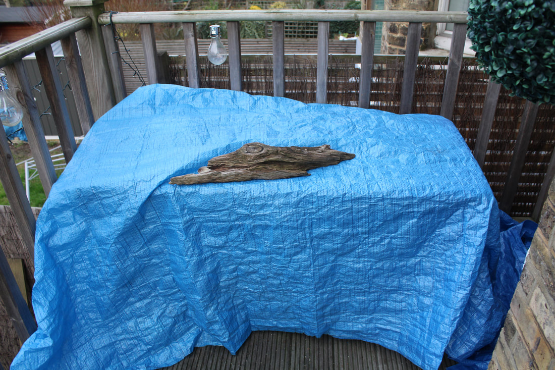
For this I thought that the bright blue colours stood out against all the other things in the picture. I placed the log on top of the box because I saw that it looked like a log flowing in a river or a lake. I also thought that the blue gave the log's dull colours more life.
|
I chose this picture as bad because for me the idea of the subject contrasted its propose. A plant can give out chemicals that can help people live and breath. But this plant is made out of plastic, which pollutes the earth because the factories that make these give off harmful chemicals like Co2 which add to the ozone layer and put us closer to global warming.
|
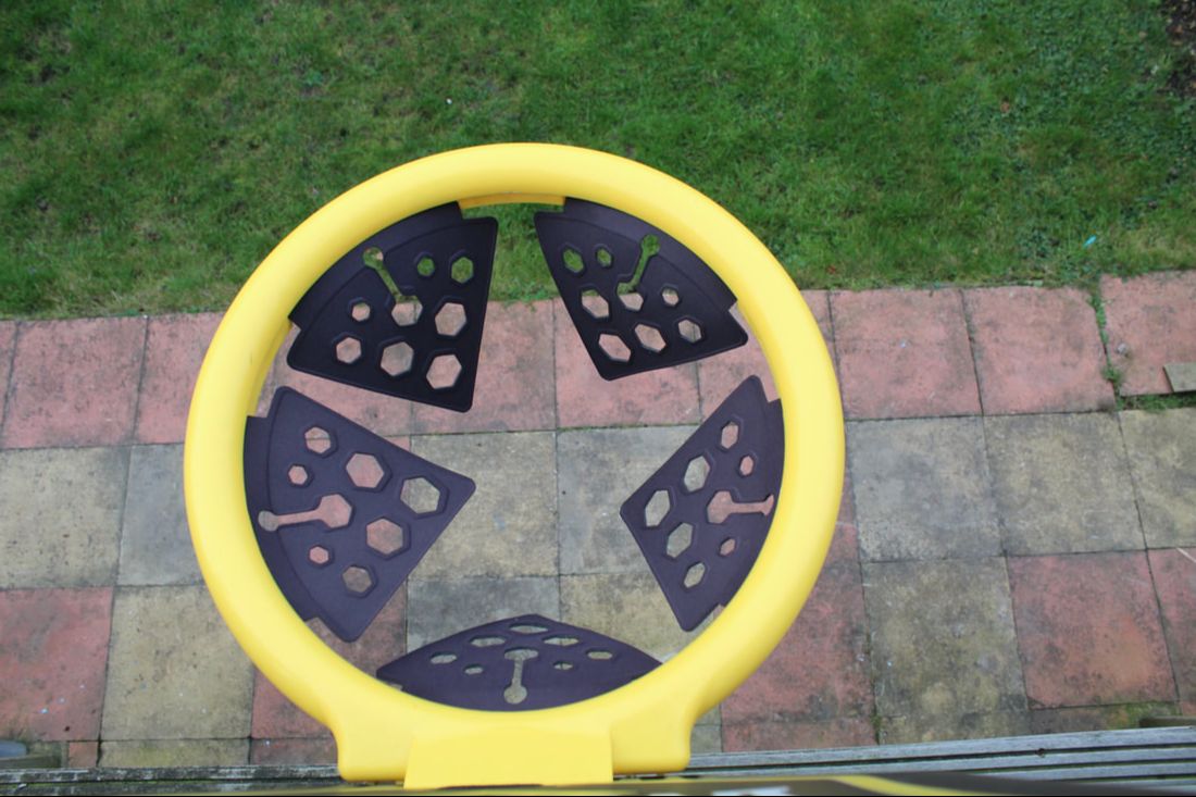
In this picture I thought that the Black made the yellow look very evil and very boring. I also thought that in the middle of the hoop there is a star which represents the lack of magic or brightness.
|
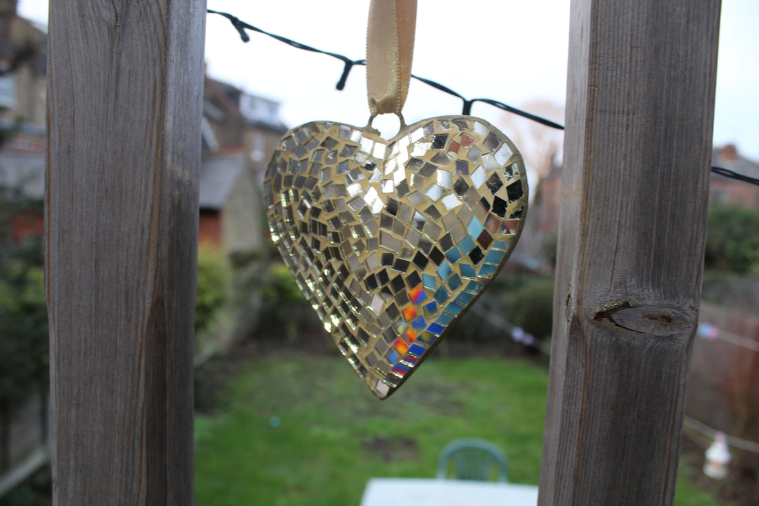
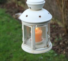
I put this as 'Good' because I thought that it represented one of humans most valuable emotions perfectly. In order to create this image I grabbed a torch and shined it on the heart to get some sparkling in the camera.
|
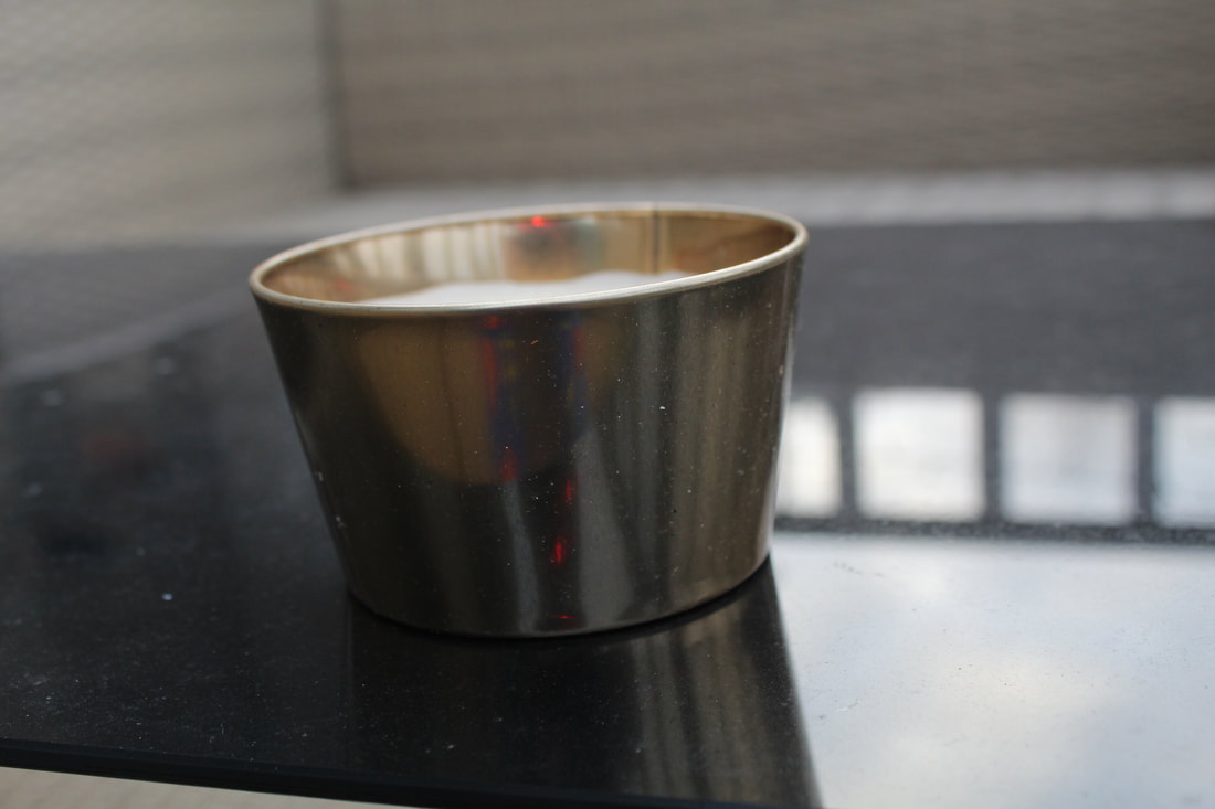
With this picture I thought that the plastic took some of the shine out of the object and made it look very cheap and dull. By putting it in a black surface it makes the candle holder look more dull less appealing to the eye
|
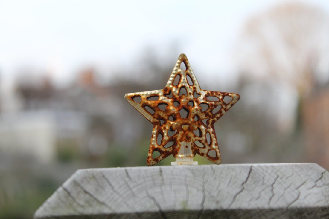
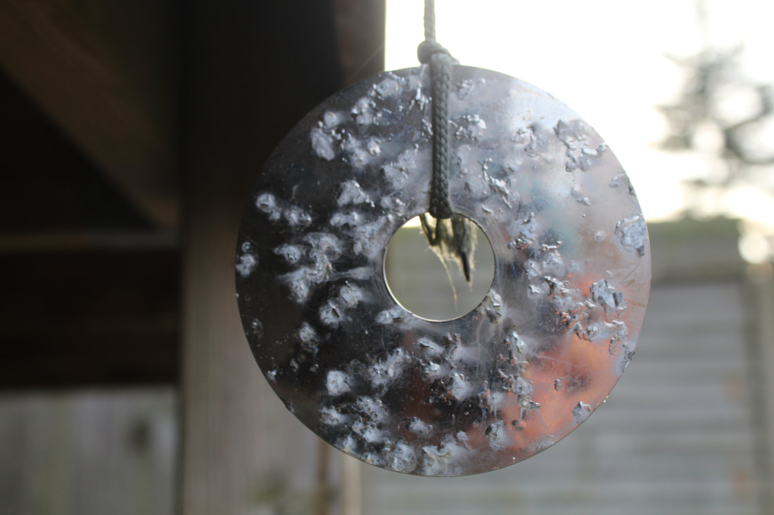
This was under ugly because the rain and weathering had rusted the object and turned something beautiful and useful to something you would throw away because it is broken.
|
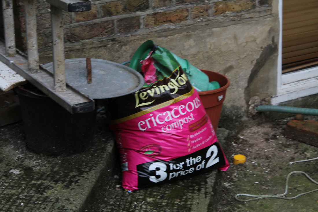
I chose this picture as good because though it was dark at this time of day and I couldn't get a good image, I still felt the impact of the colours. Another reason I chose this for a subject was because the subject was about helping create a new, it being compost.
|
The reason I chose this picture as 'Bad' was because I thought that its propose was a very bad one. It sits there and gives off harmful chemicals to the earth.
|
The reason that I put this as 'Ugly' was because i thought that, like the other picture, its propose was to give off harmful gasses. I also thought that it looked very warn out and broken because it was has remanence of the smoke around it.
|
