INCLUDE A SCREENSHOT OF YOUR PINTREST MOODBOARD OF REFLECTION HERE ASAP!!
Pintrest Mood Board
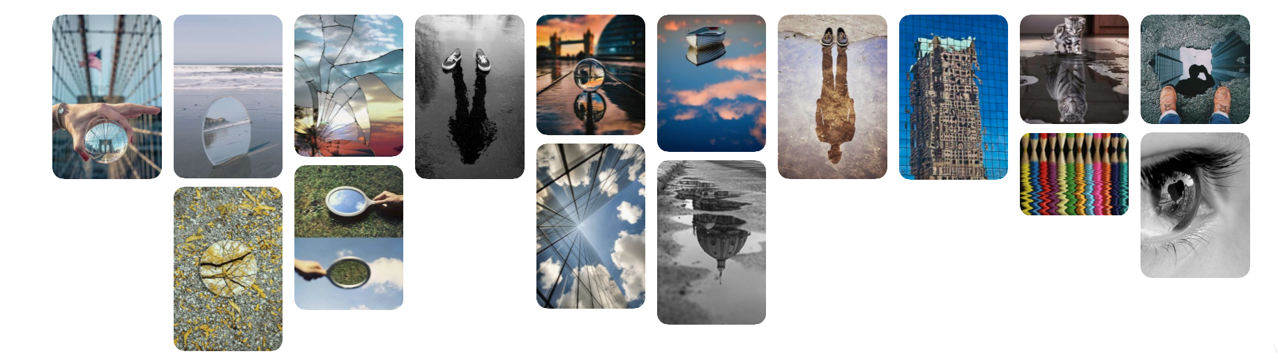
The first thing that we had to do in this topic was create a Pinterest account and then make a mood board of all our favourite pictures of reflections. The reason that we did this was so that we could get some inspiration for any of the future pictures that we are going to take.They would give us an idea for a shoot, and we could use some of the ideas in our own shoot. On this board below are pictures taken of photographers: Robert Pfeuffer, Cody Smith, Bing Wright, Jim Plaxco and Micheal Pistono, the rest are anonymous.
Distorted Reflection
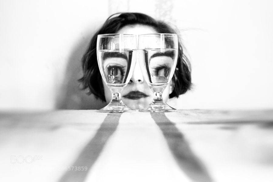
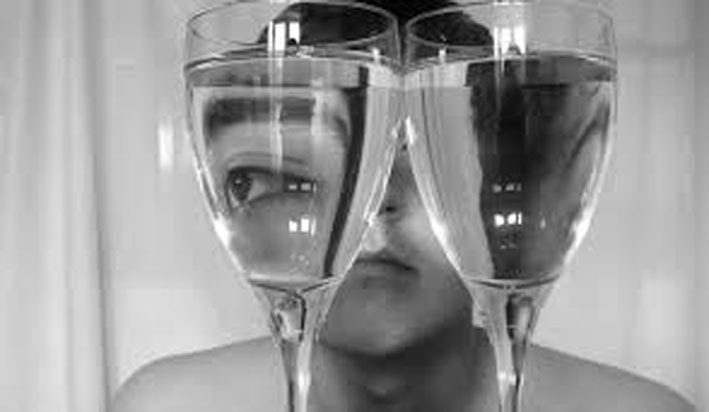
These were photos taken by by Antonio Gutierrez and he was inspired by Pereira because it was fitted with a new idea of portraiture and has a very unusual twist. The reason that he took this picture was because he thought that the way the water refraction distorts her face makes her look slightly sinister and much more dramatic.
|
|
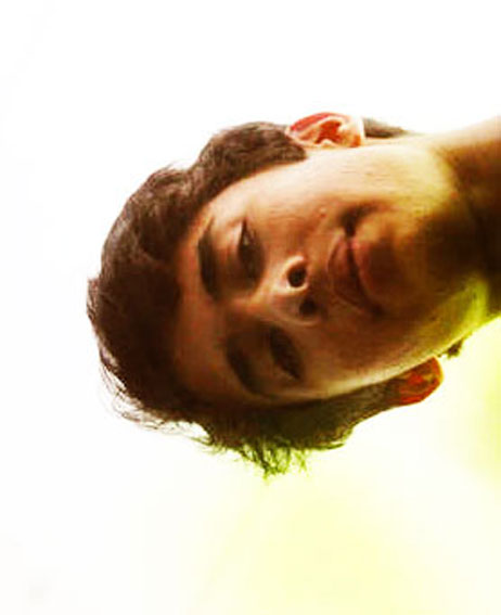
In this topic we are looking at ways to show peoples 'distorted reflections'. In doing this we will get a reflective or refractive surface and then place the photo to make his whole face or bits of his face look distorted. The ones that you can see above are the best versions of what I have taken.
|
|
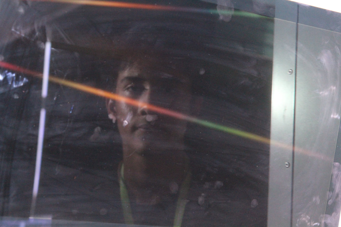
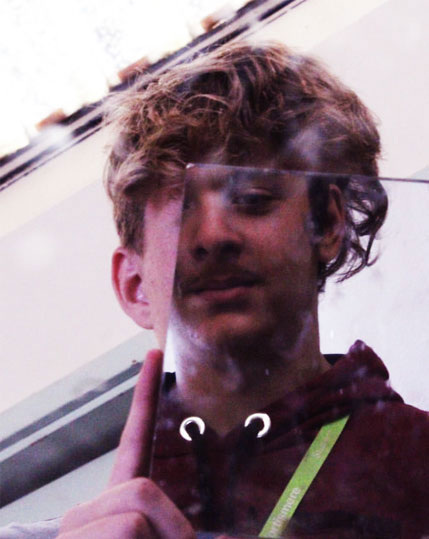
These are the two best examples of this shoot. The reason that I admire the picture to the left is because it was unexpected. I asked my friend to stare at the computer monitor and then this is what came up. I had to take another picture to try and get it right and as you can see I have applied a form of the rule of thirds as the locker edge is on the right vertical line and the blind opening a bit is on the left vertical line. This image is distorted because the sunlight is shining a multicoloured beam of light across his face. In comparison to the second picture on the left, I tried not to use any light refractions on the picture but was interested in mirror sunk in green tinted water. I wanted his face and only his face with a bit of green to be in focus, thats why I changed the (F) and stood further back so that the tray and the mirror would be blurry.
I have to say I prefer the picture to the left because it feels more stronger with the theme of distorted reflections and has a dark tone to it just like Antonio Gutierrez, it makes him seem distanced from the camera and the dark colours show it to be negative.
I have to say I prefer the picture to the left because it feels more stronger with the theme of distorted reflections and has a dark tone to it just like Antonio Gutierrez, it makes him seem distanced from the camera and the dark colours show it to be negative.
YOU HAVE SOME OTHER VERY STRONG IMAGES OF DISTORTED REFLECTION - JAI IN THE MAGNIFYING GLASS AND HORGITO WITH JOSH'S HAIR. THESE JUST NEED EDITING TO STRAIGHTEN THEM UP, ETC. DEFINITELY INCLUDE THOSE HERE AND SHOW YOUR PHOTOSHOP EDITING.
ALSO, THE 2 THAT YOU'VE SHOWN HAVE NOT BEEN EDITED - THEY REALLY NEED TO BE. PLEASE DO THIS AND INCLUDE YOUR PHOTOSHOP SCREENSHOTS AND THEN THE FINAL, EDITED VERSIONS.
ALSO, THE 2 THAT YOU'VE SHOWN HAVE NOT BEEN EDITED - THEY REALLY NEED TO BE. PLEASE DO THIS AND INCLUDE YOUR PHOTOSHOP SCREENSHOTS AND THEN THE FINAL, EDITED VERSIONS.
MOVE GUTIERREZ'S ARTIST SECTION ALL THE WAY TO THE TOP, BELOW YOUR MOODBOARD AND ABOVE YOUR SHOOT.
AARAN - I DON'T UNDERSTAND - THIS SEEMS LIKE YOU'VE HYPOTHETICALLY SHOWN US HOW YOU WOULD EDIT THE IMAGES BUT HAVEN'T SHOWN US YOUR ACTUAL EDITED IMAGES WITH SCREENSHOTS. PLEASE REMOVE THIS AND ACTUALLY DO THE EDITING .... REFER TO THE YELLOW HOW TO ORGANISE YOUR WEEBLY FOR THE EXACT ORDER THAT EACH PROJECT SHOULD FOLLOW. DO THIS EVERY TIME.
I felt like some of the pictures looked too mundane and normal, so I decided to see what I could do in photoshop to try and fix them. I have chosen to show an example of the picture of the mans face reflected in the mirror. I felt like this picture normally was not interesting because the fingermarks were covering the main picture.
Step 1: First I uploaded the picture onto photoshop so that I could begin my editing process. In order to do this I had to drag and drop the image from my desk top onto the photoshop logo. I put my hand on my mouse and hovered it over the picture. Then I used my forefinger to click and drag it.
Step 2: After that I then decided to crop the image so that I would tighten the main centre of focus in the picture to just his reflected face on the subject's body. This was is that we could cut all the back ground out and mainly focus on the face and body.
Step 3: After that is where the real editing begins. I would go onto the images folder at the top bar, select adjustments and pick the option colour balance. When I click on it another tab opens up with settings that allow me to change the 'colour balance' of the picture that I have chosen. I chose to bring out the red colour and bring out the pink colour in the image.
Step 4: After that I then decided to select the brightness contrast option on adjustments to that I could make the image look more appealing to the person that looks at the image.
Step 5: I then decided to re-try steps 1-4 but change the level in the picture so that it could look more 'sharper' and give a new look to the image. I also changed some to make the black and white to make it look like it was drawn.
Step 6: Next I changed to size so that it could be saved for web devices and then uploaded it to my Weebly.
What was good about this image was that I managed to crop out all the hands and all of the that were holding up the mirror so that it looked more mystical. I also managed to change the colour so that the fingerprints on the mirror would be more appealing than before.
WWW: I have managed to edit this image so that it works and looks better than it did before.
EBI: I could have found a way to fix the fignerpitnts and also remove his lanyard.
WWW: I have managed to edit this image so that it works and looks better than it did before.
EBI: I could have found a way to fix the fignerpitnts and also remove his lanyard.
Reflections in Mirrors
Sebastian Magnani
Sebastian Magnani was born in 1985, in Cantan Vallais, Switzerland. Where he was born he was surrounded by mountains and discovered photography when he was training as a media designer. He worked for five years as a creative in an advertising agency, and in 2011 he turned to his passion profession, photography.
The things that I like about these pictures are that they way the reflections in the mirror are so crisp and clear. This could be due to the fact that the photographer has used a hight aperture. I also like the fact that the lines in the background surrounding the mirror blend in to the image that is shown on the mirror. I also like that in some pictures the colours in the mirror reflections tend to contrast with the colours on the background.
I don't seem to dislike anything about these pictures because they seem to capture something beautiful and magical in nature.
This has influenced my work because it gave me a starting point for my project, and gave me a sense of what to take a picture of.
I don't seem to dislike anything about these pictures because they seem to capture something beautiful and magical in nature.
This has influenced my work because it gave me a starting point for my project, and gave me a sense of what to take a picture of.
PUT SEBASTIAN MAGNANI SECTION HERE WITH EXAMPLES OF HIS WORK. THE ARTIST SECTION ALWAYS COMES BEFORE YOUR SHOOT/CONTACT SHEET.
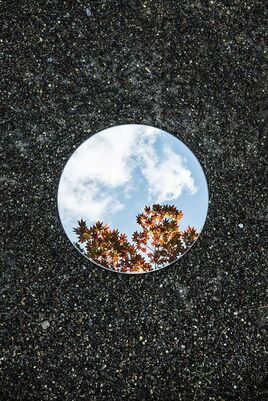
In this task we would put a mirror on the floor to reflect the sky. We tried to create a sort of mystical effect with these picture because there is an abrupt hole in the middle of reality that reflects the sky. The reason that I switched to more of a squared mirror was because I really thought that this worked in creating a magical and paranormal effect because it reflected the trees leaves, whilst also blending in with the surface it lays on.
GOOD INTRO TO YOUR TASK!
GOOD INTRO TO YOUR TASK!
This is one of my favourite photos because it perfectly reflects the tree in a clear and crisps way. I also like the fact that the mirror is on one of the lines on the rule of thirds. I also liked the angle that I took the picture on because if it weren't for the up in the background you could not tell that it was taken from the side. The tree
SELECT YOUR 3 BEST IMAGES, EDIT IF NECESSARY AND THEN, ANALYSE THE SHOOT AND IMAGES.
Reflection of Colours
|
|
Tomara Lorenz is a Postwar & Contemporary German artist who was born in 1972. She graduated in her studies of media and arts.
In the images she produces it almost creates a strange 3D effect from a flat picture. The picture almost suggests about how it can be different shapes in other dimensions of the picture. In order to make these pictures first she would create the shapes on a piece of paper, then she would use her camera and take a picture of what she has created. The reason that she takes pictures of the art work is because she wants to exploit the abstractness of the picture. I like her work because it shows an abstract side of photography, and the pictures can morph into what you imagine. The colours in the picture stimulate the natural human ability to be interested in something, almost introducing us into a state of hypnosis. I like the second picture on the slideshow because, though it only has two colours, the red and the blue seem to contrast each other and still make the picture work. I like the fact that the red is now used to outline the main focus of the image, the wight and light blue lines that create a cube sense in the middle. I also like that, even though this is a piece of art, the picture still follows the rule of thirds, as the red box extends to each line. Also, in this picture you can see that there is a slight bit of exposure on the top left side of the image to try and give the image layers. I also like the third picture in the slideshow because it really creates an alter reality effect. I think this picture works as an abstract piece of art because it plays into the use of shapes in abstract art, and combines it with the lines to create a surreal image. It is just like what we do in photography but used in a more abnormal way to get people thinking about what she wants. |
SHOW YOUR EDITS BEFORE YOUR FINAL IMAGE. MAYBE CROP THIS A BIT MORE TO TIGHTEN UP THE COMPOSITION? INCLUDE WWW AND EBI.
I don't have any edits for this picture.
I don't have any edits for this picture.
GOOD ARTIST RESEARCH SECTION AND ANALYSIS OF INDIVIDUAL IMAGES!
NOW, EXPLAIN THE AIM OF THIS TASK.
NOW, EXPLAIN THE AIM OF THIS TASK.
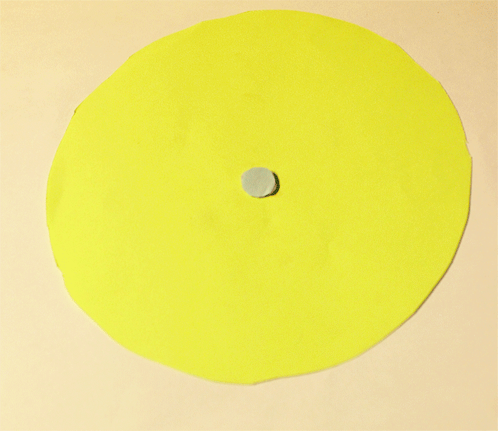
In this topic 'Reflection of Colour' our task was to make colour reflections out of paper and photograph it like Sebastian Magnani.When I was making this piece of art I was trying to show a depth in the picture by creating smaller versions of the shapes and placing them in the middle. I used bright colours to try and catch the readers eye and almost appeal to their subconscious side. When it took the picture of the sheet of paper I thought that it was too dark, no matter how hight I turned up the ISO and turned down the shutter speed. So when I put the image on photoshop to crop out the background, I also changed the brightness and contrast. The brightness was changed so that I could bring out the colour in the page and the contrast was changed so that I could give a strange sense of the colour about to leak off the page.
WWW: I managed to get the image to look a little bit like Sebastian Magnani's whilst bringing my own fee to the image.
EBI: I could be better with the cutting skills because some of the shapes go over their suggested box shape and aren't as perfectly fitted in the centre.
WWW: I managed to get the image to look a little bit like Sebastian Magnani's whilst bringing my own fee to the image.
EBI: I could be better with the cutting skills because some of the shapes go over their suggested box shape and aren't as perfectly fitted in the centre.
|
|
Firstly, I uploaded this picture to photoshop and immidietly cropped it so that the background would be cut out and you would only get the main image.
Next, I felt like the image could be improved so I went to 'Image' on the top bar and scrolled down to adjustments, then brightness contrast. A small tab came up and it let me change the brightness of the picture so that I could make it brighter, and change the colour contrast in the picture so that I could change look of the colours on the page. After that I was finished with my edit of the picture and decided to change the image so that it would fit the web page perfectly whilst not being to large. I then saved it and uploaded it to the Weelby page. |
Three Strands
Reflections In Water
|
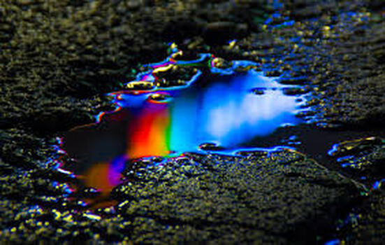
This strand was influenced by the photographer Salva Semeniuta. She was born in Serbia, Russia, but spent her life in Minsk, Belarus. She has an admiration for everything that looks cosmic such as neon colours and ultra violet rays. She says that there are many planets where the whole world is fluorescent with mountains, trees and seas like ours. She says that the colours in her pictures are very mysterious and magical. As a child she would always like to draw, she would draw things like dinosaurs in space and was always fascinated by science fiction and documentaries. She started taking photos of insects and nature when she got her first camera. But later in life she started taking pictures of body painting and digital art. She wanted to take pictures turning models into the cosmos creatures.
In this picture she would have taken it of a random puddle that was strategically angled so that she could get a solid reflection of the neon light int he puddle. The reason that she wanted to blur the neon light was so that it creates a mystical and mysterious effect with the picture. And make it seem outer worldly. She wants the picture to almost reflect the cosmos by looking like the Aurora Borealis.This helps support her idea of a science fiction-esc picture. |
Reflections In Mirrors
YOU CAN USE THIS SECTION FOR THE WORK BUT PLEASE SELECT 2 OTHER ARTISTS FOR THIS STRAND'S RESEARCH SECTION HERE.
This work was influenced by the photographer that was previously looked at, 'Sebastian Magnani. He was a Swiss photographer that was born in 1985. He was born in an area where there ware beautiful mountains everywhere, he started taking pictures of them and then decided that he wanted to be a photographer. His series 'Reflection In Mirrors' had influenced me and made me want to go out and try and re-create his pictures but bring my own sort of style to it. Just like the pictures I did before I want to create that same magical and surreal effect, but I wanted to use better mirrors and try and play with the lighting in some of the photos to bring in a contrast.
The reason he took pictures like these was because he thought that the mirrors looked like a planet, it had its own number of risks, lightings, different moods, colours and different lightings, hence why he used a circular mirror. He found them a fascinating interaction of nature or life and death. In these pictures he said that he wanted to almost have a large comparison between two opposite things e.g. new and old. But mainly he wanted these to make people do self-reflection and self-development because it is always crucial to progress.
Reflections Of Colours GIFS
This section is inspired by Tamara Lorenz. She is a post-war artist that creates a strange 3D effect with 2D pictures that she has created. When she makes these pictures she will combine the different shapes and combine the different colours in a piece or art work, then she will take a picture of the work to bring in a kind of multi-dimensional effect with the picture. You can sort of see this wit the light reflections on the pictures. This also shows that the picture was not made on a computer, of if it was it was printed out and then photographed.
The reason that I wanted to do this as a strand was because I really liked the abstractness of the idea of different shapes and colours combined. But I think that there is a different effect if the picture was animated to move or expand whilst changing colours. It would bring a real hyper reality effect whilst connecting to the person watching subconsciously.
Tom Hussey
He graduated from Southern Methodist University in 1987. It was from here where he earned a bachelor in fine arts and film productions and a minor in photography. He became fascinated with the Vietnam war veterans and befriended someone that fought in the war during the 60's-70's. Hussey used his skills in fine arts to create a thesis called 'Ask not what your country can do for you', which entailed photographs and writings that he felt were directly relating to groups of Vietnam war veterans. He then used his photos to create a campaign called 'Reflections' for Novartis' Exelon, a pharmaceutical drug company.
Due to the fact that his campaign was about development for drugs that help cure Alzheimers and dementia, it makes sense that in the photo there is an elderly man or woman that is proudly and happily staring into their mirror, and seeing themselves in their youthful state where they must have felt happier. This ties in with the campaign because it is showing the senior citizens remember their past and their life, showing that the development of the drug will help people feel this good, and remember their happy lives. In some of the photos you see another person standing behind the old people, possibly to show the generations that have passed, and the new ones that will rise up from the old ones. The mirror in all the photos is to almost show the perspective of the elderly people in the pictures as it is mirroring what life used to be like. The use of the mirrors in the photos is also to connect the different time periods and lay them side by side, playing with the idea that all time exists in the same time. This is showing that the older people can see into the different time lines, suggesting that they are worth the campaign, and are worth the money going into developing drugs to help cure the illnesses like Alzheimer's and dementia.
This photo was taken on a digital camera, you can see this by the lack of a grainy texture that a film camera would create. Hussey has also used the rule of thirds by placing the daughter on the left vertical line, and placing the reflected mother on the right vertical line. He has also used a slightly tilted angle when taking this photo as everything in the photo looks slightly slanted to the right. His use of pale colours like the whiteness of the background and the clothes they wear is well used to try and hint towards the innocents and purity of the elderly people, whilst blending in the background together to bring full attention towards the people staring into the picture.
I think that the slight tilt is used to create a sense of unease towards the viewer, to try and suggest that this is all a false creation of what life could be like, but what it is not now.
Halloween Reflection Pictures
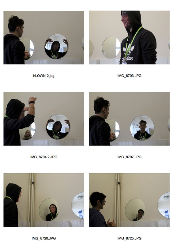
Our aim for this task was to make the mirror reflect the dark side of the person looking into it, as to fit into the theme of halloween.
When we took these pictures were water to try something like Tom Hussey and have a subject reflected in the mirror. The only thing we did different was make the reflection look like a reflection of a darker world, unlike Tom Hussey. When we took these photos it was halloween and we wanted to create the sense of fear and the sense of being trapped by placing a scary figure in your reflection to show peoples true desires, and to present what some people are on the inside. Though I thought that most of the people in my class were trying to create fear by acknowledgement of a darker force that learns within you, so I decided to take that idea and bring more of a comedic effect towards the photo.
With the first photo I got my friend to do a ridiculous pose to try make the monster less scary and to make him more irritating towards the viewer. It is a social reflection to the people that infuriate other people by doing one thing or another, and at the end of the day they know what they are doing and they know how bad they are making other people feel but won't change because they enjoy who they are. This is all shown by the fact that the monster looks inviting and the man on the normal side of the mirror doesn't look surprised and has accepted it. Though I didn't want to just single out one person, I was trying to say that this is a trait amongst lots of people, thats why I had another mister reflected in the other mirror next to his. This picture is trying to bring in the controversial issue about should people change for the better if they are happy with the fact that they can get worse.
With the second picture I wanted to try and show the perspective of the monster that looks in the mirror and sees that there is a normal person on the other side. I wanted to almost reverse the idea of the human with an evil side by creating a monster with a kind side. I wanted this one to show how people will always look at someone and judge them by the little fact they have heard about them, rendering them a horrible and disgusting person when really inside they are a kind and delightful human being that just wants to be friends with people. The fact that the human is smiling in the mirror shows the happy and joyful personality that he has.
WWW: I felt like I really got my point across and created a feeling of being trapped with my pictures.
EBI: I could have gone in tighter in the picture and cut out most of the background. I also could have gone from a better angle to get a higher angle and point of view.
Reflection in water
These pictures were influenced by Semeniuta's work of the reflections of neon lights on puddles. I wanted to try and capture the same effect but thought that there wasn't enough neon lights in my environment, so I decided to reflect the natural surroundings on puddles of water, to give a mundane look to the pictures and to make people feel more at home. In order to take good pictures you had two really think about all the different effects that are created if you change the settings of the camera. For example I had to continuously change the shutter speed so that I could get some light reflections in the dark places, but also not get an over exposure on the images. I also had to frequently change the ISO because I would be constantly entering dark and then light environments and the shutter speed could only go so far. The final setting that I had to look out or for was the aperture priority setting. This was important to keep my eye on because in the reflections I had to play with the death of the reflected item and the depth of the puddle length to the camera. The highest (F) number I went to was 15, and I had to keep still or there would be a blur on the image.
I wanted to capture everything as it was found in its environment, so I didn't force or move anything in the pictures, that is how it was found at that time. The only things that I would change are the items that are reflected in the puddles. I would put my friends in the pictures and have them to things like stand opposite the direction of the sun light, and then I would also get them to use the mirrors and try and reflect the light into the puddle.
WWW: I managed to get find some good reflections in the puddles and used my knowledge of the camera to not get too much of light exposure.
EBI: I could have taken some more photos of the surroundings and maybe have angled them differently so that they are more appealing.
Bridget Riley
Bridget Riley is a photographer that rose to fame in the 1960's when she reportedly changed the way of paintings based upon repeating geometric forms. It was because of what she did that made her the leading artist of her generation. She opened her first show in New York and the show sold out it was even opened. It is said that her paintings have increased 25,500% in value in the last 25 years as a painting that cost $20,000 25 years ago now costs $5.1 million.
Reflection of Colour GIF
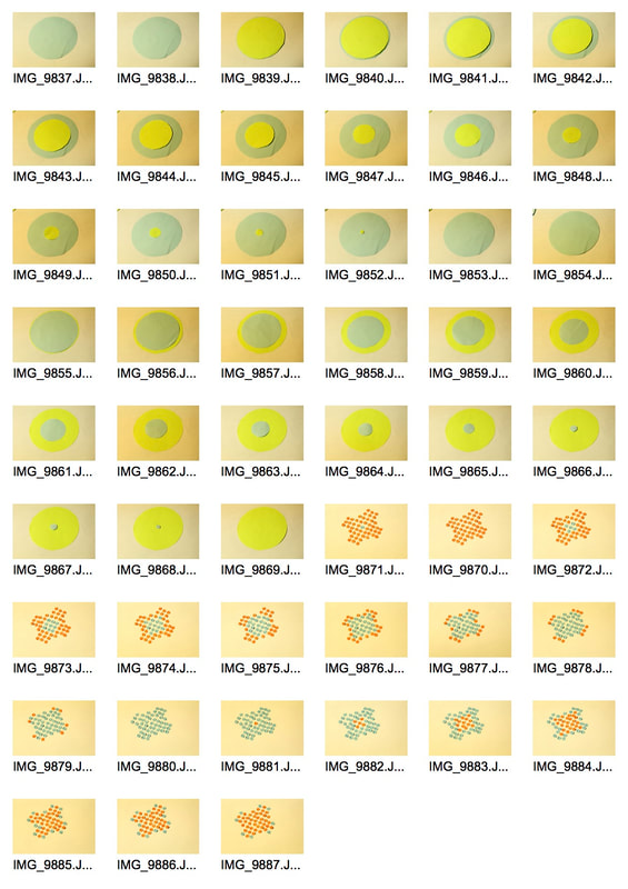
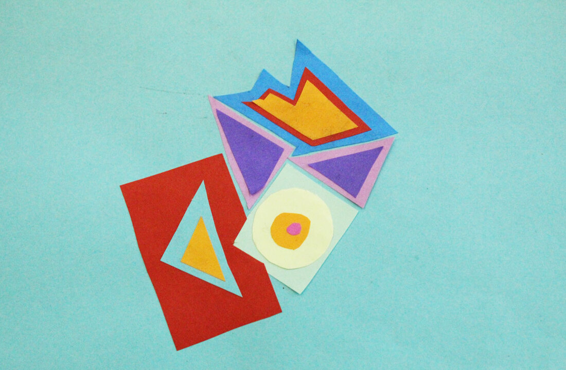
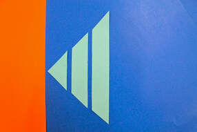
With this strand I wanted to try and develop the reflection of light picture. Instead of letting the different shapes almost hook you in, this will show exactly what you are imagining. I felt like creating a star patter was something that was done before, so I wanted to take this idea and make something new with it. I wanted to try and not just have one shape that changes colour, but many of other shapes that make up a new shape. The reason that I did this was because I wanted to create a sense of texture on the shape and make it look alien like.
The reason that I chose this pattern as that I wanted to create a surreal effect for the viewer. The reason that I had both shapes enlarge from he middle and expand was because I wanted to try and create a continues effect to try and represent the earth, hence why I have used blue and green. I wanted to try and subtly spook the viewer into understanding how insignificant their life is in the wide spread of earth. I also achieved this effect by changing the lighting in the picture so that I could create a sense of unease. This involved me changing the ISO for the picture so that I could achieve this effect but when I took these pictures I would keep the camera on a stand so that I could get room to place the different shapes everywhere. In order to achieve this enlarging effect I had to use a two sheets of paper and cut out a circle with a radius from 0.5-7 cm so that it would look like a clean gradual enlargement. In order to let it stick to the page I had to use blue tack.
WWW: I flet like I have created the effect that I want to by at least making people think about earth.
EBI: I cold have used a different tool to cut the shapes to reduce the amount of uneven edges, and also maybe took more care into the placement so that it doesn't move about not he shape.
WWW: I flet like I have created the effect that I want to by at least making people think about earth.
EBI: I cold have used a different tool to cut the shapes to reduce the amount of uneven edges, and also maybe took more care into the placement so that it doesn't move about not he shape.
Reflection in Mirrors
With these pictures I had to use an ISO that differentiated from 400-6400 as each photo was shot on different times of the day. The shutter speed had to also be frequently changed because of the different exposures that were present, and I couldn't change the other settings because they were perfect for some f the pictures. With some of the pictures I wanted to try and make it look like the nature had cracked through the image of the man made things like walkways and roads. by placing the mirror on half off the screen and angling it towards things like trees and plants. In order to get those pictures to work I had to try and put the (F) to 11 because then I could get the plants and leaves in the background in focus. I wanted the photos to look like there was a crack in the earth so that I could show the theme of nature prevailing through any struggle.
With a couple of the photos I had one of my friends stand in a hight place on a brick wall and hold the mirror up to his face. The reflection on the mirror was of a bunch of bright green trees in the back ground, which I thought would show the idea that we are made from nature, and there is a slight bit from our primal instincts embedded within us. With the picture I tried to keep colour out of it so that the only real bright colours you would see was of the tree that was reflected on the mirror, thus focusing our attention towards it.
With the other pictures I wanted to try and show a reflection of light in a mirror. The backgrounds of the photo where the mirror would lie on would be ordinary and regular to try and put peoples gaze of this and push it towards the mirror in the centre. The reason that I chose a beam of light to reflect was because it looked like a spectral object that was floating in the sky, the blurriness of it would show that it was out of reach. That was also the reason that I chose the mirror that was in a circle. One reason was because I thought that a circle would put the viewer at ease because it was rounded and didn't have any points that would catch other reflections. The second reason was because the circle mirror would be more related to a planet than anything else, helping bring in the idea of something spectral that might be from space.
WWW: I feel like that the mirror picture with the grass pushed my theme through perfectly, the reflected trees on the man showed what I wanted the viewer to see perfectly and the cracked images were very effective in trying to get their point across.
EBI: some of the cracked images were slightly blurry and that ruined the effect a little bit because the camera couldn't focus in on the edge of the mirror and caused a slight blur. And on the mirror reflected on the person picture, the trees in the back ground were blurry because I couldn't keep a steady hand with that big of an aperture.
Final Strand: Reflection of Colour Gifs
The intentions of this task was to try and go a step further from the reflection of colour talk that we did earlier. I wanted to try and create a surreal effect by building on the imagination of the person looking at it.
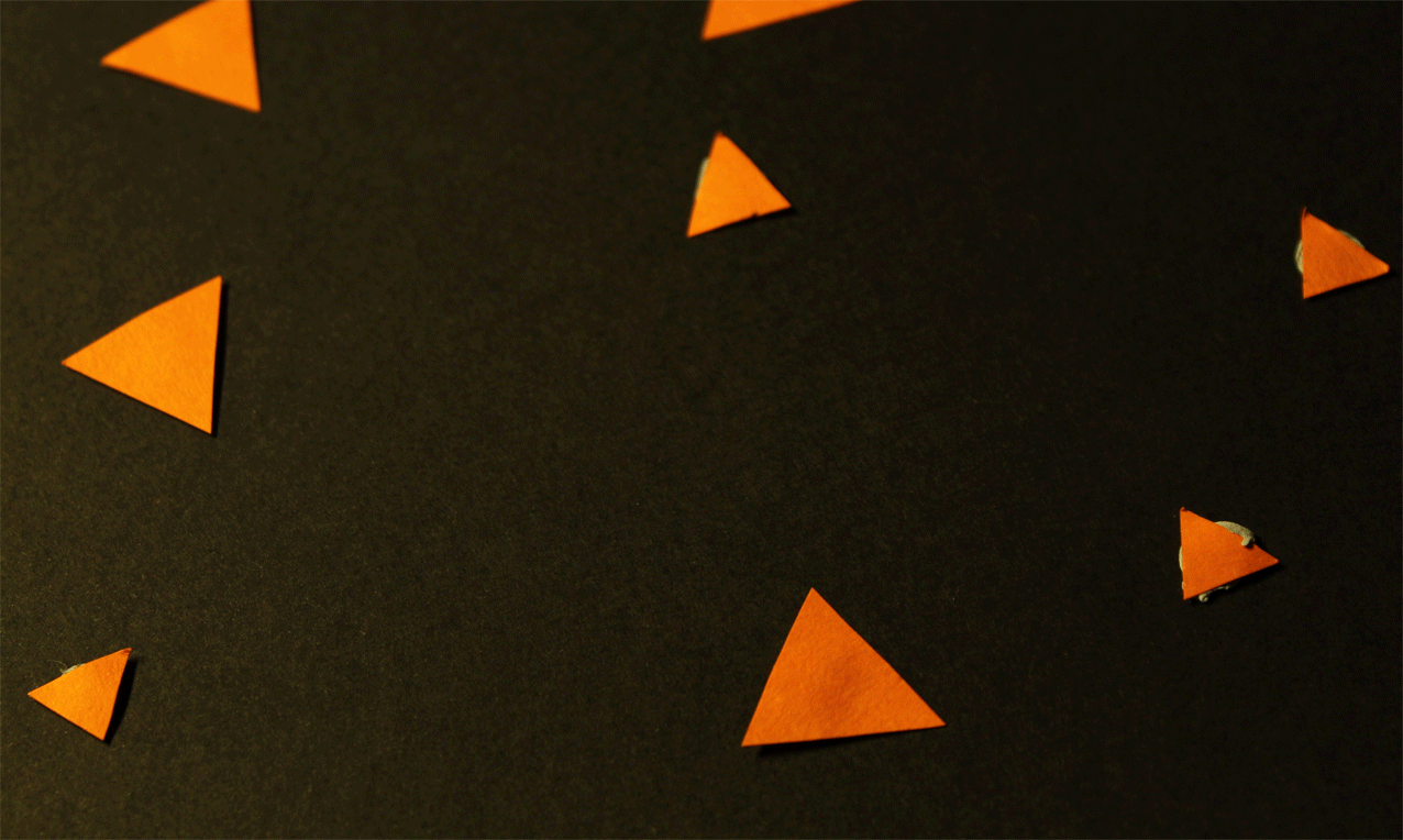
My idea in mind when I was creating this GIF was to create a sense of unease by using the contrast of the black and the orange colours. The reason that I chose these colours was because they were the Halloween colours, they present an image of horror and slight joy. These mix of emotions was what I wanted to create with the contrasting colours, to show how things would be happy and joyful, and how they could turn to fear and darkness. The use of the different coloured triangles was because I wanted to almost give a hint that things would change to the person viewing it. I also intentionally blurred the top of the image by moving the camera so it was looking at this from a slant. The reason that I did this was because I wanted to try and create an endless effect in this picture, to make it seem like there is more that we aren't seeing.
WWW: I created the effect with the lighting and the colours that I wanted to.
EBI: some of the blue tack on the pieces are visible and that has ruined the effect of the GIF.
WWW: I created the effect with the lighting and the colours that I wanted to.
EBI: some of the blue tack on the pieces are visible and that has ruined the effect of the GIF.
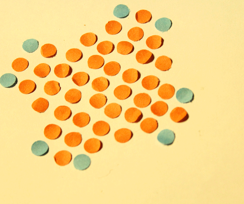
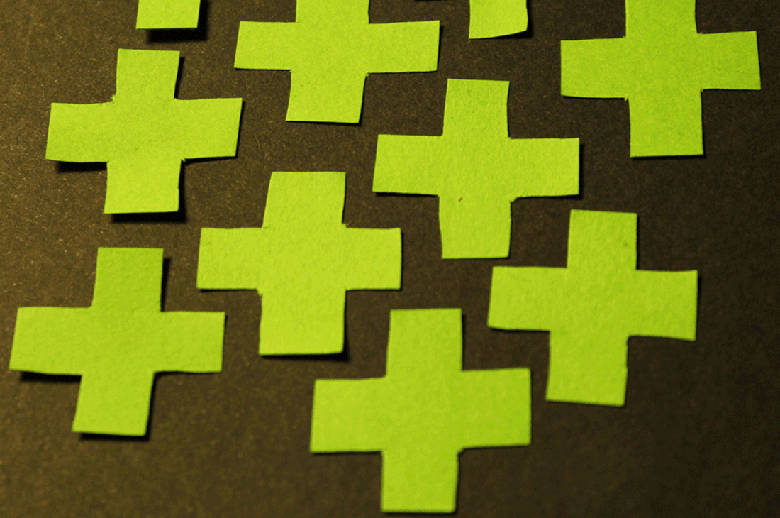
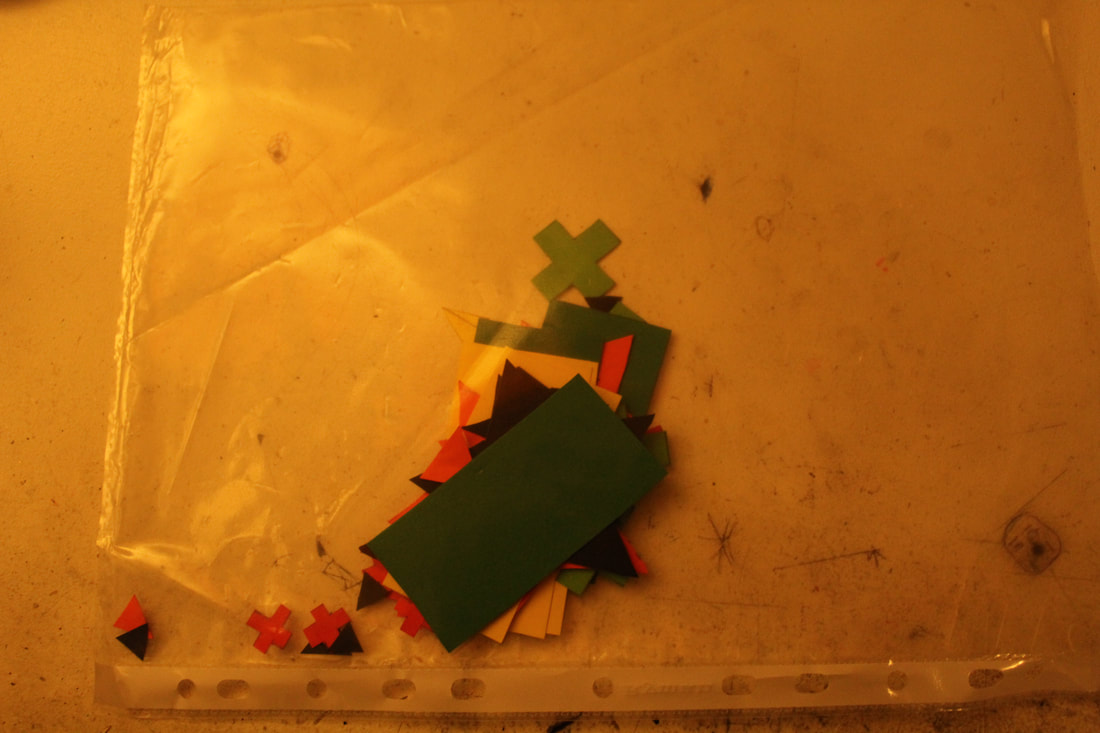
My intentions for this GIF was to try and use the intense colours and size of the crosses to spook people by enlarging them and changing their colour. I wanted to try and create an overbearing effect in the pictures by using these effects.The overbearing effect was to try and trigger a sense of tension and a sense of stress amongst the person viewing the picture. One of the other ways that this effect was created was because of the fact that some of the crosses enlarge to outside of the picture to try and really bring in a sense of scale and of inferiority. In order to take these pictures I used a low shutter speed of 1/60 because I was using a tripod and had less chance of a shake, I used an (F) of 6 because the camera was fairly close to the paper and I used an ISO of 3200 because the setting was quite dark and I needed some extra light to be taken in.
WWW: I feel like my effect I am trying to create has come across perfectly in my eyes.
EBI: I could have been more careful when I was taking the pictures because you can see some of the pencil marks of where I drew a frame for the pictures and cut out the crosses.
WWW: I feel like my effect I am trying to create has come across perfectly in my eyes.
EBI: I could have been more careful when I was taking the pictures because you can see some of the pencil marks of where I drew a frame for the pictures and cut out the crosses.
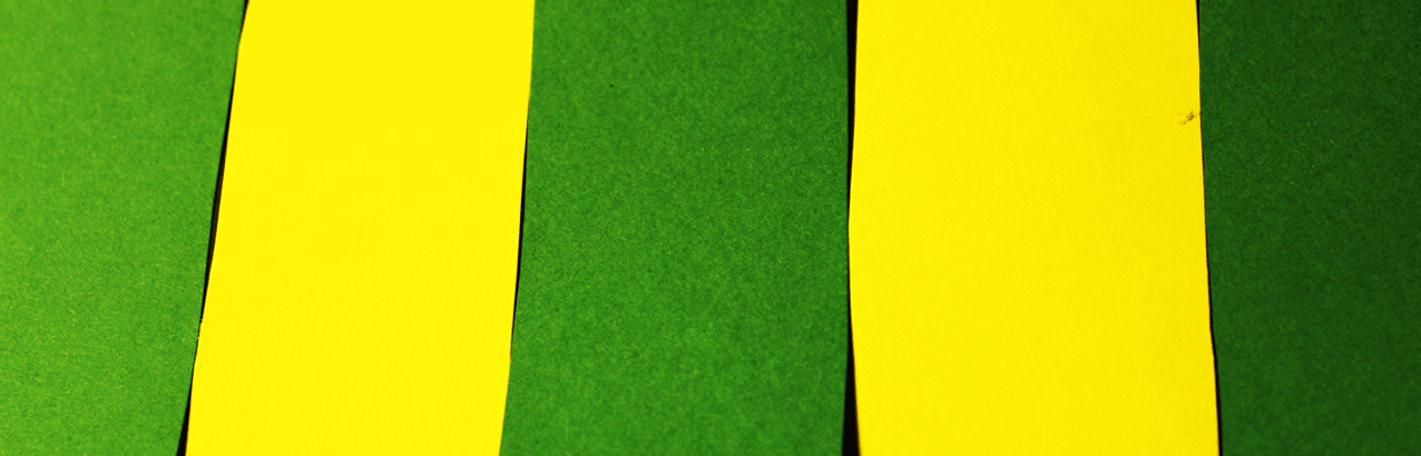
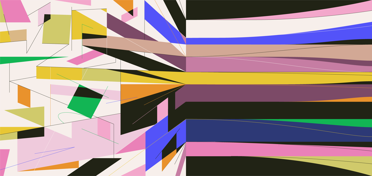
The reason I created this GIF was because I wanted to try and confuse the people that looked at this for a long time. This was one of the easiest ones to make, and yet it was one of the most effective ones in trying to confuse the viewer. The reasons that I did this was because I wanted to play with direction: in this GIF you can either see that the green bars are traveling to the left, or they are traveling to the right, it merely is based on the way that you eyes perceive the image. This entire image is to show the different perspectives of the different people in the world. some people will see things in one way, whilst others might see it in another direction.
In creating this GIF I used a contrast of the boldness of the dark green with the pale and brightness of the yellow colours. This was because I wanted people to focus on the green colours as they were the ones that are traveling in either direction. Another way that I did this was by almost singling out the green bars by having the black gaps between each colour. The gaps were used like that, and to also make the GIF look a bit fake for the viewer, as so they don't get sucked into the bright and moving colours of the image. In order to bring out the brightness of the yellow I had to move the light right above the image and then change the brightness and the contrast in the image to try and make the colours look more saturated.
WWW: I feel like the image that I have created shows the different perspectives like I wanted it to, and with little planning and changing.
EBI: I could get some of the cuts cleaner and left a longer but thinner gap between the bars.
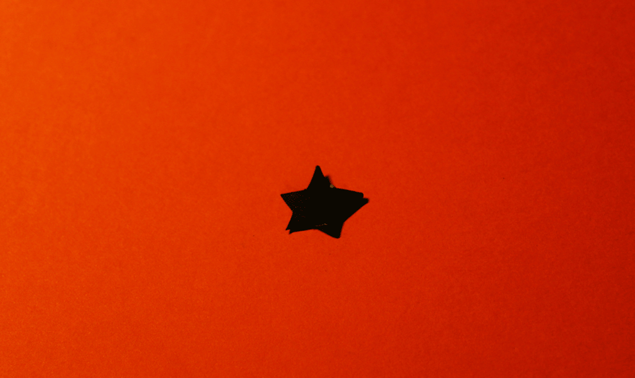
This picture was made because it was a creative and artistic way of presenting the day and night cycle. The star in the middle of the GIF is mean to represent the subconscious of a person, and the different colours represent the day or the night. When the Black star is growing big it shows that the person is gaining more and more conciseness and is more aware of everything that is going on, and the orange represents the daytime. When the star turns to orange and shrinks inside the black background, this shows the person is slowly and slowly losing conciseness and is ready to relax. The concise mind is slowly and slowly growing smaller to show an increasing state of tiredness in the subconscious mind. The dark colour around the star is to try and create a sense of security and an sense of safety amongst the viewer as the start slowly grows smaller and smaller.
WWW: I felt like the image has worked out well and some of the things like the different sized star shapes make it look like the star has a whiplash effect.
EBI: I could have maybe cut the star more cleaner without getting some irregular pointed bits in the curves of the shapes.
WWW: I felt like the image has worked out well and some of the things like the different sized star shapes make it look like the star has a whiplash effect.
EBI: I could have maybe cut the star more cleaner without getting some irregular pointed bits in the curves of the shapes.
This was less of a GIF and more of a shortly animated story using paper cutouts. With this GIF I wanted to try and create sense of a miniature creation by having the four diamonds force together and create for other shapes that will move on to cause another reaction. The reason that I cut them out to look very geometric like was because I wanted to try and bring in an academic feel to it, repeating the picture to a sort of close up chemical reaction in science. The reason that I made it in a repetitive motion as a GIF was because I wanted to try and show all of the small reactions and small events that go unrecognised every day, and how insignificant they are to our lives the way that old items combine to make something new and spectacular that will only just repeat the life cycle and react with something else to make a new item that will do the same, and so...
WWW: I felt like I did the best I could to get the diamonds moving across a straight line.
EBI: I could have cleared the sheet and moved the camera so that everything was in focus.
WWW: I felt like I did the best I could to get the diamonds moving across a straight line.
EBI: I could have cleared the sheet and moved the camera so that everything was in focus.
How the 'Light GIFS' were made
STEP 1: The first thing that I had to do to start off the project was make some plans on paper about each one of the GIFs I got pieces of scrap paper and drew out the different shapes that I would want to use in a GIF, and also choose a shape that could be warped to make something new or strange. When I drew out the shapes I had to annotate them with what colour would best fit and what colour would contrast with the other one on the page. I would only want two colours on the page because any more and people would get confused further. Once all the shapes were drawn I then had to decide how big I wanted each of the shapes by putting a number on it, that would be the measurement in CM of the shape.
STEP 2: Once I had finished the plans I then had to go out to the shops and buy the list of coloured paper that I had written down.
STEP 3: Next I had to draw out the different shapes according to the sizes that were on the plan, then I had to cut them out and organise them so the they were all together and with their specific sheet of paper they were being animated on. After that I had to setup my tripod, set up the lighting and then start animating the different GIFs.
STEP 3: I then had to put all the work on photoshop and change the brightness contrast of the pictures that they looked more appealing. They wouldn't let me do it as a GIF so I had to then change each picture. I would make the brightness hight for the light pictures and then do the opposite for the dark ones. The contrast would be at the full so that I could get a comic and cartoon effect to distract from the fact that it was made out of paper.
Step 1: The first thing that I would have to do is upload all the pictures for the GIF by going to file and choosing load pictures into stack.
Step 2: I would put each of the pictures that I was using on different tabs of photoshop and then edit each one by going onto edit, adjustments, and then brightness contrast. A second window would come up and then it gave me options on what to change in the picture. I tried to change the brightness to make it darkest that the paper would look more like it was made on a computer. I also changed the contrast on the picture so that the orange was more stronger and bolder on the picture.
Step 3: After I had changed each to the pictures so that they looked new and the same, I went onto file, scripts, and load files into stack so that I could upload all of the pictures at once.
Step 4: Once all of the pictures were uploaded they went into different layers of the image. That is when I selected Window on the top bar and then ticked animation so that the animation bar would appear. Then I would click the button on the top right corner of the animation tab and select the option 'make frames from layers' to import it and make it a GIF.
Step 5: Once all GIF was made into an animation I could change the time delay by changing the sections at the bottom of each image in the frame. Once I had fixed the time I then decided to crop the GIF so that I could get the animation in the centre of focus. I then changed the image size to make it smaller and then saved the image for web devices.
Theo Simpson
Theo Simpson was born in 1986 Doncaster and he lives and works in Lincolnshire. He is a photographer that studied on the HMD course in Sheffield before completing one year in BA. He has a fascination with England's landscape and the industrial heritage that remains. He was interested on how the landscape around him was changing diversely.
Simpson creates an endless feel to this image. He does this by repeating the same image over and over again to create a strange sort of pattern, and highlighting a section of the image. By doing this Simpson wants us to consider the fact that life is ever growing and keeps going on, the highlighted section of the image is to represent your life is a sea of others.
Simpson is considering the idea that life around him keeps moving forward and changing for better or for worse. This is shown by the constant repetition of one image to create a larger and more meaningful image to convey his point. Simpson was interested in this issue because he was so fascinated with the industrial heritage that was around Englands landscapes, and how they would be different every time he went to see them.
In order to create this picture Simpson has used another sheet of paper and he has just copied the same picture many times in a small size, then he has combined them in a sort of collage and placed some colour in the picture. This creates a very natural effect of the picture because it shows the effort it must have taken to do this, representing the effort that has gone into the changes that are happening all around. This helps support Simpsons point about everything around him that keeps developing to become something new.
Skip Dolphin Hursh
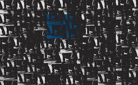
This is the work of the photographer Skip Dolphin Hursh. This is a piece of his called intercom and as you can see it displays compilation of bright and dark colours that work together to make a 3 dimensional collage image. This is shown by the use of the dips in the steps of colour, they make the image look like it has turned or been folded and is now coming the viewer. Alongside this picture on his website he has the phrase 'Hope for the best, prepare for the worst? How we manage critical incidents at intercom'. This is referring to the idea he was talking about: Almost every software company today has some kind of incident response process to help them navigate major service outages.
The engineers that made this picture felt that after a major incident, they needed to up their game. They thought this because their business has grown as-well-as their potential customer, and how that could get impacted by an incident. Hursh says that a few months after this picture was made he and his company had to work on their incident response time so that nothing like what had happened will happen again. The incident they talk about is the spike in email volume. This was considered an incident because it meant that they couldn't reach out to their audience.
The engineers that made this picture felt that after a major incident, they needed to up their game. They thought this because their business has grown as-well-as their potential customer, and how that could get impacted by an incident. Hursh says that a few months after this picture was made he and his company had to work on their incident response time so that nothing like what had happened will happen again. The incident they talk about is the spike in email volume. This was considered an incident because it meant that they couldn't reach out to their audience.
Aaron - Remove the Sebastian Magnani photograph from your Distorted Reflection section and put it into the correct section.
Enlarge the 2 images you have by Antonio Guttierez and then the ones you've used of Sebastian Magnani, as well.
Describe in more detail how you distorted those faces - what specific things you did to create the facial distortions. Crop the 2 final images of Jai.
Respond to all red feedback and then, only when you have, please turn it green so I know you've improved your work.
Please include www and ebi on your images of Horgito with Josh's hair.
It's not clear which your favourite photo is of the Sebastian Magnani shoot is, as it's in a slide show. Please pull out the image you're evaluating from that slide show.
Go back to your original Reflections of Colour paper cut - I'd like you to zoom in and make several different crops that give you different compositions and then I'd like you to rearrange those compositions on your page - this will show a development of your work.
Introduce the aims of your Halloween Reflection Shoot. Show your Photoshop screenshots of your edits from this Halloween shoot.
Put the Slava Semeniuta research in your Reflections of Water section. Then, introduce the aims of your Reflections of Water shoot.
Move your analysis below your final images of the Reflections of Water shoot.
Move your contact sheet of your Reflections of Colour GIF below your intentions.
In your Reflections of Colour GIF, I'd like you to create a new research section on the work of Theo Simpson, but particularly with your GIFS, you could do this further down, include the work of Skin Dolphin Hursh, David Stanfield, and Al Boardman - the guys who made the GIFS that we see on the Fortismere Art and Photography website.
Before your yellow and green GIF, I'd like you to include an artist research section on the work of Op Artist Bridget Riley - she's currently having an exhibition at the Hayward Gallery - would be fantastic if you could go and then include a brief write-up of the exhibition with some images. Perhaps after viewing her work, you may continue to be inspired to make another GIF inspired by her paintings.
Move the How the Light GIFs section were made sections directly below each individual GIF that you've done so we're looking at your process with each of the moving images you've created.
I would like you to create one final GIF, where you come up with another specific concept - possibly using some more complex shapes and where you break them up more than the other ones - maybe an inspiration from Bridget Riley, as mentioned above. I'd like you to photograph the images for this new GIF in daylight using a much lower ISO so you get better lighting and less grain in your images. I think it would be fantastic if you could create a really strong final GIF to wrap things up with.
Final Piece
Annotation Help
Introducing a task:
Subject matter
ebi:
Subject matter
What’s next
Analysis Help
What do you think the photographer’s intentions are? There may be more than one. ‘PEC’ each intention.
P (Photographer’s name) creates (what type of images? Fantastical, surreal, objective)
E He / she does this by… (describe something in the image)
C He/she wanted us to consider ….
What wider issues is the photographer addressing?
P (Photographer’s name) is considering (is the photographer talking about a bigger issue in photography, society, politics?)
E This is shown by … (describe something in the image)
C The (Photographer’s name) was interested in this issue because (they felt it was relevant to us now…)
How do the materials and techniques used support your photographer’s intentions?
P (Photographer’s name) has used (the darkroom / multiple exposure / film / digital manipulation techniques) in creating this work.
E This creates a ______ effect. (describe something in the image)
C This helps to support (Photographer’s name) point about (showing an identity / hiding a person’s identity / the media / anonymity)
Introducing a task:
- In this task I was required to…..
- This task links to the theme, Force, as it shows....
Subject matter
- The subject I chose to photograph suited the theme as it……
- My composition helped to support my response to the theme by….
- I managed the exposure very well. My ISO / shutter speed / aperture settings were…..
- I prioritised my shutter speed to… (capture movement / blur/ frozen moment)
- I prioritised aperture to manipulate depth of field.
- I used a tripod to avoid camera shake.
- My images express my intentions which were…
ebi:
Subject matter
- The subject I chose to photograph did not necessarily fit the brief as it was not interesting enough / appropriate / adequately lit…..
- Next time I should go to (a different location), photograph at a different time of day, organise people in advance, think more about my composition so that….. ect
- I did not create enough depth of field / sense of movement.
- The image is over exposed / underexposed / too blurred.
- Next time I should use a tripod / use a different type of lens (be specific) / experiment with film…
- My images do not show my intentions which were…
- The concept wasn’t clear in my images, I need to make it more explicit by…
What’s next
- Next time I will consider the work of (a photographer) to inspire a more accurate depiction of what I want to achieve.
- I will experiment further with… (blur / shutter speed / composition)
Analysis Help
What do you think the photographer’s intentions are? There may be more than one. ‘PEC’ each intention.
P (Photographer’s name) creates (what type of images? Fantastical, surreal, objective)
E He / she does this by… (describe something in the image)
C He/she wanted us to consider ….
What wider issues is the photographer addressing?
P (Photographer’s name) is considering (is the photographer talking about a bigger issue in photography, society, politics?)
E This is shown by … (describe something in the image)
C The (Photographer’s name) was interested in this issue because (they felt it was relevant to us now…)
How do the materials and techniques used support your photographer’s intentions?
P (Photographer’s name) has used (the darkroom / multiple exposure / film / digital manipulation techniques) in creating this work.
E This creates a ______ effect. (describe something in the image)
C This helps to support (Photographer’s name) point about (showing an identity / hiding a person’s identity / the media / anonymity)
