Portrait Transformation
Bernhard Handick
|
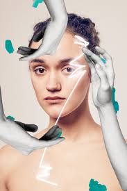
Handick creates quite a magical image. He does this by having the bright light being drawn over her face. I think that he wants us to consider the abnormalities of a person.
He wanted to show the human body as free and presenting nudity as something natural. I think that this is shown by the fact that she isn't wearing any cloths, and looks innocently at the camera. Handick was interested in this issue because he wants people to see it just like they do in sculptures. Handick used cut outs when creating this picture as shown by the hands, in creating this photo. This creates an abstract effect on the viewer as it is an example of abstract art that sends an intriguing message. |
|
|
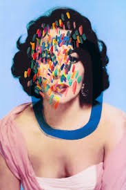
Handick creates a surreal effect with this picture. He does this by defacing the picture of the lady with different colours. He wants us to consider different methods of presenting art in this picture.
Handick is considering the idea of identity in this picture. This is shown by the fact that her face is being obstructed by many different blotches of colours over his face. Handick does this to bring out peoples beauty, and show the connection between him and the model. Handick has used a regular camera get the picture, and has then gone over it with different paints to make the photo more from his point of view. This helps to support Bernhard's point about identity. |
|
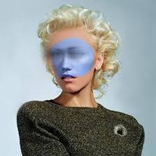
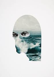
Handick creates a sense of incompletion. he does this by painting a large blue circle that covers the eyes of the model on the front. I think he does this so we can consider the imperfection of earth.
Handick is considering reflection of society. This is shown by the blue circle, which might represent earth. Handick was interested in the issue because it was a rising issue that is still present now. Handick had used the idea of manipulation with paint and blurs. This creates a strange effect as you don't recognise the person because you don't see her eyes. This could help support his idea of society, and how it has changed. |
|
Sergei Sciatchenko
|
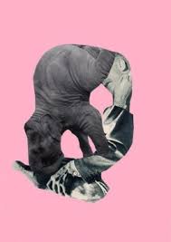
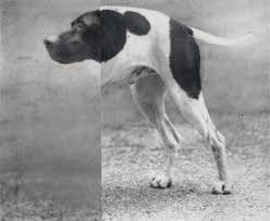
Sciatchenko creates an unidentifiable object in this picture, much like his work as a whole. He does this by using different bits of other images related to his certain art piece, and sticks them together. He wants us to consider the idea of reconstruction.
Sciatchenko is considering the radical idea to remake society. This is shown by the new objects or creatures he makes from the old. Sciatchenko is interested in this issue because he was fascinated by the idea of remaking society in a more enlightened line. Sciatchenko has made this picture by taking fragments of other animals and combining them in a logical way. This creates an interesting effect because, even though it isn't the same animal, it seems to make sense. |
|
|
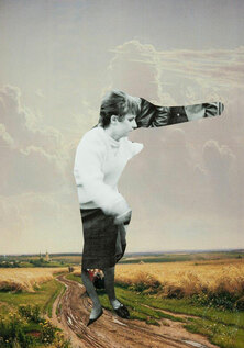
Sciatchenko does creates a sense of nostalgia in this picture. He does this by showing the sea in the shape of the mans head, showing that he is remembering his time as a child, and triggering yours. He wants us to consider how free we were as a child.
Sciatchenko is considering the weakness in people that want to return to their past. This is shown by the mans eyes that stare out with a disappointed look. Sergei was interested in this because he described it as 'yearning for a lost world'. Sciatchenko has made this picture by mixing two pictures together. This creates a sense of imagination. This helps support his idea of nostalgia, as the child imagination would think up something like this. |
|
Sciatchenko creates a surreal effect in this picture. He does this by adding different parts onto an already existing picture. He wants us to consider the mood by the use of discolouration.
Sciatchenko is considering the odd ones out in society. This is shown by the mutated man staring at the people next to him. Showing that all they see is this, and he sees them as regular people along the street. Sergei was interested in this issue because it shows problems that can be fixed in society. Sciatchenko used film and changed the final made picture with fragments of the other pictures. This creates an outer-worldly effect on the viewer. This helps to support the point about remaking society. |
|
Isabel Reitmeyer
|
Reitmeyer creates a sense of feeling in this picture. She does this by testing our brain to different pictures, and see how we feel about them. She wants us to consider the freedom of emotions.
Reitmeyer is considering the idea of a limitless imagination. This is shown by the fact that she has reconstructed the different photos. Reitmeyer was interested in this because it meant she could do quite rough and radical works. Reitmeyer has used different pictures from different sources, and has bound them together. This creates quite an interesting piece of work as her intentions are to touch your feelings.This helps to support her point about limitless imagination because she is being free with her work. |
|
|
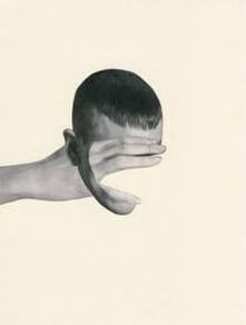
Reitmeyer creates quite a ghostly sense in this picture. This is shown by the fact that the hand has traveled through the head like it wasn't there. I think she wants us to consider the idea of the real and unreal.
Reitmeyer is considering the idea of class.This is shown by the fact that the man has his face covered with a hand, saying that some people will never be seen. Reitmeyer was interested in this issue because it would give a voice to the unknown. Reitmeyer would use a blank sheet and stick two card board cutouts in a certain way to make like the way she wants it. This creates quite an isolated effect for the picture. This helps to support her point about giving a voice to the unknown. |
|
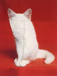
Reitmeyer creates a mystery sense in this picture. She does this by manipulating the picture of a cat. She wants us to consider the unknown.
Reitmeyer is considering the idea of visual communications. This is shown by the fact that the animal doesn't have eyes in this picture, maybe she is trying to send a message about being lost. I think that Isabel was interested in this issue because it was something that is still around today. Reitmeyer has used a picture of a regular cat, and she has cut it up and moved everything around. This creates quite a spooky effect for the viewer. This helps to support her view on visual communications, as she is trying to send a scary message. |
|
Personal Portrait Transformation
In this product we looked at the work of the artist Ian Rankin. He was famous for asking famous people, with his help, to destroy photos of themselves. What was interesting about this piece of work was that it got some of the musicians to find out a bit of their identity. So, in lesson the teacher challenged us to do the same with a famous person. We had to get the picture and, with a point an a meaning, destroy the picture in inspiration of Ian Rankin.The famous person I chose was Keanu Reeves. The reason I chose him was because I thought he represented the issue I was trying to address. With this picture is was trying to state how many actors and directors are seen as very underrated and only seen in one specific way. He was the perfect example because, until recently he wasn't considered a good actor. This was because in most of the big blockbuster films he has been in he has been considered emotionless and action filled. But lately he has shown his talent and proven that people like him can change and get themselves known.
|
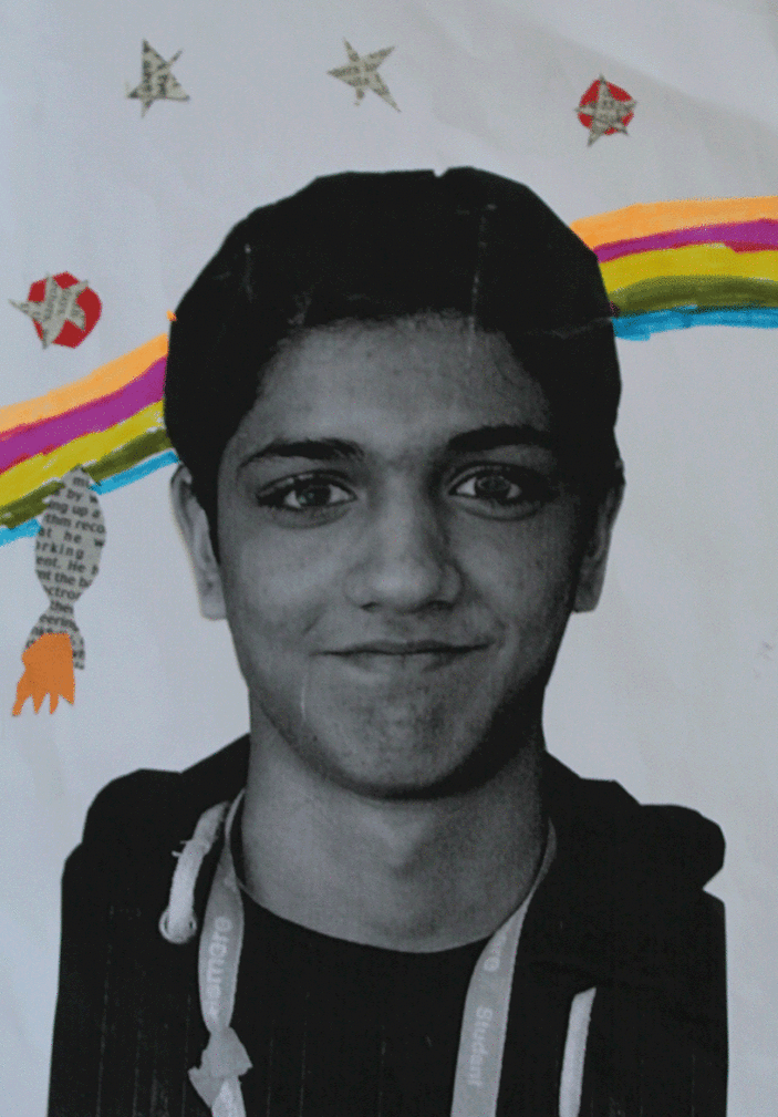
While doing the portrait transformation project we were told to make one of ourselves, this is mine. With this I wanted to show what I found interesting. The rocket and stars in the background to show that I am interested with things beyond what they are. The reason that I had words in the stars was to show the stories that are with in the littlest detail. The rainbow is there to create a sense of emotion with colours so that the photo doesn't look plain and boring.
WWW: I managed to get my point across with this art work EBI: I could have done more to make the picture more colourful and place more meaningful abnormalities. |
|
Rankin
|
Born in 1966, Rankin created a photography series called Rankin destroy. With the series 'Rankin Destroy' he invited all of these famous actors and stars to take one of their pictures and destroy it so that it will fit their personality.This caused a lot of celebrities to embrace their creative side and destroy their pictures in a way that made presented them. A'jene Gilkes got a picture that she modelled for and decided to shred the image horizontally and place the sections around so they don't make sense. But it wasn't just her. Jenna Hughes also decided to put a large burn hole in the middle of a portrait shot of herself. |
Christoffer Relander
|
|
Relander creates a sense of mystery in his images. He does this by shielding the identity of the model to the viewer. He wants us to consider the nature around and in the subject of the photo.
Relander is not considering any specific individual in this piece of work. This is shown by the fact that his image is of a silhouette made with leaves. By keeping the identities of the models anonymous, it allows the viewer to develop their own opinion of the models appearance. Relander has used overexposure in creating this work. This creates a beautiful effect of the picture, as it shows the beauty of nature. This helps support his point about showing an identity. |
Jasper James
|
|
James creates a very surreal sense in his pictures. He does this by simply mixing the silhouette of the people in their inventive positions with the pictures of the city in Tokyo he has taken. He wanted us to consider the loss of individuality in urban areas
James is considering how people seem lonely in pictures, so combining them with the city scape he is making it seem like they are losing themselves in the hustle and bustle of the city. This photographer was interested in this because he thought that living in an urban area was a large part of our collective identity. James has used a digital software to edit the images together and make it seem like the way he wants. This creates a modern and personal effect in the picture as you can see that he has chosen specifically their position and place in the picture. This helps support James's point about loss of individuality in urban areas as it shows his individual image he has created. |
Double Exposure
These pictures are not unlike the ones that Jasper James had taken. In order to make the image you see before you we had to take two pictures: One of the figure we need to use against a white background and the other was of the piece of nature we needed to combine with the person. In order to do this we put both pictures in photoshop so that we could remove the white background with the select tool and then place that image on the one of the leaves. To get the final image we had to play around with the opacity of both layers on the picture. This was my final image.
|
|
These were other pictures that we took and mixed together.
In photography, a multiple exposure is the superimposition (the placement of one thing over another) of two or more exposures to create a single image, and double exposure has a corresponding meaning in respect of two images. The exposure values may or may not be identical to each other.
In order to make theses pictures first we had to put both pictures on photoshop. Once they were both on we got the self portrait photo and selected the white background to be deleted so we can just get the figure. Once that was done we had to unlock the layer by double clicking on it then clicking enter once the tab came up. Then we had to copy the image and paste it on the picture of the nature. We would unlock both layers then change the opacity of both till we got the image. Also, we went selection that said normal and changed it to lighten or darken the layer, it was the nature layer. Once we were happy with the final image we went to the file, save and then save to web devices.
Force of Nature
The sun light was at its best when I took these pictures so my ISO varied from 100, 200, 800, 1200 and 6400. My shutter speed had to change from 1/80-1/250 due to the unexpected exposures. The (F) stop number had to go to 11 for some pictures that required me using the full length of the subject.
In the task 'Force of Nature' out intentions were to show in areas where nature would reclaim their position over man-made things. So, we had to find area where plants had grown through and/or over man-made objects. We would go to in nature and see things like bricks with large plants penetrating through it, and buildings with vegetation overgrowing the first layers.
WWW: I managed to capture the point of the picture whilst trying different angles to make the picture more appealing.
EBI: Some of the pictures had a high exposure and I felt like I could have chosen some better subjects and maybe created some pictures.
With this picture I used an ISO of 200 because I was outside and the sun wasn't to bad at this time. The Shutter-speed was 1/150 because I didn't want to put my ISO any lower. The reason I chose this picture as my favourite for my force of nature was because of what I wanted it to symbolise. The task was to show where nature would reclaim man made things, and for me I thought that this showed nature to be very strong to the point that it has taken over the concept of enjoyment. Even though 'enjoyment' has been here for a long time, it has been taken over by most man-made things like books and TV's, so for it to come back and reclaim its position. The fact that they are plastic figures shows that it was 'man' that made nature reclaim its position. When I took this picture I just wanted the flours and its box and not so much of the background. After time I found that if I go far away and zoom in it will keep the plant in focus while seriously blurring the background.
With this picture I used an ISO of 1200, shutter-speed of 1/90 because of the dark conditions and an (F) of 5.8 as I didn't need to focus on this factor a lot. The reason i chose this was because I thought it had the same intentions as the picture before, except this was more subtle as doesn't shine out like a flower in a pot and isn't used for the same intentions. The reason I chose this was because I thought it shows the connection that we have between nature in a very interesting way. It shows that we are inseparable, even in death. So, even though we have made these big factories that destroy the land, we still have an bond with nature.
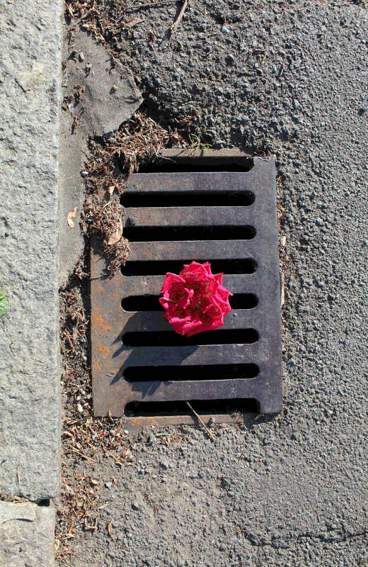
With the sun glaring into the lens I had to change the ISO to 100 and the shutter-speed to 1/250 so that I could get less exposure and still get a nice pale yellow colour to this picture. The reason I decided to take this picture from the top view was because I thought that it would capture all that needed to be in the picture. The reason I got the curb in the picture was because I wanted to appeal to the rule of thirds and make this picture more appealing. Thats also why I placed the rose at the near centre of the picture. The reason I took this picture was because I wanted to show that there was a beauty in the most disgusting parts of life. And what better to represent life than something that has the same ageing affect as a human.
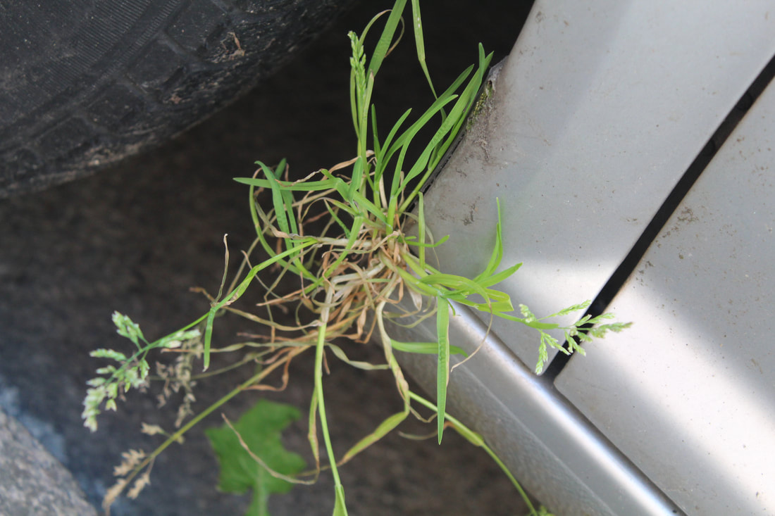
I took this picture right after the last one and only changed the ISO to 400 as there was a shadow. When I saw this I found it interesting as there was a large wad of grass and weeds wedged inside the door of the car. I found this peculiar because of what it represented for me. After years of land being ruined by factories and buildings all starting since the industrial revolution; plants being destroyed and killed, it was finally time for revenge. So when most people just see a bit of plant on the car, I see a beautiful attempt at redemption. In order to get a strange sense in this picture I decided to tilt the camera to give an altered reality effect.
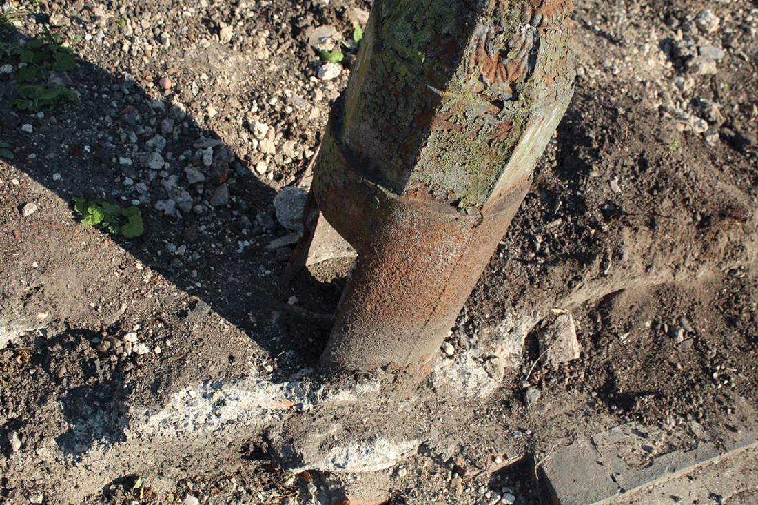
This picture was taken in the corner of the next road to me and was a target zone for light. I had to put my ISO on 100, my shutter-speed on 1/80 and my (F) was 6.8 so that I could get some of the background in focus. My main focus was the rusty lamp in this picture. The reason I used this as my subject as it looked like the remanence of this world, left in a post apocalyptic world. Looking at this I saw everything destroyed for what ever reason, reduced to dust, broken bricks and stones. And through all of this, nature prevails reclaims their spot on earth as the start of a new. There wasn't any technique I needed to do for this picture.
Force or Architecture
In the task 'Force of Architecture' we were trying to capture the large scale of the architecture that was around us. We would use our photography skills: rule of thirds, different exposures, negative space and geometric shapes. With this topic I learned a lot of techniques in order to present things as big, one of them being the use of comparison. When trying to show a building or object as large it helps to see how small thing s look against it. We got the idea of 'Force of Architecture' from the photographer Simon Phillips, who took photos of large buildings and made them seem extremely large. He would take the pictures at different angles so that he could really capture everything in the scene whilst still maintaining scale. Also his use of negative space helped comprehend how large the picture was.
Since all of my pictures were outside I decided to vary my ISO from 100-800 as there was a lot of light, and a lot of shadows. My (F) did change to 6 and 8 so that I could focus on the buildings that were far away. The shutter speed was on a 200 because the exposure was too high and I kept shaking when I needed to take a difficult shot.
Since all of my pictures were outside I decided to vary my ISO from 100-800 as there was a lot of light, and a lot of shadows. My (F) did change to 6 and 8 so that I could focus on the buildings that were far away. The shutter speed was on a 200 because the exposure was too high and I kept shaking when I needed to take a difficult shot.
|
This section is 'Negative Space'. With this I thought that the absence of anything in the background will pull the focus on this object and due to the fact that it is alone, there is no telling how big or small it is.
WWW: I really captured what I wanted to in these pictures while using exposure to brighten out most of the background. EBI: Some of the pictures are from the same angles and of the same building which could change to bring a variety. |
This section is 'Geometric Shapes'. The reason I chose this was because when looking at 2D objects there isn't much that is appealing unless it is art. But when you see the 3D side of objects it really gives another edge to it and presents it as larger as there is more information taken in.
WWW: I felt like the pictures that I had taken were good and showed the 3D sides of the buildings. EBI: I felt like I could have contributed more to this particular section. |
This section is 'Condensed'. Th reason I chose this as a section was because I built on the idea that the brain can only handle so much information at a time before things seem 'big'. So when taking these pictures I had to make sure that there was a lot of detail in the pictures so that the when people try to analyse the picture they get overwhelmed.
WWW: I chose buildings with a lot of detail and managed to take the shots of the whole thing with as little negative space as necessary. EBI: I could have maybe lost some of the space in the background and gone up closer for the pictures. |
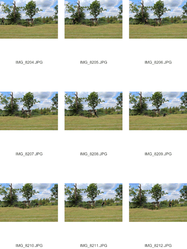
Force of Movement
With this picture we went out to the field and I took a picture of the person running and jumping over a hill. We took these pictures on a continues shooting while the subject was jumping so that we could get him in different positions. In this task we aimed to get the same person in the picture more than once.
|
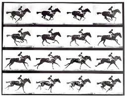
Eadweard Muybridge, also known as Edward James Muggeridge, was born on the 9th of April 1830 in Kingston upon the Thames in England. He died in May 1904.
In 1872 Muybridge was experimenting with motion photography when he hired a railroad magnate (a wealthy and influential businessperson) to prove that all four legs of a horse are off of the ground at the same time while trotting. But due to the limitation of camera shutter speed the experiment was unsuccessful. However, in 1877, after a murder trial, Muybridge moved through Central America and Mexico and set up 24 cameras with new special, more sensitive shutters that he had developed, they drastically reduced exposure. As you can see he was somewhat right. After he did this he took the pictures you see and put them in a rotating disk to create the first ever magic lantern. So when someone would spin the disk the horse would look like it was moving. The way that this links in with our work is that the photograph you see underneath is made with the same idea in mind, just different look and final piece. If you were to put our pictures on a spinning disk it would look like our final image. |
|
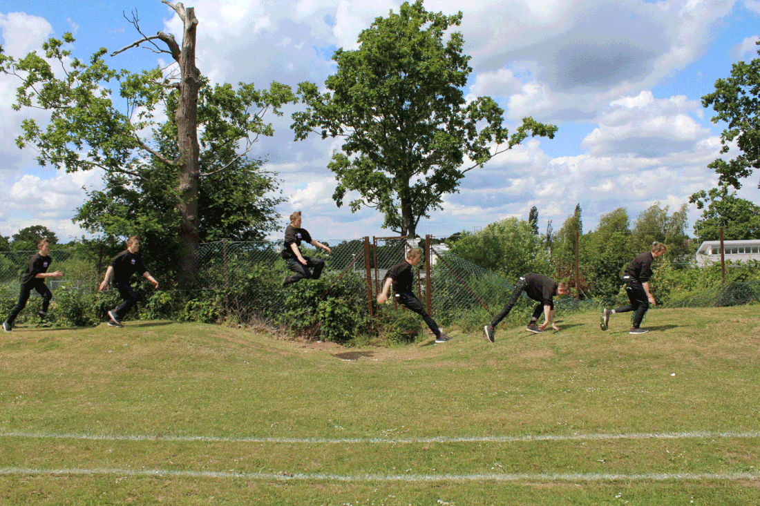
When creating these pictures we needed go through a long process on photoshop:
- First we had to put the first two pictures on photoshop, as we had to work with two at a time to make it easier. You would have to select one of the pictures (CMD+A) and then copy the image and paste it on the other picture so that it was on another layer.
- Next you would have to unlock the first layer and label it something to show that it is the original layer. On the side you will need to place the named layer over the pasted one so that the named on is on top of the others. Then change the opacity, which is located on top of the layer section. Change the opacity to something low like 40%, then use the eraser too that it located on the hot-bar on the left side.
- Next you will have to rub out the insides of the second layer picture. Once it is rubbed out then change the opacity back to 100% so that there are two of the same person.
- Once that is done I flattened the layer by going to layer on the top apple toolbar and then clicking flatten at the bottom. This condenses the two layers in one.
- Add the next picture and repeat the previous steps so that you can put more people
- If you need to move the pictures then just click the bottom layer and then click CMD+T to move the pictures.
WWW: I managed to incorporate the rule of thirds in my work and get a lean series of pictures. Also I am now more confident with photoshop since the I had to blend in some of the background and get in some shadows.
EBI: I should have used a tripod when taking the pictures because they were not exactly cleanly layered and I had to move a lot of the pictures to fit them in the top layer better.
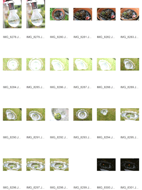
Force of Water - 1/3
|
For force of water I was influenced by Stephan Gill and Harold Edgerton. The thing that I liked into Stephan Gill's picture was that he took a picture of another picture and covered it with mess. I liked the demotions he was creating with he picture so that why I decided to get a polaroid picture that I took before, and dunked that in a bowl of water. But when taking the picture I found that you couldn't see the water, so I got a straw and would try to get a ripple effect with air.
The way that I took influence from Harold Edgerton was by dropping the stone in the water with a continues shutter-speed. But I thought that I should attempt another picture but get a different affect on the water. So I grabbed a bunch of small stones that were used for decoration and poured it in the water so that I could get a bubbling affect. I felt like I should have more colour like he did by dropping a white liquid in a red one. |
|
|
With this strand force of water I had to show water reclaiming and imposing on objects or the surroundings. With this brief I wanted to create different effects with each picture, not have different variations of the same picture. With the picture dunked in water I took influence from Stephen Gill's work where he would take pictures of landscapes then dunk them in sewage water to make a point. In my picture I wanted to explore the idea of altered reality by making it seem dream-like. With that picture I zoomed in to not get the background and turned my shutter-speed up to 250 and my ISO down to 200 (as it was inside). I wanted it a bit dark to make it seem like night time and subtly suggest sleep.
The stone dropped in the water was taken from Harold Edgerton's picture where he dropped a white liquid in a red liquid and caught the result. I wasn't sure how to re-create that picture so instead I did my own version based on what he did. I changed the ISO to 100 because of the high sun light exposure and the shutter-speed to 1/250 so that I could get crips shots on my continues shooting. I set up a stand and put the camera on a timer so that I could focus on the stone. Though, after taking this picture I was interested in what it would look like if there was more than one item dropped in the water, and though what it might look like if Harold Edgerton had used more than one drop. So I gathered small stones that are used for decoration and put a continues shooting with the same setups while I emptied them out into a water. The end result was interesting as it looked like the water was bubbling With the water in the plant pot and in a puddle I thought it reminded me of Richard Long's work where he would forge things in the land so that it would make an appealing picture. So I got a pot of water and decided to see what it was like to engulf different plants and settings in it. Both pictures were my idea of what it would look like after it had rained, and what was left the morning after. But my faverouit was the mud picture because I placed a long stick in it to make it look like a farm and present a rule of thirds in my picture. WWW: I took influence form my different pictures and then decided to incorporate the techniques in my own work. EBI: I could have taken more pictures involving this strand but was unsure on what to take. |
|
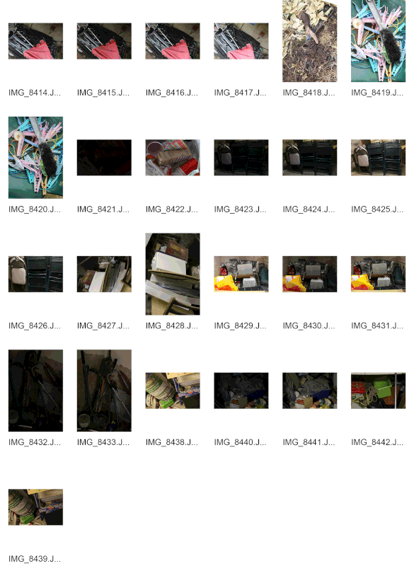
Neglect - Strand 2/3
|
In the strand of neglect you were meant to capture the feeling of neglect in a simple picture. Before taking these pictures I looked at the picture of Chernobyl done by Navdar Kander. I saw the peeling wall paper and 'neglected' room that looked almost ghostly and really wanted to create the feeling he did with these pictures. I also saw the picture of the broken and rusty bike in the dark and mouldy shed, and really thought that this represented neglect in the simplest way possible. So when I was taking these pictures I went into my basement to find old useless things that had been chucked down there, and tired to capture the essence of its loneliness. But when I saw things cluttered together it really put into perspective the idea of neglect over time, that these things were once bought and used and now they are broken and forgotten by the world. And that really made me think about how this will happen to us as the human race some day.
With each picture the dim lighting was the same in the basement so I kept it on an ISO of 1200, a shutter-speed of 1/150 and an (F) of 5,6. When taking these pictures I wanted to try from different angles to make them appealing to the eye. WWW: I re-created his work the best I could with my photography knowledge EBI: Looking back I haven't really projected my point across as well as I could have. |
|
|
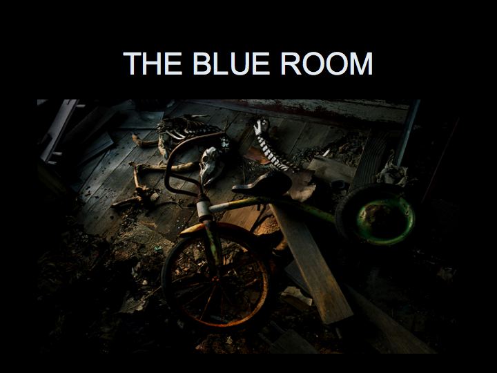
This strand was based on the picture I saw of a broken, rusty and neglected bike, created by The Blue Room. I felt like that this picture really grasped the idea of loneliness and neglect. Also, I liked the fact that it has a simple story behind it.
I wanted to create something like this picture but add in more clutter to really show the mass of neglect. I liked the fact that this person went into their shed and took the picture, so I decided to take pictures in my basement where there was a lot of neglected items and memories there. |
|
Chemicals in Water - Strand 3/3
|
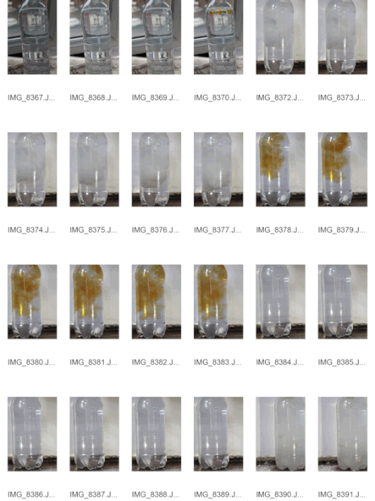
I saw the pictures that Dan Toben Smith took where he put a jar on a table with a white background to make the ink that he dropped in the water more clear. Also, he would blast a pale light on the jar so that it makes the chemicals look darker, and brings a sense of contrast into the picture. I wanted to try and re-create his picture with my own devices. I found a regular sized bottle of water and filled it up to the near top with water. For some of the pictures there was not top because I had to place a funnel inside to get the liquid accurately in. I also decided to do what he did and blast a light on the bottle so that I could get a refraction shadow on the back wall and try to bring some light to the other chemicals I put in water.
When takin these pictures I used an ISO of 800 so that the camera could absorb some more of the light, I used a shutter speed of 1/250 so that I could get a clear crips image of the bottle and chemicals and I used an (F) of 5.6 as the bottle wasn't that far away. In order to get the motion of the chemicals falling I changed the settings to continues shooting and put it on a timer so that I wouldn't get a blur on the picture or a wrong angle. Also, the timer left me time to pour the chemicals in the water. WWW: I managed to get the clear motion and take inspiration from Dan Toben Smith and did the best I could to re-create his picture. EBI: I would have mixed more chemicals at once. Also, I could have used a different background and made it easier to take the pictures so that I could get a better angle that didn't slope all the time. |
|
|
These are some of the pictures that Dan Tobem Smith had taken. As you can see that in each picture he tries a different effect with different containers. With the black ink picture you can see that he mist have take it in a petrie dish or a small bowl; what I liked about this picture is that he has not gone for the traditional way and taken the picture from the side so that you could see the drip falling down, he has taken it from a top down view and gone against the conventions. By shooting from this angle you can see a different perspective of the drop as it spreads out into the water, showing no sense of layers.
I also like the picture of the close up not the red and blue ink in the liquid. This photo creates quite a magical sense and a mystery one as well. This is because it reminds people of a crystal ball which brings in quite a mystical and supernatural sense in the picture. I can say the same thing about the other picture with the orange liquid that is connecting in the middle. Both of these pictures remind me of a rorshack test. |
|
Last week you talked about continuing with balloons. This is interesting work by Edward Horsford:
My favourite strand is 'Neglect' because I feel like I could use a lot more creative ideas.
Continuation of Neglect strand 1/5
As I liked these strands so much I decided to develop them further so that I could really get a new sense of neglect. I wanted to capture loneliness as sub theme of neglect as I thought that it would get the point across further. When taking these pictures I wanted to try and isolate one specific object or attraction and play with the lighting so that I could make it look very dark to reflect the mood of the picture. By showing an object by itself I had to take into account any distractions in the negative space of the pictures. So I would have to go out and move things or change the angle to make sure that the distraction wasn't seen. The reason I took the picture of the rubbish lying outside the house was because it was like the picture taken from left London where there was all the rubble and wood and junk piled in the middle of a warehouse. If thought that that showed the feel of neglect by the random junk being plopped and forgotten in a large warehouse. When it came to the burning paper I hadn't taken any inspiration from any of the chose.
With these pictures I used an ISO of 400, a shutter speed of 1/80 and an (F) of 6.4.
WWW: I really got good pictures and managed to capture the theme well for my first development.
EBI: I could have done better with the lighting of the picture to make it more darker.
With these pictures I used an ISO of 400, a shutter speed of 1/80 and an (F) of 6.4.
WWW: I really got good pictures and managed to capture the theme well for my first development.
EBI: I could have done better with the lighting of the picture to make it more darker.
|
|
|
Continuation of Force of Water
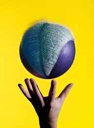
In this strand, Force of Water, the objective was to show the movement of water and give it a forceful personality. With this strand I focused more on using water balloons because of the photo taken by Edward Horsford. In the photo he took it was of a ballon on a string, but the balloon was popped and water was emerging out. This still, I felt, was very appealing to me as it showed something that people don't normally focus on. You usually see who you got wet when you throw a water balloon, not the way that the water flows out of the container. When taking the photos you have to be very careful with your camera settings, and where you put the camera: if you put the camera in the sun then when the water seeps out it will cause a refraction and create some lens flares that will affect the picture, and you have to time it perfectly so that you don't just get pictures of the full balloon and then the balloon skin falling with no water. Thats why some of my pictures weren't as good, I had to try and get used to the timing and only put the best pictures on.
|
|
|
|
|
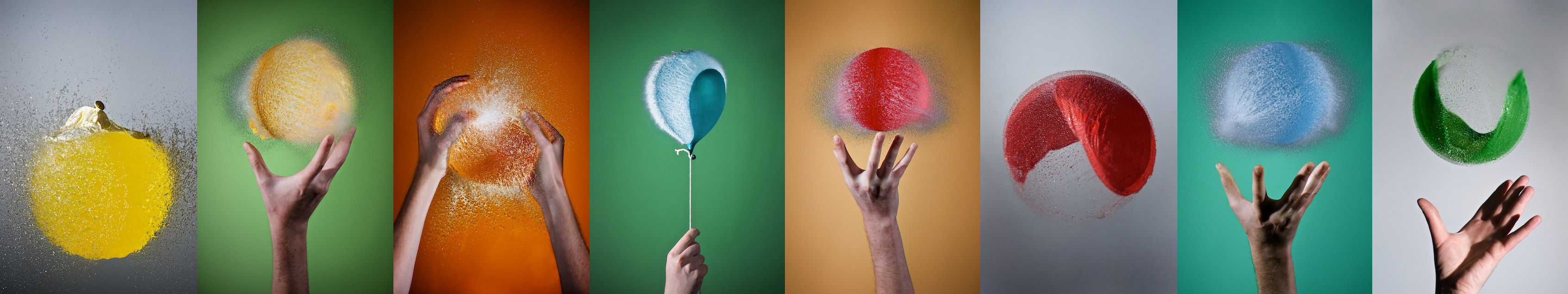
This was the picture taken by Edward Horsford. The reason that I took inspiration from this picture is because of the shape of the balloon and how the water spreads out from either side. I also like the fact that the balloon is on a string, it looks like something magical he has created. I think that in order to take that picture he must of flipped the image, the original was taken upside down, hence why the balloon is 'floating' perfectly.
I like the fact that he has taken it on a green background because it really singles out the balloon from everything with the use of negative space. The fact that he made it green fits in with the mood of the picture. |
|
Edward also made this picture. This is interesting because you can see a ripple in the water where the balloon burst, and there isn't much light exposure on the water. The use of the purple colour of the balloon contrasts with the bright yellow background, dark and light colours contrasting. You can see that he has photoshopped this image and changed the light intensity and the brightness/contrast as the hand at the bottom looks distorted and the shadow on the hand is darker than normal. He has used a rule of thirds by ending the balloon on the last top line and keeping the hand and explosion with in the two vertical lines.
These two pieces of work influenced mine because it perfectly showed still life and showed something that people have thought about much, what things look like when frozen in time. |
|
Overall, I feel like what I have done well for this strand as I have shown what I think 'force of water' looks like.
WWW: Working with water balloons was hard but I managed to push through and get the pictures that I wanted.
EBI: I did feel like some of my pictures could be a lot better and I could try and change things like the ISO and the shutter speed because some pictures were too dark and in some I didn't get the explosion. I also should have done it on a background to get a clear view of the falling water.
Neglect Strand 2/5
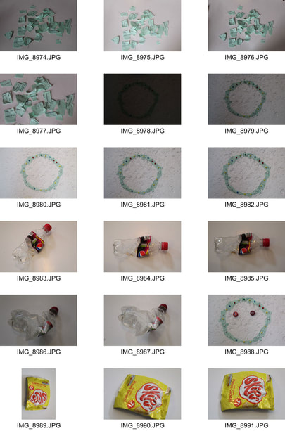
In this strand of neglect I have tried to create a sense of realism with neglect, hence why I took pictures of litter and singled them out. All around. Its almost like everyday you hear things about how the planet is doomed, global warming is among us and there is nothing we can do. It is only now that people with high power have started to do something about it. So the reason that I took these pictures was to try and expose things that can be changed, but won't. I am trying to show neglect of the planet. There weren't any artist that really influenced my work, I just felt like this was an issue that needed to be addressed, thats also why I chucked the rubbish in the bin right after using them. The reason that I put it up against a white background was to try and show the inferiority of the object, to try and show how small one thing is by itself and how less intimidating it looks. The reason that I wanted to bring that quality out was to show how easy it is to handle these simple things, and also show how easy they can be forgotten.
This photo is one of my favourites because the pair is first seen hiding inside the wooden frame works, it really shows the feeling of neglect as it has been chucked there and will be left for a long time. The other reason is that this fruit is bio degradable so, even though it doesn't fit in with the idea of pollution, it still fits in with the idea of neglect as if this would still be there then it will slowly decompose and be forgotten, no one would even know it was there.
All of these photos are in focus and I feel like I have captured what I need and have no need for a re-shoot because I have made sure that most of these pictures follow the simple things: rule of thirds, a high shutter speed of 1/250 to try and bring in a bit of darkness and changed the ISO to 200 so that the camera would not get any exposure from the bright sun light.
WWW: I managed to get my point across in a subtle form so that I could get people to think more on the photos.
EBI: I should have taken some more pictures of bits of litter dropped on the floor to try and make my point stronger.
|
The way that I made this collage was by first uploading all of the selected images to photoshop then changing the brightness and the contrast so that they could be seen better and would be clearer. Then I would crop out the negative space that was in the photo then I would copy the image and paste it on the grid. Once on the grid I would press Cmd+T so that I could change the size and make it fit on the grid. Once they were all the same size on the grid I would move them so that there was less of a distance between them, but still some room so you could look at each individual picture. Once that was done I cropped the edge and then coloured the background in black so that I could isolate each picture and make it look like a roll of negatives.
|
|
Neglect strand 3/5
|
With this development strand of neglect I tried to use this as a sort of continuation from the last one, but with a new type of message. The reason I took photos of things from the bin was because I wanted to enlarge the idea of re-using items. I would take out things from the bin in my room and create a happy face to influence a 'brighter tomorrow' and a healthier way of living, happily.
In doing this process you can see that I have used such items as torn up paper, bottle caps, crisp packets, discarded coupons and chocolate bar rappers. After folded them so that I could make a usable shape I then used my styrofoam board and a bunch of map pins to try and create an image by sticking them in a certain way. |
|
|
|
I got my influence from the sculptures made by Sayka Kajita
The photo of the horses was created by Sayka Kajita and the reason that I chose this was because it creates quite a mystical sense. She does this by having the horses phase through the wall whilst still galloping, like a wandering spectre. She wants us to consider the importance and peace that comes with life. Sayka Kajita is considering the idea of re-using and no waste. This is shown by the fact that the image is made entirely from discarded bits of plastic. Kajita was interested in this issue because it creates a sense of energy and harmony form discarded plastics. She is transmitting a feeling of hope. Kajita has used bits of plastic left around and in the bins to create this piece of work. This creates a proud effect as it shows recycling in the truest form. This helps support her idea of hope |
Overall, I wanted to show that there was a way to make things better from all the pollution around, and I think I have put that idea in people's head subtly.
WWW: I got my message across and, even though it wasn't my main focus, I still managed to use different photography techniques with a shutterspeed of 1/80, ISO of 1600 and an (F) of 6.8.
EBI: I could have done more to the face and really tried to make a good work of art.
WWW: I got my message across and, even though it wasn't my main focus, I still managed to use different photography techniques with a shutterspeed of 1/80, ISO of 1600 and an (F) of 6.8.
EBI: I could have done more to the face and really tried to make a good work of art.
Neglect strand 4/5
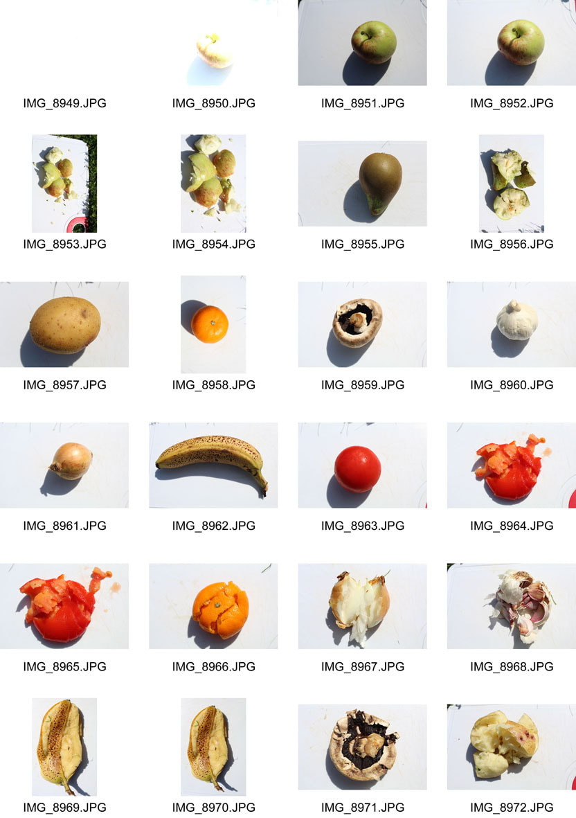
In this development strand of neglect I wanted to explore the idea of time, and how to incorporate that with neglect. The way that I did this was by first gathering a bit of fruit or veg, placing it against a white background, then smashing it with a large plank of wood. I felt like this presented my message extremely well. It entails how something so useful and vital and healthy for us, like fruit and vegetables, can be broken or forgotten in an instant. How quickly something can be destroyed and forgotten.
While taking these photos I didn't get any influence from a specific photographer, would take ideas from all these photographers that would break things or deconstruct things like Todd Mclellan. He was a Toronto born artist that would deconstruct electrical items and lay out each bit in its own individual peace. The reason that he did this was to show the beauty that came with electronics. One of his pieces is below.
While taking these photos I didn't get any influence from a specific photographer, would take ideas from all these photographers that would break things or deconstruct things like Todd Mclellan. He was a Toronto born artist that would deconstruct electrical items and lay out each bit in its own individual peace. The reason that he did this was to show the beauty that came with electronics. One of his pieces is below.
|
|
|
Overall, I have achieved what I wanted to in this project by bringing to mind how easily things will be forgotten, and how our significance and our work will truly someday be forgotten in a flash. The way I took these pictures was I first took all the pictures of the regular, not smashed, food then I would smash them after and take their picture. I took the pictures outside so that I could get some nice lighting that could easily be changed. I felt like the grass would make the picture seem unprofessional so I grabbed chopping board. The reason I used this and not something else was because of the association of the chopping board with the smashed food.
WWW: I found that when taking these pictures I found a creative way to do it and managed to get less exposure by turning up the shutter speed to 1/250, turning the ISO to 100 and putting the (F) on 5.8.
EBI: I could of had more pictures and maybe done some more things to help push my message across more.
Neglect strand 5/5
In this topic of neglect I wanted to try and show neglect by isolating something and showing how easy it is to make something look in a negative way. The way I did this was by taking a picture of something that you would encounter every day, and use black and white texturing to flip it and make it look like something dreary. Make it look like something that was in an old photo album. I felt like by changing it to black and white I could really bring in an aspect of loneliness to the picture, and make the thing seem lonely. I also decided to try and not just change the colour, but also change the brightness contrast of the picture so that I could lighten or darken some of the other colours in the picture to try and make the main subject look isolated from everything else.
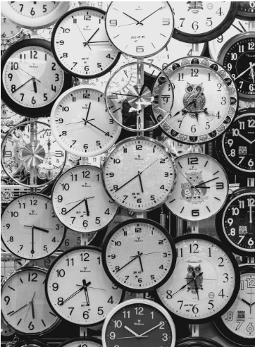
There was only one photograph by photographer Andrew Grushnikov. He took a black and white picture of a bunch of different wall clocks all huddled together.
There was only one photograph by photographer Andrew Grushnikov. He took a black and white picture of a bunch of different wall clocks all huddled together.
|
In this photo Grushnikov creates a sense of loss. He does this by having no negative space in his photo, everything is just clocks. He wants us to consider the importance of time by having it fill the frame.
Grushnikov is considering the idea of how we let go of time and not make it a concern. This is shown by the fact that each clock as a different time, and each one is different in its own way. He was interested in this issue because of how it is being wasted by some people all around the globe. Grushnikov has used a a studio to take this picture and he has used an editing software to change the colour to black and white. This creates quite a nostalgic effect in the photo. I think that this helps him support his idea about not waisting time because it shows how some people spend more time reminiscing about time and not understanding about what is going on in the present. |
In order to make these pictures look like the final image first I would input them into photoshop. Depending it it looked better I would flip the image a certain way and then after that I would go to 'Image' on the top bar and scroll down to 'Adjustments' and then 'Black and white'. When I would click on Black and white a menu would open up and which, would allow me to change the intensities of the different colours all over the picture. Once that was done, depending on if I was happy with the final image, I would change the brightness contrast of the picture to try and bring a heat intensity to the picture and really emphasise the outlines of the object. I would go through the same steps but click 'Brightness/contrast' instead of 'Black and white'. Another menu would pop up and allow me to change the brightness and the contrast of the image. Once done I would change the image size and save it.
Overall, I felt like this strand was my favourite because it really presented neglect in a new way from the other developments. For this strand I used an ISO of 100 or 400 as I took photos inside and outside, a shutter speed of 1/100 to get less light exposure and an (F) of 5.8.
WWW: With this final development I really felt like I did a lot to try and make it seem appealing and interesting to anyone who views it.
EBI: I could get one or two of the photos in focus and would take more pictures with wider ideas.
WWW: With this final development I really felt like I did a lot to try and make it seem appealing and interesting to anyone who views it.
EBI: I could get one or two of the photos in focus and would take more pictures with wider ideas.
Final Piece
Annotation Help
Introducing a task:
Subject matter
ebi:
Subject matter
What’s next
Analysis Help
What do you think the photographer’s intentions are? There may be more than one. ‘PEC’ each intention.
P (Photographer’s name) creates (what type of images? Fantastical, surreal, objective)
E He / she does this by… (describe something in the image)
C He/she wanted us to consider ….
What wider issues is the photographer addressing?
P (Photographer’s name) is considering (is the photographer talking about a bigger issue in photography, society, politics?)
E This is shown by … (describe something in the image)
C The (Photographer’s name) was interested in this issue because (they felt it was relevant to us now…)
How do the materials and techniques used support your photographer’s intentions?
P (Photographer’s name) has used (the darkroom / multiple exposure / film / digital manipulation techniques) in creating this work.
E This creates a ______ effect. (describe something in the image)
C This helps to support (Photographer’s name) point about (showing an identity / hiding a person’s identity / the media / anonymity)
Introducing a task:
- In this task I was required to…..
- This task links to the theme, Force, as it shows....
Subject matter
- The subject I chose to photograph suited the theme as it……
- My composition helped to support my response to the theme by….
- I managed the exposure very well. My ISO / shutter speed / aperture settings were…..
- I prioritised my shutter speed to… (capture movement / blur/ frozen moment)
- I prioritised aperture to manipulate depth of field.
- I used a tripod to avoid camera shake.
- My images express my intentions which were…
ebi:
Subject matter
- The subject I chose to photograph did not necessarily fit the brief as it was not interesting enough / appropriate / adequately lit…..
- Next time I should go to (a different location), photograph at a different time of day, organise people in advance, think more about my composition so that….. ect
- I did not create enough depth of field / sense of movement.
- The image is over exposed / underexposed / too blurred.
- Next time I should use a tripod / use a different type of lens (be specific) / experiment with film…
- My images do not show my intentions which were…
- The concept wasn’t clear in my images, I need to make it more explicit by…
What’s next
- Next time I will consider the work of (a photographer) to inspire a more accurate depiction of what I want to achieve.
- I will experiment further with… (blur / shutter speed / composition)
Analysis Help
What do you think the photographer’s intentions are? There may be more than one. ‘PEC’ each intention.
P (Photographer’s name) creates (what type of images? Fantastical, surreal, objective)
E He / she does this by… (describe something in the image)
C He/she wanted us to consider ….
What wider issues is the photographer addressing?
P (Photographer’s name) is considering (is the photographer talking about a bigger issue in photography, society, politics?)
E This is shown by … (describe something in the image)
C The (Photographer’s name) was interested in this issue because (they felt it was relevant to us now…)
How do the materials and techniques used support your photographer’s intentions?
P (Photographer’s name) has used (the darkroom / multiple exposure / film / digital manipulation techniques) in creating this work.
E This creates a ______ effect. (describe something in the image)
C This helps to support (Photographer’s name) point about (showing an identity / hiding a person’s identity / the media / anonymity)
